- Home
- /
- Programming
- /
- SAS Procedures
- /
- Re: Creating a plot with a "normal range" bar on the side
- RSS Feed
- Mark Topic as New
- Mark Topic as Read
- Float this Topic for Current User
- Bookmark
- Subscribe
- Mute
- Printer Friendly Page

- Mark as New
- Bookmark
- Subscribe
- Mute
- RSS Feed
- Permalink
- Report Inappropriate Content
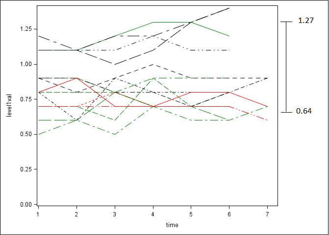
I have plot of the trajectory of a value over time and I would like to place just outside the graph, on the right, a bar indicating the normal range of the value (including numbers). How can accomplish this in proc template?
I've attached a rough picture of what I mean.
Thanks,
John

- Mark as New
- Bookmark
- Subscribe
- Mute
- RSS Feed
- Permalink
- Report Inappropriate Content
Without having data and your existing template it is pretty hard to provide details.
My first thought on this would be to add a high-low bar associated with a minimum or maximum value of you the x variable. Or look up the examples related to the GTL Draw statements and POLYLINE.
- Mark as New
- Bookmark
- Subscribe
- Mute
- RSS Feed
- Permalink
- Report Inappropriate Content
Here is some sample data. In the original graph you saw, there are 3 groups of patients, with each patient measured up to 7 time points. Here is data from one group, which includes 3 patients.
| PT | Time | Value |
| 102 | 1 | 1.1 |
| 102 | 2 | 1.1 |
| 102 | 3 | 1.2 |
| 102 | 4 | 1.3 |
| 102 | 5 | 1.3 |
| 102 | 6 | 1.2 |
| 103 | 1 | 0.7 |
| 103 | 2 | 0.7 |
| 103 | 3 | 0.6 |
| 103 | 4 | 0.9 |
| 103 | 5 | 0.7 |
| 103 | 6 | 0.8 |
| 104 | 1 | 0.9 |
| 104 | 2 | 0.9 |
| 104 | 3 | 0.8 |
| 104 | 4 | 0.9 |
| 104 | 5 | 0.9 |
| 104 | 6 | 0.9 |
.jpg")
Catch up on SAS Innovate 2026
Nearly 200 sessions are now available on demand with the SAS Innovate Digital Pass.
Explore Now →Learn the difference between classical and Bayesian statistical approaches and see a few PROC examples to perform Bayesian analysis in this video.

Find more tutorials on the SAS Users YouTube channel.
SAS Training: Just a Click Away
Ready to level-up your skills? Choose your own adventure.
-
2 replies
-
09-05-2014 10:57 AM
-
1562 views
-
0 likes
-
2 in conversation
-
