- Home
- /
- Analytics
- /
- SAS Data Science
- /
- Re: How can I show graphs created in Open Source Integration Node, SAS...
- RSS Feed
- Mark Topic as New
- Mark Topic as Read
- Float this Topic for Current User
- Bookmark
- Subscribe
- Mute
- Printer Friendly Page
- Mark as New
- Bookmark
- Subscribe
- Mute
- RSS Feed
- Permalink
- Report Inappropriate Content
Hello everyone!!
I am trying to show in the output of an OPEN SOURCE INTEGRATION NODE (SAS Enterprise Miner 14.3) a graph I create in R.
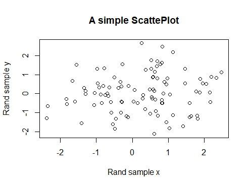
For example, I designed a toy dataset and the graph I would like to see in SAS Enterprise Miner.
R Script:
set.seed(12345)

# Populating a dataset:
data <- data.frame(x = rnorm(n=100, mean = 0, sd = 1),
                   y = rnorm(n=100, mean = 0, sd = 1))


# The graph I want to display in SAS Enterprise Miner:
plot(data$x, data$y,
     main = 'A simple ScattePlot',
     xlab = 'Rand sample x',
     ylab = 'Rand sample y')
And the expected graph I would obtain:

SAS ENTERPRISE MINER (version 14.3):
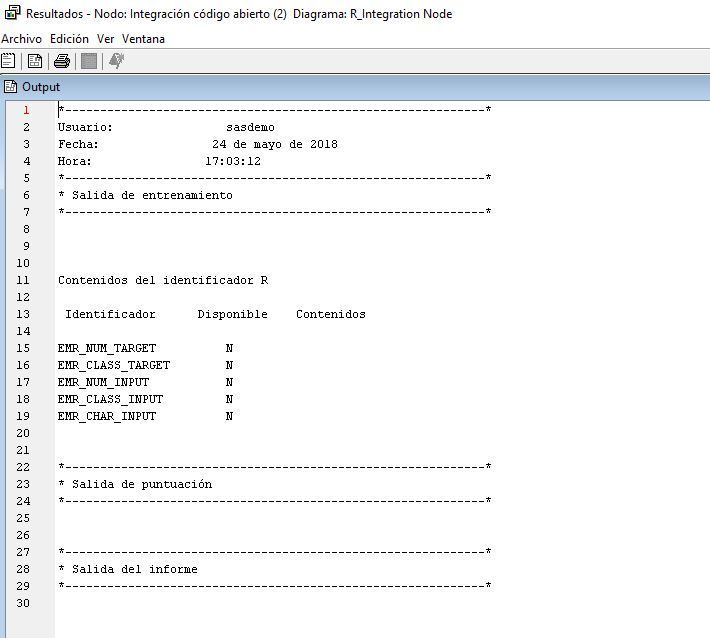
I put an Open Source Integration Node, set the OUTPUT MODE to NONE, put the same R code (above) as shown here:

After running the node, I can't see the graph I expected to see:

I don't know what else to do, what I am missing to configurate.
Thanks in advance, for the tips you could provide.
- Mark as New
- Bookmark
- Subscribe
- Mute
- RSS Feed
- Permalink
- Report Inappropriate Content
Hi @juan_valido
Graphics that are generated in R and saved with the following file extensions (jpg, png, gif) are available on the View Menu. Select View >> SAS Results >> Train Graphs to access your R generated charts, graphs, and data visualizations. Multiple graphics can be accessed using the arrow buttons in the Train Graphs dialog box.
Save these graphic files to the current R working directory. Here is a sample where a plot is save into a png file.
png("EMR_forestMsePlot.png")
plot(&EMR_MODEL, main='randomForest MSE Plot')
dev.off()
Hope this helps.
Radhikha
Catch up on SAS Innovate 2026
Dive into keynotes, announcements and breakthroughs on demand.
Explore Now →Use this tutorial as a handy guide to weigh the pros and cons of these commonly used machine learning algorithms.
Find more tutorials on the SAS Users YouTube channel.


