- Home
- /
- SAS Communities Library
- /
- VA Report Example: Ways to use the Cumulative Period operator
- RSS Feed
- Mark as New
- Mark as Read
- Bookmark
- Subscribe
- Printer Friendly Page
- Report Inappropriate Content
VA Report Example: Ways to use the Cumulative Period operator
- Article History
- RSS Feed
- Mark as New
- Mark as Read
- Bookmark
- Subscribe
- Printer Friendly Page
- Report Inappropriate Content
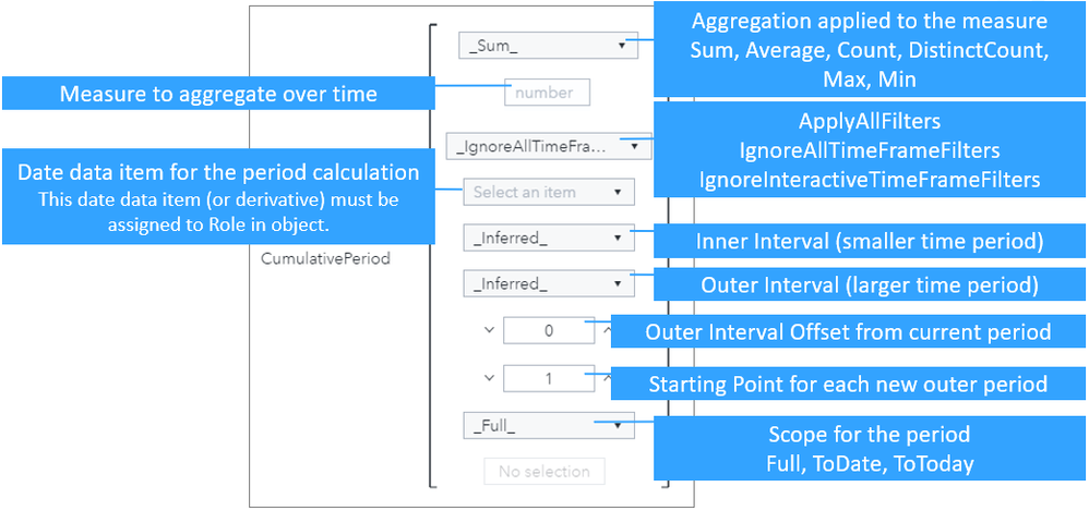
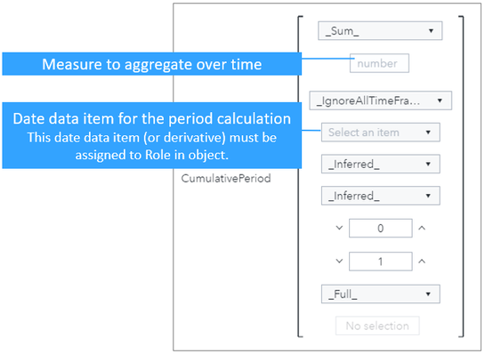
In this post, I will show ways to use the cumulative period operator but first let’s break down the inputs. See the SAS documentation for more details about the SAS Visual Analytics Operators for Data Expressions, including the Cumulative Period operator.
Starting with the two callouts on the left:
- Select from your data source the measure you wish to aggregate.
- Select from your data source the date data item you wish for it to be grouped by. The format must include the year and this is data item, or a derivative, must be assigned a role in the object.
The callouts on the right include:
- The type of aggregation to perform for the selected measure.
- How to treat time filters. For more detail on each option see this article.
- The inner interval to reset for each by group.
- The outer interval to reset for each by group.
- The outer interval offset from current period.
- The starting point for each new out period by group.
- Scope for the period by group.
Select any image to see a larger version.
Mobile users: To view the images, select the "Full" version at the bottom of the page.
Example 1: Cumulative Period with Default Values
For the first example, let’s keep it simple. That means we will use the _Inferred_ options for both the inner and outer intervals with the aim to explain what is happening.
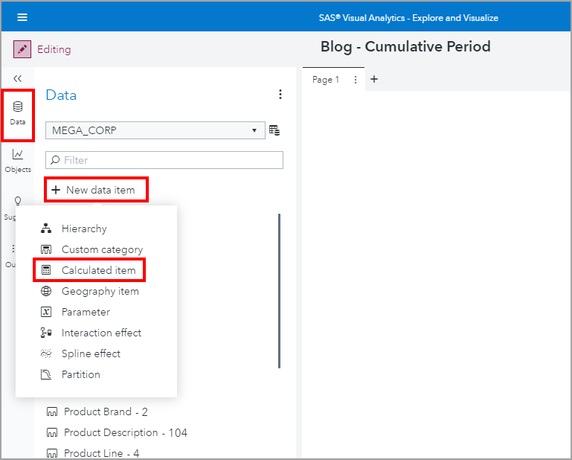
Let’s create a new Calculated item by using the Data pane and select + New data item.
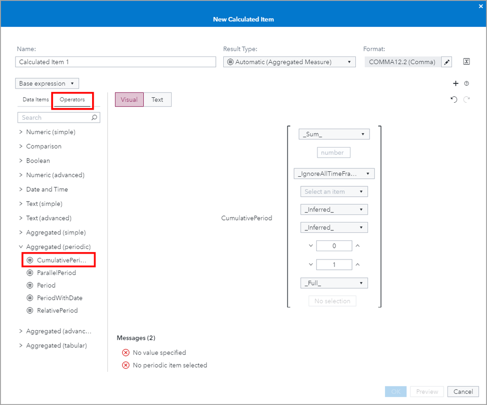
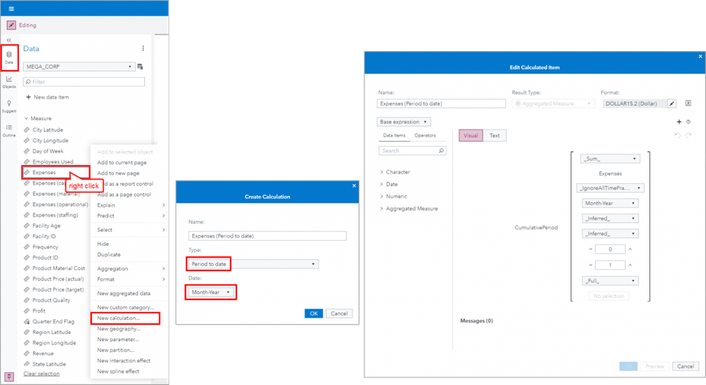
Next, use the Operators tab and expand the Aggregated (periodic) group and double click on CumulativePeriod to add it to the expression.
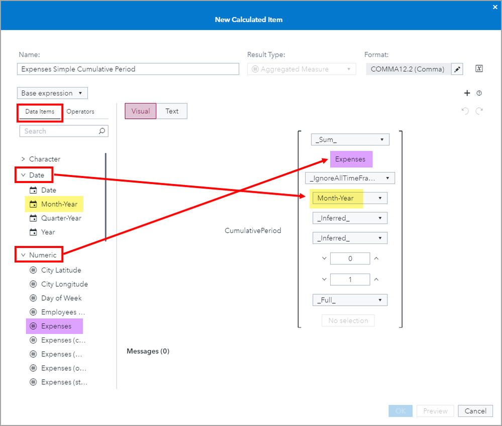
Now we need to assign data items to the expression. First we need to select the measure we want to aggregate. In this first example we will use the Sum aggregation for Expenses.
Next we need to select the time period for which to group the aggregation by. The available options are the Date data items in your data source that include year in the format. In this example, I selected Month-Year.
Since this is our first and simple example, I will leave the rest of the expression parameters to their default values.
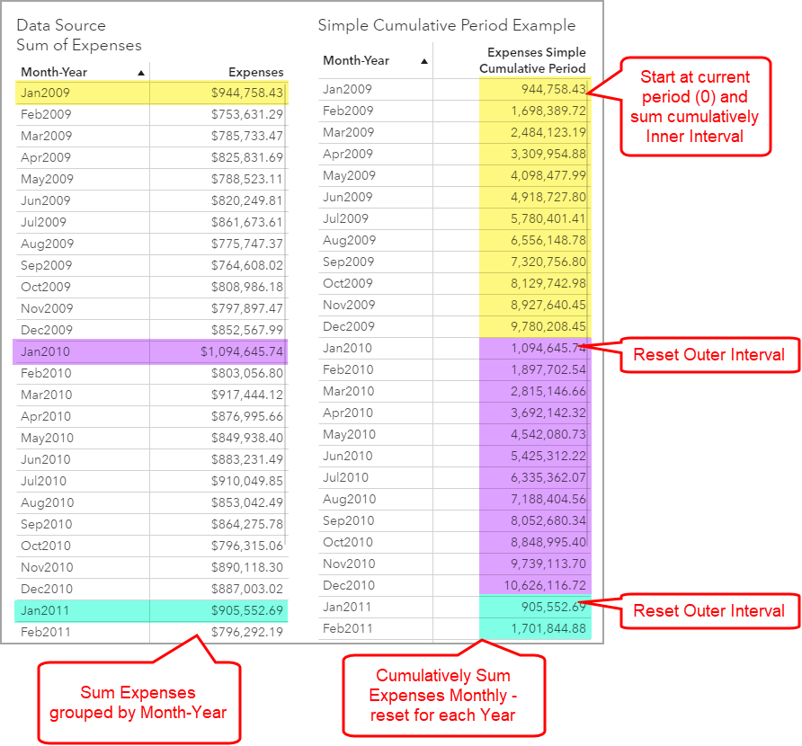
Let’s take a look at the results. By leaving the CumulativePeriod defaults for the expression, we can see that the inner and outer intervals are driven by the selected periodic by group, in our example Month-Year.
The inner interval is Month. That means that the measure, Expenses, will be cumulatively summed till it hits the outer reset interval which is Year in this example.
The List Table on the left is there for comparison. It shows the Month-Year by group and the Sum for Expenses per period.
The List Table on the right is where we have our CumulativePeriod expression added named Expenses Simple Cumulative Period. The coloring was added with my screen capture tool and the coloring corresponds to the reset value as show on the left.
This calculation is also referred to as Period to date and it is available as a SAS Visual Analytics out-of-the-box Derived Item. See the SAS Documentation for more information about Derived Items.
One of the key benefits of a Derived Item is that it can easily be created from the Data pane. I walked through the steps of how to assign roles for the above example, but this Cumulative Period expression can also be created with just a few clicks.
Example 2: Previous Period Monthly Cumulative Difference
Now let’s experiment with the offset parameters. In this example, we will build from our previous simple example by wanting to compare the month’s cumulative sum to the previous periods.
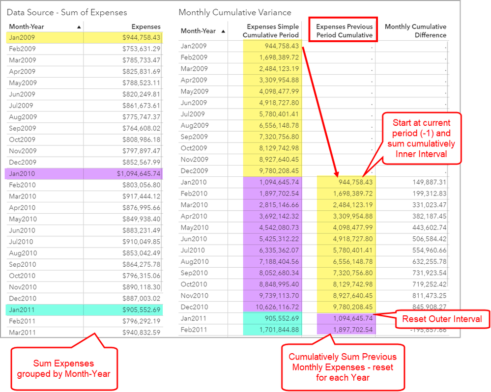
To do this, assign -1 to the outer interval offset parameter. This means we want to start the cumulative sum not at our current row (designated by zero) but for the previous outer interval (designated by -1).
Let’s take a look at the visual. Here you can see that for the Expenses Previous Period Cumulative measure that we created with the above expression, it shifts the cumulative sum for the previous period to the current period. This means that for each row of data we have both the current and previous cumulative periods and can now perform a subtraction for these two columns, see the column named Monthly Cumulative Difference.
I included the List Table on the left for comparison. Again, the coloring was added with my screen capture tool and the coloring corresponds to the reset value as show on the left.
Example 3: Cumulative Monthly Sum of Expenses Year to Date
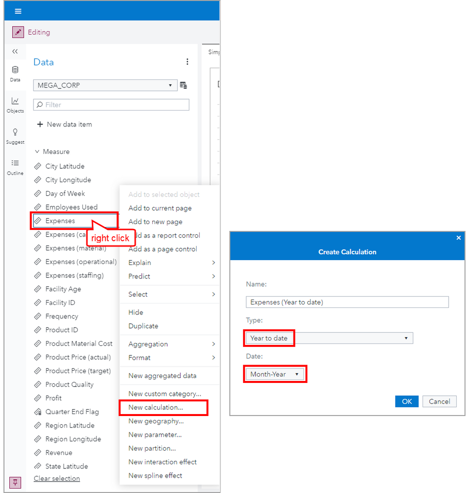
Now let’s take a look at a popular metric: Cumulative Sum Year to Date. As this is such a common metric, it is available as a Derived Item.
I’m keeping it simple and using the same measure, Expenses, and the same date data item, Month-Year.
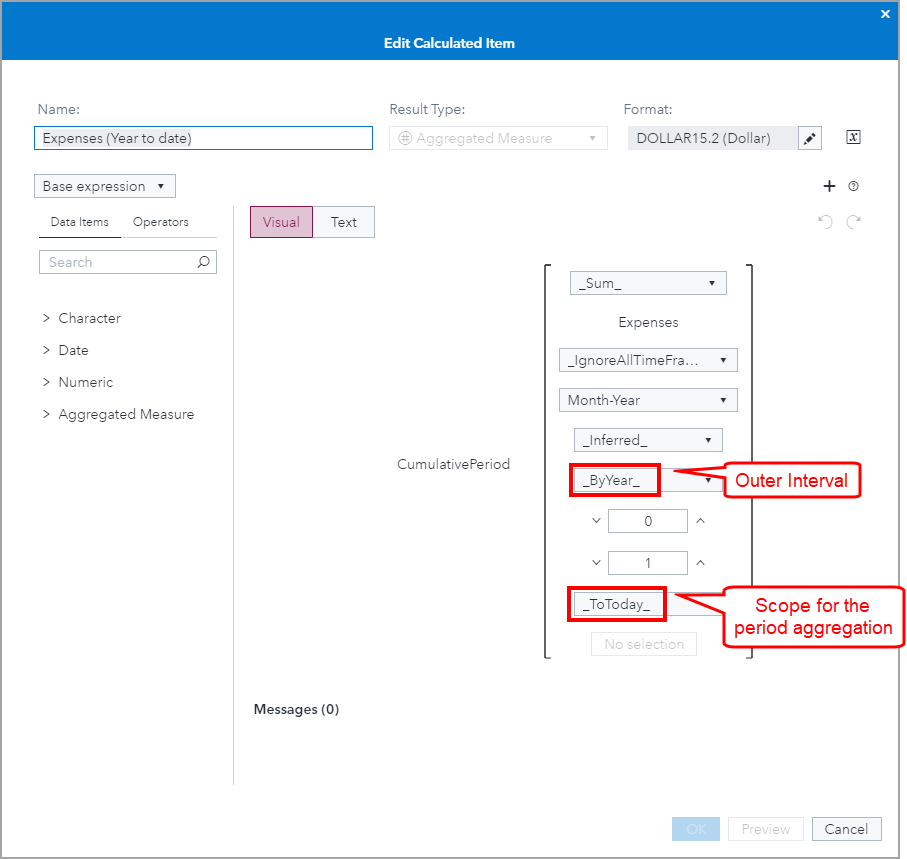
Notice that the generated expression uses the _ByYear_ for the Outer Interval and the _ToToday_ value for the Scope for the period aggregation. That means, it will cumulatively sum the inner interval values till it reaches today’s date, which happens to be September 15, then repeat for each outer interval.
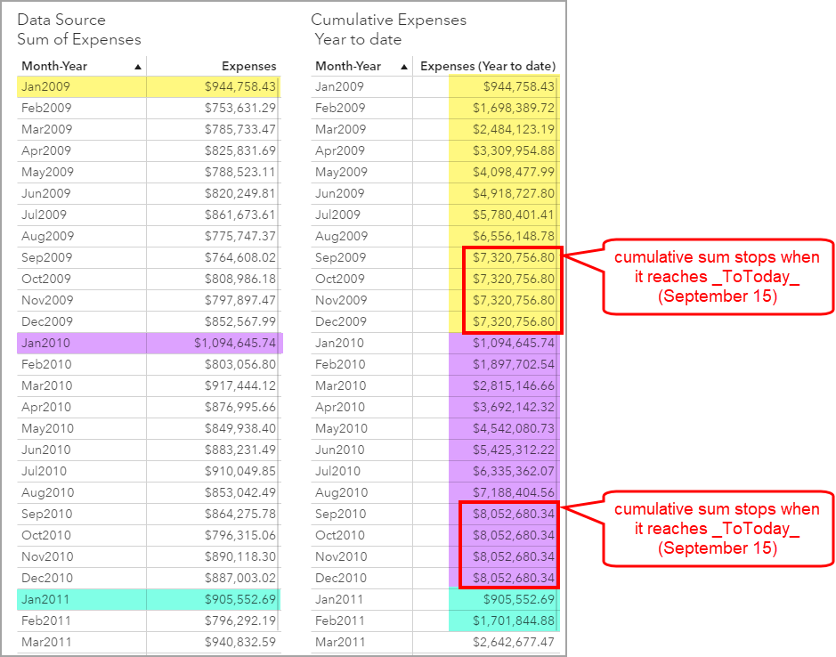
Let’s take a look at the results. I included the List Table on the left for comparison. Again, the coloring was added with my screen capture tool and the coloring corresponds to the reset value as show on the left.
Notice that once the value _ToToday_ is reached, September 15 in this case, then the cumulative sum stops and the value remains the same for the remainder of that interval. When the Outer Interval resets, then the cumulative sum resumes till the _ToToday_ value is reached again. As the resolved value of _ToToday will increment, then the cumulative sum will then be different daily; thus the meaning of Year to date.
Now that we understand how this example of CumulativePeriod works, I want to show how you can use different visual objects in a report. Let's look at the Crosstab and Line Chart objects.
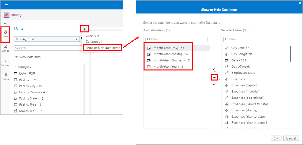
Pro Tip: Remember the strict requirement that only the date data item used in the CumulativePeriod expression, or a derivative of that data item, can be assigned to the visual. I want to show you an easy way that we can add additional date data item derivatives. The auto generate Date Hierarchy feature can be used to create new date data items from the data item used in the CumulativePeriod expression. This will automatically create 1) a date hierarchy from the selected date data item but 2) individual date data items that can be unhidden to use for other objects.
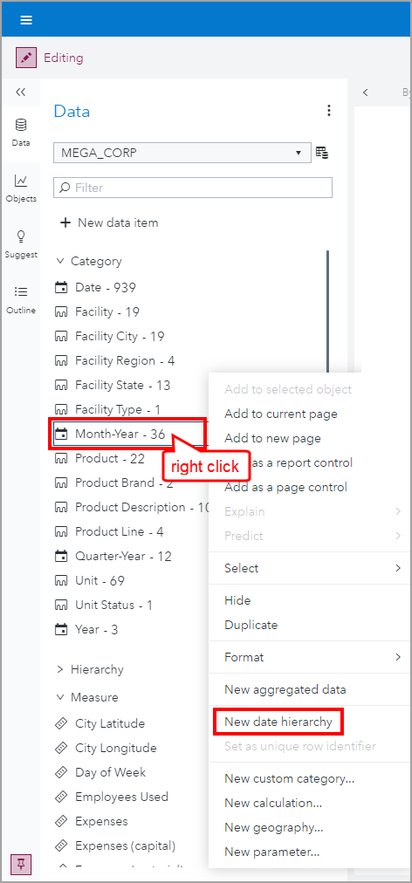
To create a Date Hierarchy for the Month-Year date data item we have been using in the CumulativePeriod expression, right click on Month-Year and select New date hierarchy.
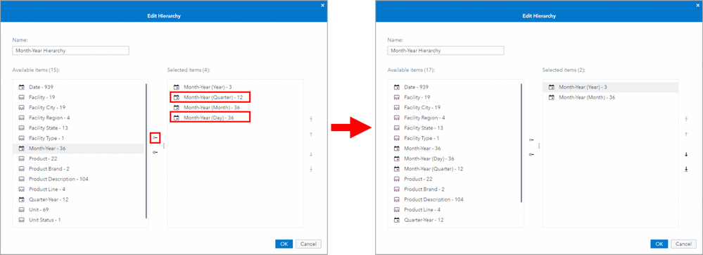
Then you can edit the created date hierarchy and keep only the levels you wish.
You can also unhide the new date data items for use in objects!
If there is a format that you need to use in an object but it’s not automatically generated, you can duplicate the original date data item used in the CumulativePeriod expression and select the desired format.
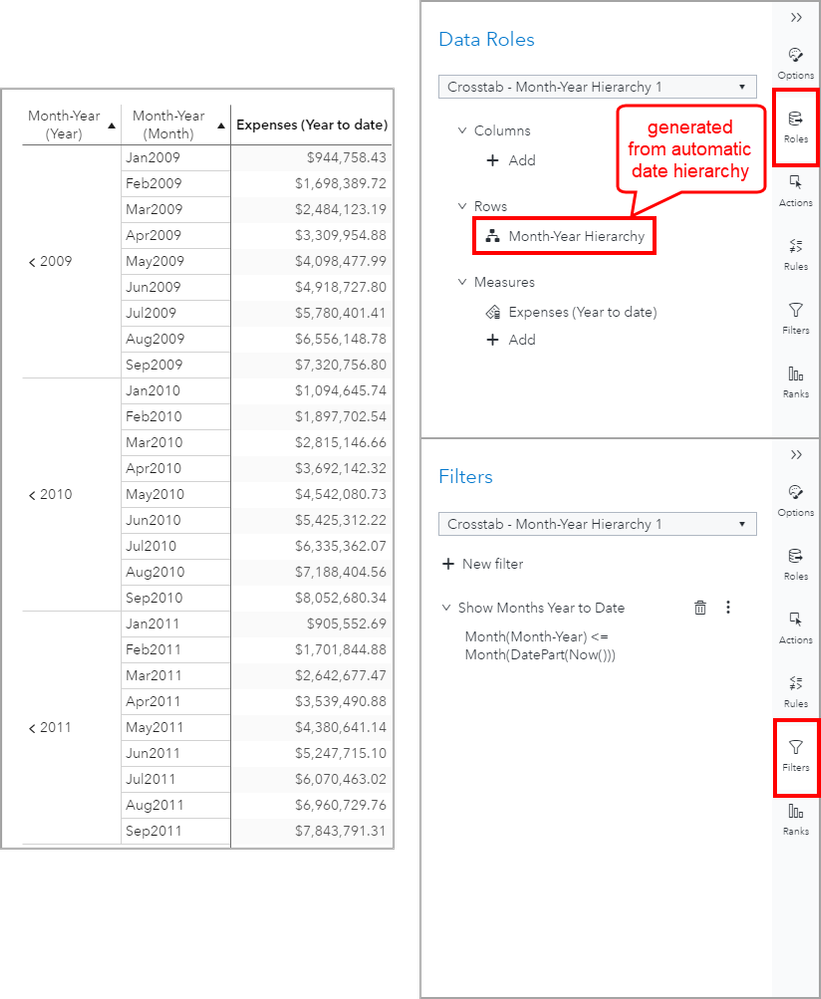
With this new date hierarchy, we can create a Crosstab that looks like this. Notice that I’ve also applied a filter to only show the values up to the _ToToday_’s month. I made this a Common Filter so that I can share it with other objects in the report. I chose to filter out the days beyond the _ToToday_ value as I didn't think seeing the final cumulative sum repeated for future dates made sense.
Here is a Line Chart you could also use. I applied the Common Filter to only show the values up to the _ToToday_’s month.
Example 4: Cumulative Monthly Sum of Expenses per Quarter
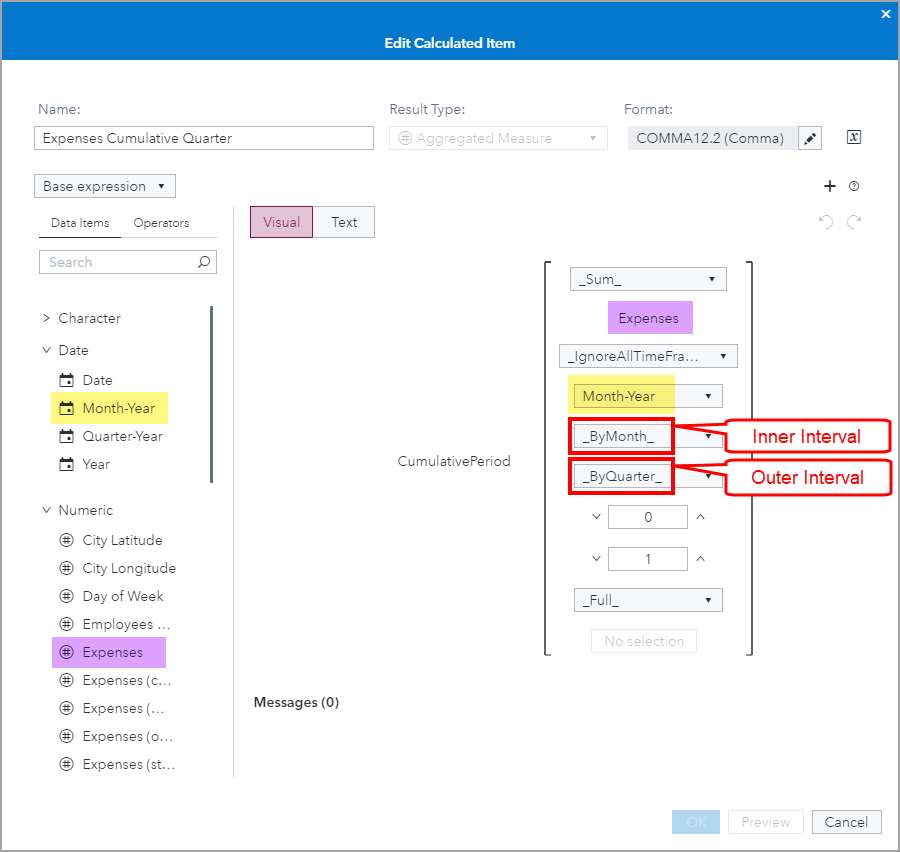
In this example, we will explore changing the values for the Inner and Outer Intervals. Notice that the data source selections for measure, Expenses, and the periodic time by group, Month-Year are still the same as in the previous examples.
In this example, I have selected the Inner Interval to be ByMonth and the Outer Interval to be ByQuarter. Notice that these values are not coming from the data source but are available interval options provided by this operator. I kept the offset values to default.
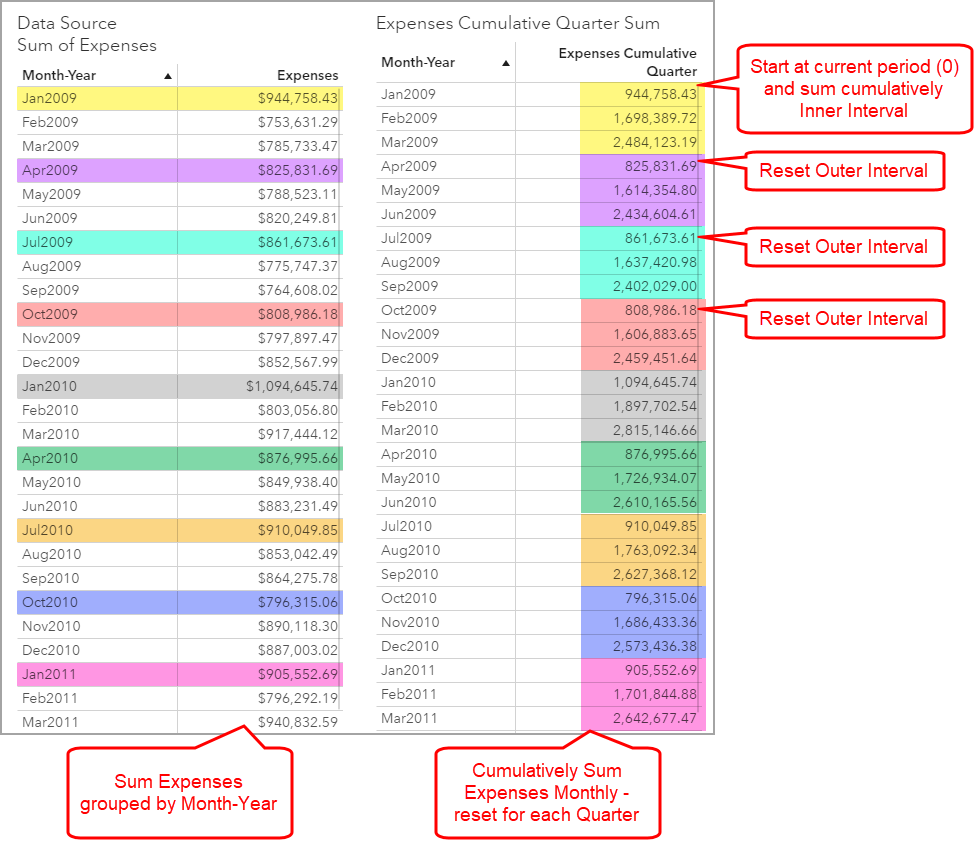
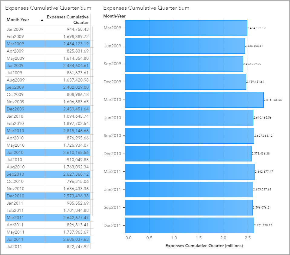
Let’s take a look at the visual. Hopefully you can now better predict the behavior of this operator. Here you can see that the Expenses are cumulatively summed for each inner interval, Month, and then reset for each outer interval, Quarter.
I included the List Table on the left for comparison. Again, the coloring was added with my screen capture tool and the coloring corresponds to the reset value as show on the left.
And here are a couple of visual object recommendations for comparing each ending quarter’s value. The coloring for the List Table uses the SAS Visual Analytics Display Rule feature. The Bar Chart is using a Filter to only compare the ending quarters’ values.
Summary
The main take away from these examples is that the Cumulative Period aggregated periodic operator is a powerful tool to have at your fingertips to display critical metrics you want to compare and analyze over time.
While all of the inputs to this operator are important, the two key ones are the Measure you want to aggregate and the Date data item for the period by group calculations.
It is also important to remember that this Date data item must be assigned a role in the visual object and the only other time periods must be generated from this date data item by either duplicating it and assigning a different format, or by using the automatic date hierarchy generation.
Special thanks to Ed Dobner for his contributions to this article.
- Mark as Read
- Mark as New
- Bookmark
- Permalink
- Report Inappropriate Content
Great article. It has helped me a lot. I also needed to calculate monthly cumulative difference of expenses, like you show in example 2 . Thank you for this article. regards Karolina T
- Mark as Read
- Mark as New
- Bookmark
- Permalink
- Report Inappropriate Content
Hi Teri!... or other...
I have a problem in this…
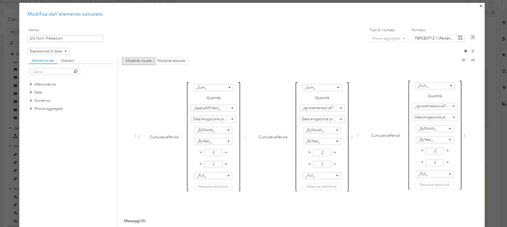
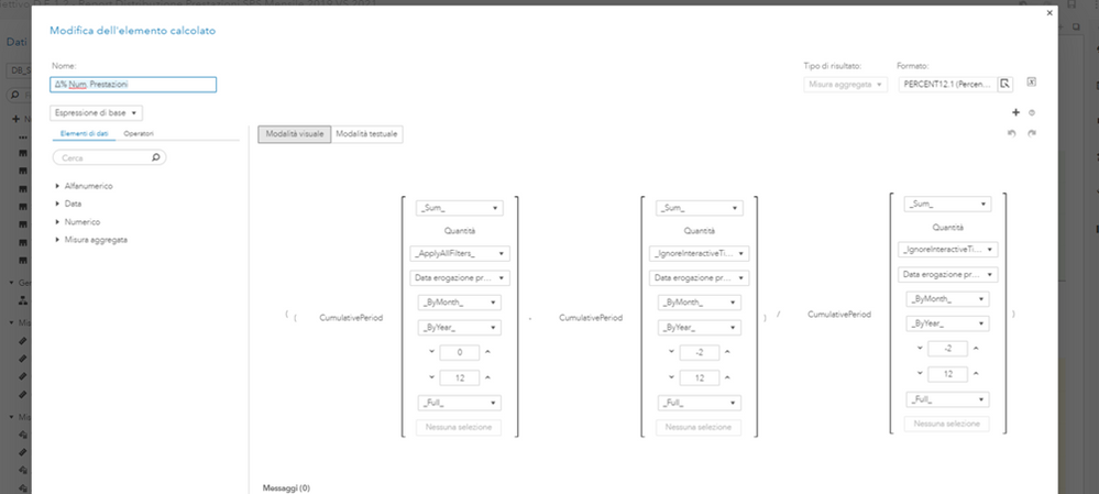
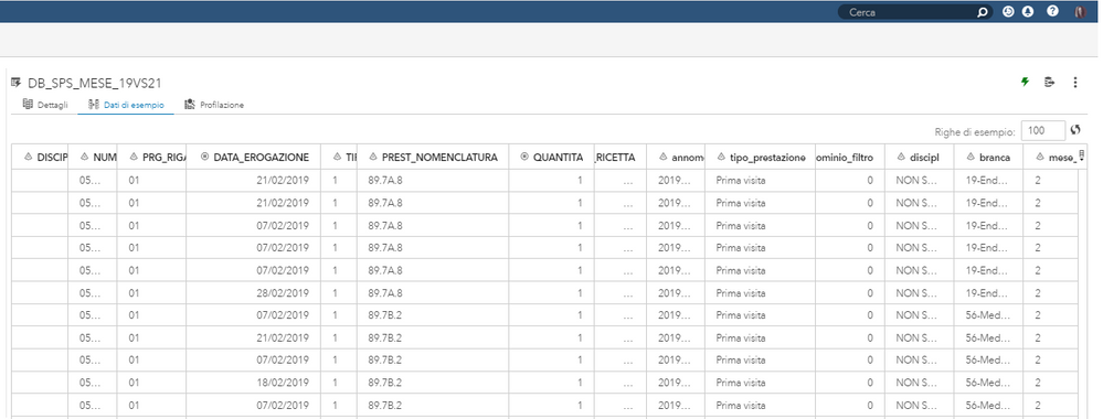
The value of the variable 'Δ% Num. Prestazioni' ((Quantità_2021 – Quantità_2019)/ Quantità_2019)*100) of the first two months does not appear in the graph: why?
Someone can help me?
If I enter 12 in the starting point for each new out period by group, I have this:
The table data is:
Where is my error?
Thanks!
- Mark as Read
- Mark as New
- Bookmark
- Permalink
- Report Inappropriate Content
Hi Teo,
I replied directly to your message.
Let me know if you have additional questions.
Thank you,
Teri
- Mark as Read
- Mark as New
- Bookmark
- Permalink
- Report Inappropriate Content
Hi Teri ... or other,
@TeriPatsilaras: thanks for your helpful article.
I have got a problem using the Cumulative period option.
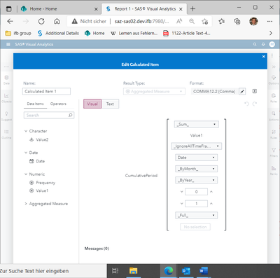
I have got a table with three columns: Date (Date), Value1 (numeric), Value2 (Character) and I define a “Calculated Item 1”:
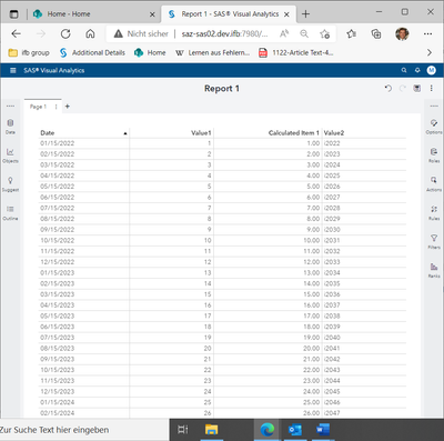
Then I choose a list object with three columns (Date, Value1, Calculated Item 1) which works how I would expect the “Cumulative period” to work:
But when I include “value2” column into the list, it seems that the “Cumulative period” doesn’t use the “date”-column anymore for the cumulation:
(I know that my “Value2”-character-column looks like consecutive years.)
My two questions are:
- What is happening here?
- What can I do, that in the second list object the “Date” will be used for cumulation again.
I am using VA Release 7.51.
Thanks
Markus
- Mark as Read
- Mark as New
- Bookmark
- Permalink
- Report Inappropriate Content
Hi Markus,
Additional Categorical data items, such as Value2, will be used as another "group by" category that the Periodic Operator will take into account. This is how all of the VA visuals behave and there’s no way to alter this behavior.
If you added additional measure values, then they would aggregate up to the "group by" data items, but any Categorical data items will be taken into context when performing aggregations.
I added a few Crosstab objects to help illustrate. You can see that your Value2 category data item is unique per row, therefore there is no "by group" that the Cumulative Period can aggregate on. In the new Value3 category data item I created, you can see how the Cumulative Period restarts at the new "by group" value but aggregates within each "by group" value.
Thank you,
Teri
- Mark as Read
- Mark as New
- Bookmark
- Permalink
- Report Inappropriate Content
Hi Tery,
Thankyou very much for the fast response as we ll as for the helpful answer.
Thanks
Markus
Catch up on SAS Innovate 2026
Nearly 200 sessions are now available on demand with the SAS Innovate Digital Pass.
Explore Now →SAS AI and Machine Learning Courses
The rapid growth of AI technologies is driving an AI skills gap and demand for AI talent. Ready to grow your AI literacy? SAS offers free ways to get started for beginners, business leaders, and analytics professionals of all skill levels. Your future self will thank you.
- Find more articles tagged with:
- GEL
