- Home
- /
- SAS Communities Library
- /
- VA Report Example: Applying a Color-Mapped Display Rule for a Dual Axi...
- RSS Feed
- Mark as New
- Mark as Read
- Bookmark
- Subscribe
- Printer Friendly Page
- Report Inappropriate Content
VA Report Example: Applying a Color-Mapped Display Rule for a Dual Axis Bar-Line Graph
- Article History
- RSS Feed
- Mark as New
- Mark as Read
- Bookmark
- Subscribe
- Printer Friendly Page
- Report Inappropriate Content
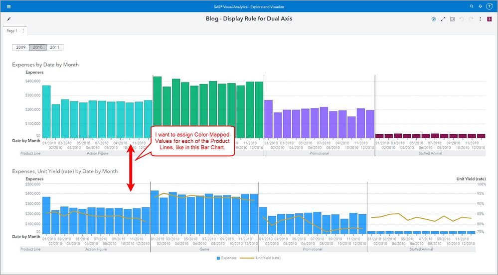
A report requirement came my way asking for a Color-Mapped Display Rule on a Dual Axis Bar-Line Graph. Because of the multiple measure Role Assignment this graph object does not support the typical out-of-the-box Color-Mapped Display Rule. This restriction is in place because if you have multiple measures assigned to an object then the object will often use color to identify what the graph element represents. The legend also helps the user identify which color maps to which value. For additional details see the SAS Visual Analytics Documentation: Working with Display Rules.
This requirement came in for the Dual Axis Bar-Line Chart and because the multiple measure assignments are for different graph elements entirely, one for the bar and one for the line, we can use a workaround to achieve the report requirement.
Since the out-of-the-box Color-Mapped Display Rule isn’t supported, we will need a numeric representation for each Category value. This technique isn’t difficult and depending on how many unique Category values you have; this can be added into your data transformation so that you don’t have to create a numeric representation at the Visual Analytics report level.
Let’s dive into this VA report example. Here was the request:
Select any image to see a larger version.
Mobile users: To view the images, select the "Full" version at the bottom of the page.
Color-Mapped Display Rule
Bar Chart
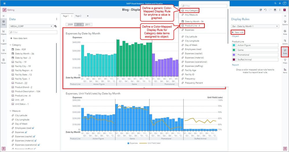
Typically, to define a Color-Mapped Display Rule, you use the + New rule from the Rules pane. Here in the Bar Chart you can see we have two ways to define a Color-Mapped Display Rule:
- Any Category: here you would type a value and for any time that value is graphed, regardless of the Category data item it belongs to, if it falls into the ability to have a Display Rule applied, then that color will be applied to the graph as defined.
- Individual Category Data item: here you would select a data item that has been assigned a Role in the object and when you type a value, if it falls into the ability to have a Display Rule applied, then that color will be applied to the graph only for the selected Category data item as defined.
In the Rules pane, you can see that for the Category data item Product Line, I have defined a Color-Mapped Display Rule for the Product Line values: Action Figure, Game, Promotional, and Stuffed Animal.
Dual Axis Bar-Line Chart
When selecting the + New rule for the Dual Axis Bar-Line Chart, you can see that only Measure data items are available. This is because this chart requires multiple measure Role assignments which means that Display Rules cannot always be applied at the Category level.
We can work around this limitation by creating a non-additive numeric representation for the Category data item, in this example, Product Line.
Solution
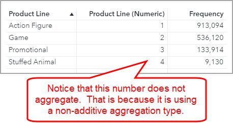
For this solution, we will create a non-additive numeric representation for the Category data item: Product Line. We will do that by creating a new calculated data item and name it: Product Line (Numeric). In the List Table shown, you can see how each value of Product Line will map to a number. As you can see by the Frequency column, this List Table object is aggregating the rows as defined in the data item properties. Creating this List Table is a good way to double check that your calculated data item is returning the expected results.
Create the calculated data item
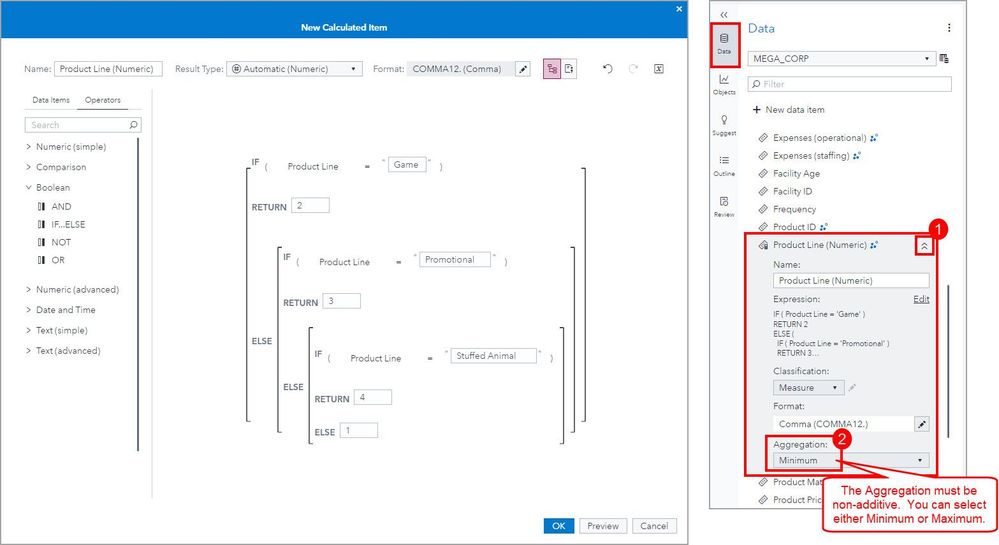
From the Data pane, use the + New data item and select Calculated item.
In the New Calculated Item window, create an IF… ELSE logic statement for each value of the Category data item minus 1. This is because the last ELSE condition will hold the final value.
After the new calculated item is created, use the Data pane and expand the data item properties using the chevron button. Then change the Aggregation to be non-additive. You can select either Minimum or Maximum.
Define the Display Rule
Now we will need to define the Display Rule for our new Measure data item that represents our Category data item. We will need to create an expression for each value of our data item.
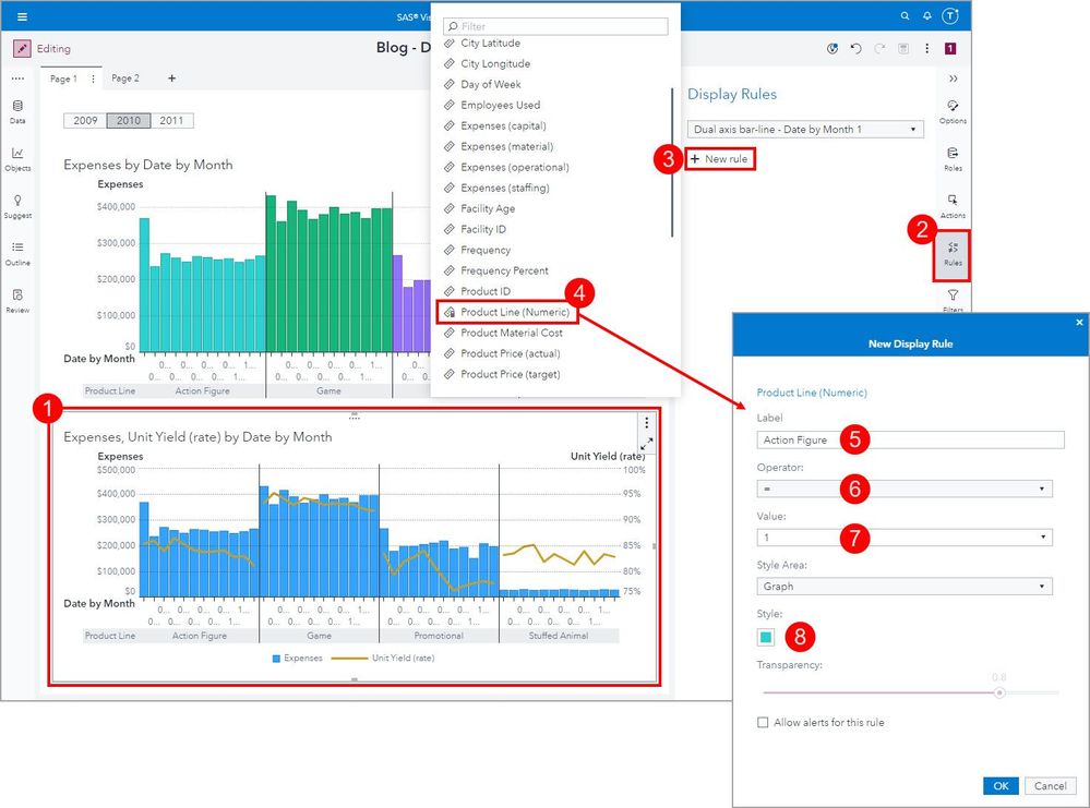
Follow these steps:
- Select the Dual Axis Bar-Line Chart to make it the active object.
- Select the Rules pane.
- Click the + New rule menu.
- Select the newly created measure data item: Product Line (Numeric).
- In the New Display Rule window, give the rule a Label. I will use the value of the Category data item as the label.
- Select the equals Operator.
- Enter the Value that corresponds to the Category value.
- Select the desired color for the graph Style.
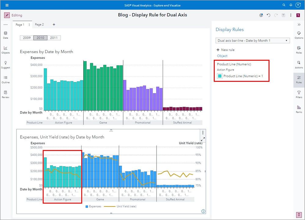
Once you click OK you will see something similar to the below:
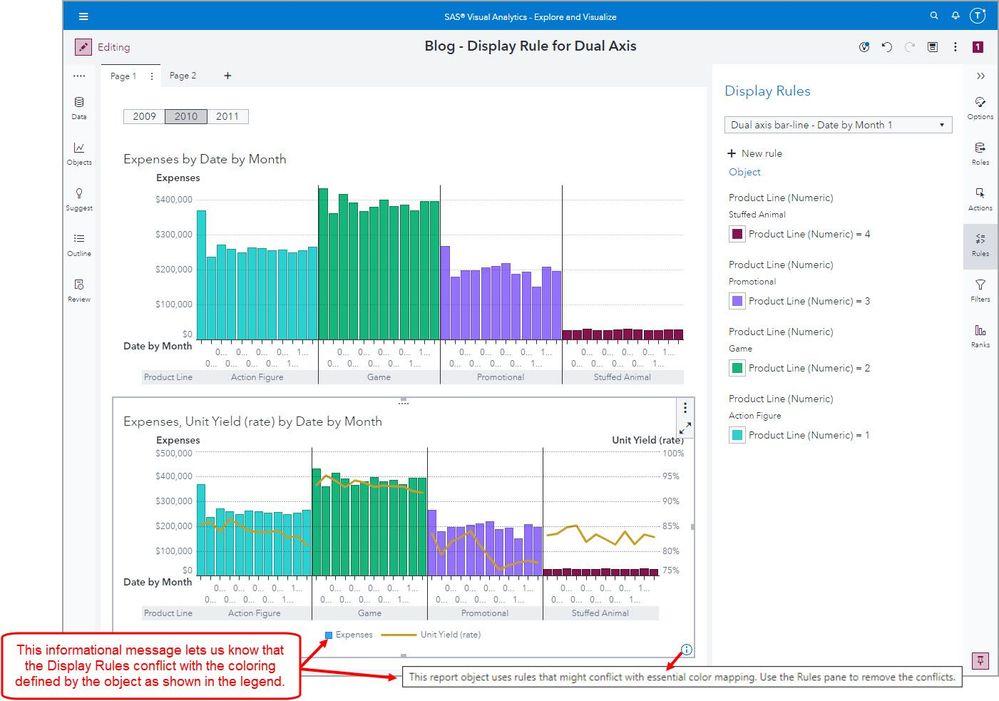
Repeat steps 3 – 8 for the remaining values. The end result will look like this:
This informational message lets us know that the Display Rule defined for this object conflicts with the color assignment that is defined by the object and shown in the legend.
To ensure your users understand what is graphed, I recommend adding a descriptive title and removing the legend.
Conclusion and Considerations
Now you have seen how you can work around a Display Rule limitation if the Object and Role assignment combination results in the restriction of Color-Mapped Display Rules.
Remember this restriction is in place because if you have multiple measures assigned to an object then the object will often use color to identify what the graph element represents. The legend also helps the user identify which color maps to which value. It can be the case that working around this restriction can make sense in your VA report, just use caution and be sure to title your object carefully and remove the conflicting legend display.
If you have “a lot” of Category values that would make the IF…ELSE logic statement cumbersome, you can add a numeric representation in the data source and then use the Data properties to make the Aggregation Type non-additive. This is done for other types of numeric data items that are non-additive such as ID numbers like Social-Security Numbers, Zip Codes, and SKUs.
See the below for additional Visual Analytics report examples:
- VA Report Example: Moving Average
- VA Report Example: Percent of Total – For All, For Rows, and For Columns
- VA Report Example: Moving 30 Day Rolling Sum
- VA Report Example: Number of Days Profitable for the last 30 days
- VA Report Example: Current Month vs Previous Month
- VA Report Example: Month Average versus Total Average
- VA Report Example: Ways to use the Cumulative Period operator
- VA Report Example: Relative Period Report in SAS Visual Analytics
- VA Report Example: Distinct Count If – Run multiple queries at once
- VA Report Example: Add a scope to an aggregated measure: Article | YouTube
Find more articles from SAS Global Enablement and Learning here.
Catch up on SAS Innovate 2026
Nearly 200 sessions are now available on demand with the SAS Innovate Digital Pass.
Explore Now →SAS AI and Machine Learning Courses
The rapid growth of AI technologies is driving an AI skills gap and demand for AI talent. Ready to grow your AI literacy? SAS offers free ways to get started for beginners, business leaders, and analytics professionals of all skill levels. Your future self will thank you.
- Find more articles tagged with:
- GEL
