- Home
- /
- Programming
- /
- ODS Reports
- /
- Re: gplot to sgplot transformation
- RSS Feed
- Mark Topic as New
- Mark Topic as Read
- Float this Topic for Current User
- Bookmark
- Subscribe
- Mute
- Printer Friendly Page
- Mark as New
- Bookmark
- Subscribe
- Mute
- RSS Feed
- Permalink
- Report Inappropriate Content
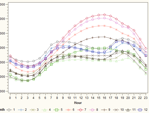
Hi I have this code for GPLOT but I want to change it into SGPLOT as I think there's more options to make it look nicer. Here's the code I have and I need help transforming it into sgplot:
proc sort data = dataname;
 by Month Hour;
run;

proc summary data = dataname;
 by Month Hour;
 var Load;
 output out = means (drop = _:) mean = mean n = n stderr = stderr;
run;

symbol1 i = j value = W font = marker c = vivb h = 1 line = 1 width = 1;
symbol2 i = j value = W font = marker c = bigb h = 1 line = 1 width = 1;
symbol3 i = j value = W font = marker c = liolbr h = 1 line = 1 width = 1;
symbol4 i = j value = W font = marker c = lilg h = 1 line = 1 width = 1;
symbol5 i = j value = W font = marker c = vilg h = 1 line = 1 width = 1;
symbol6 i = j value = W font = marker c = salmon h = 1 line = 1 width = 1;
symbol7 i = j value = W font = marker c = vipk h = 1 line = 1 width = 1;
symbol8 i = j value = W font = marker c = lippk h = 1 line = 1 width = 1;
symbol9 i = j value = W font = marker c = strbr h = 1 line = 1 width = 1;
symbol10 i = j value = W font = marker c = morbr h = 1 line = 1 width = 1;
symbol11 i = j value = W font = marker c = debr h = 1 line = 1 width = 1;
symbol12 i = j value = W font = marker c = bib h = 1 line = 1 width = 1;

proc gplot data = means;
axis1 order=(0 to 23 by 1);
 plot mean * Hour = Month / haxis=axis1;
 title 'Average Hourly Load for Every Month';
 format Month
run;
Here's how it look with gplot:
Accepted Solutions
- Mark as New
- Bookmark
- Subscribe
- Mute
- RSS Feed
- Permalink
- Report Inappropriate Content
It's hard to say without knowing the structure of your data, but I think the following will get you started:
title 'Average Hourly Load for Every Month';
proc sgplot data = means;
 format Month;
 series y=mean x=Hour / group=Month;
 xaxis values=(0 to 23 by 1);
run; - Mark as New
- Bookmark
- Subscribe
- Mute
- RSS Feed
- Permalink
- Report Inappropriate Content
In this case, you want to use the SERIES command in PROC SGPLOT with the GROUP= option.
Paige Miller
- Mark as New
- Bookmark
- Subscribe
- Mute
- RSS Feed
- Permalink
- Report Inappropriate Content
When I change it to sgplot, command 'plot' does not work anymore
- Mark as New
- Bookmark
- Subscribe
- Mute
- RSS Feed
- Permalink
- Report Inappropriate Content
@matt23 wrote:
How would the code look for sgplot then?
When I change it to sgplot, command 'plot' does not work anymore
As I said, you use the SERIES command. Here is the documentation if you are not familiar with it.
Paige Miller
- Mark as New
- Bookmark
- Subscribe
- Mute
- RSS Feed
- Permalink
- Report Inappropriate Content
Bookmark this page:
https://blogs.sas.com/content/graphicallyspeaking/
Its has code for pretty much any graphing activity you want to do, it is my one best source for anything sgplot/gtl related.
- Mark as New
- Bookmark
- Subscribe
- Mute
- RSS Feed
- Permalink
- Report Inappropriate Content
- Mark as New
- Bookmark
- Subscribe
- Mute
- RSS Feed
- Permalink
- Report Inappropriate Content
It's hard to say without knowing the structure of your data, but I think the following will get you started:
title 'Average Hourly Load for Every Month';
proc sgplot data = means;
 format Month;
 series y=mean x=Hour / group=Month;
 xaxis values=(0 to 23 by 1);
run; - Mark as New
- Bookmark
- Subscribe
- Mute
- RSS Feed
- Permalink
- Report Inappropriate Content
Is there any way I can edit the look of each SERIES?
- Mark as New
- Bookmark
- Subscribe
- Mute
- RSS Feed
- Permalink
- Report Inappropriate Content
Yes. The easiest way (assuming you are using a modern version of SAS) is to use the STYLEATTRS statement.
proc sgplot data=have nocycleattrs;
styleattrs datacontrastcolors=(black bigb liolbr lilg vilg salmon vipk lippk strbr morbr debr bib);
series y=mean x=Hour / group=Month;
xaxis values=(0 to 23 by 1); run;
run;
- Mark as New
- Bookmark
- Subscribe
- Mute
- RSS Feed
- Permalink
- Report Inappropriate Content
I'm a fan of the data attribute maps. Having the data in a data set makes it a little more dynamic and easy to change/update IMO.
@matt23 wrote:
Yes, thank you, that is perfect.
Is there any way I can edit the look of each SERIES?
Learn how use the CAT functions in SAS to join values from multiple variables into a single value.
Find more tutorials on the SAS Users YouTube channel.
SAS Training: Just a Click Away
Ready to level-up your skills? Choose your own adventure.


