- Home
- /
- Programming
- /
- ODS Reports
- /
- Re: How to Colour Columns as Data Bars and by Using Conditional Format...
- RSS Feed
- Mark Topic as New
- Mark Topic as Read
- Float this Topic for Current User
- Bookmark
- Subscribe
- Mute
- Printer Friendly Page
- Mark as New
- Bookmark
- Subscribe
- Mute
- RSS Feed
- Permalink
- Report Inappropriate Content
Hello everyone,
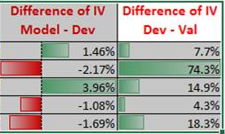
I'm trying to make "Data Bars" and "Conditional Fromatting" in SAS, which we can do in Excel. I have a similar image which is created in Excel as follows. Excel helps us by the following steps -> Style->Conditional Formatting ->Data Bars. I prepared a sample data. If it is possible, I would like to see last two columns the image as below.
Data Have;
Length Characteristics $ 20 Dev 8 Model 8 Val 8 ModelDev 8 DevVal 8 ;
Infile Datalines Missover;
Input Characteristics Dev Model Val ModelDev DevVal;
Datalines;
WOE_variable_1 0.1 0.1 0.1 0.1 0.7
WOE_variable_2 0.1 0.1 0.1 0.1 0.3
WOE_variable_3 0.1 0.1 0.1 -0.1 0.1
WOE_variable_4 0.1 0.1 0.1 0.1 0.5
WOE_variable_5 0.1 0.1 0.1 0.1 0.1
;
RUN;
PROC FORMAT;
picture pctpic (round) low-<0 ='009.99%' (prefix='-' mult=10000)
0-high='009.99%' (mult=10000)
;
RUN;


PROC REPORT Data=Have;

Column Characteristics ("IV" Dev Model Val) ModelDev DevVal;

Define Characteristics / Display "Characteristics (Variables)";
Define Dev / Display "Dev" STYLE(column)={backgroundcolor=Yellow};
Define Model / Display "Model" STYLE(column)={backgroundcolor=Yellow};
Define Val / Display "Val" STYLE(column)={backgroundcolor=Yellow};
Define ModelDev / Display "Difference of IV / Model - Dev" Format= pctpic.;
Define DevVal / Display "Difference of IV / Dev - Val" Format= Percent7.2;

/*Compute ModelDev;*/
/*Call Define(_col_,'style',*/

Run;
Thank you,
Accepted Solutions
- Mark as New
- Bookmark
- Subscribe
- Mute
- RSS Feed
- Permalink
- Report Inappropriate Content
Hi
You will need to create a graph for each school district. An then include those graphs in the Proc REPORT
See the example below, it just creates the one graph which is used for all the schools.
ods _all_ close;

Data Ranks;
  Length RateRank 8  SchDist $ 20 VarCount 8 VarRate 8;
  Infile Datalines Missover;
  Input RateRank SchDist VarCount VarRate;
  Datalines;
1 Auburn 523 720
2 Seattle 3425 560
3 Higline 662 543
4 SouthCentral 90 539
5 Kent 785 524
6 Renton 429 407
7 Shoreline 225 334
8 FederalWay 424 338
9 Tahoma 69 198
10 SnoqualmieValley 61 183
;
Run;

*
* load all the SAS/GRAPH macros
*;
%annomac


Data Anno;
*
* declare the variables used by the annotate macros
*;
%dclanno

*
* set the coordinate system, in our case % of graphics area
*;
xsys="3";
ysys="3";
*
* set how to measure size for text (pt)
*;
hsys="D";
*
* use macros to create two bars and a text
*;
%Bar(0,0,100,100,cx0000ff,0,e);
%Bar(0,0,75,100,cxff0000,0,s);
%LABEL(100, 50, "75", cx000000, 0, 0, 8, none , <);

Run;

ods listing;
OPTIONS printerpath=postscript;

filename bar 'c:\temp\barsample.png';
goptions reset=all;
goptions
  device=png gsfname=bar
  xpixels=100 ypixels=25;
;

Proc gslide Anno=Anno;
Run;

Quit;

ods listing close;


Proc Format;
  Value ColorList
    1-3="cxff0000"
    4-6="cxff9999"
    7-10="cxffeeb8"
    11-13="cx9999ff"
    14-16="cx0000ff"
    17-19="white"
  ;
  Value TextColor
    1,2,3='white'
    other='black'
  ;
RUN;

ods html file="c:\temp\sample.html";

PROC REPORT data=Ranks nowd;
  Columns RateRank SchDist
    ("Selected Measure" VarCount VarRate);
  Define RateRank / "Rank" group style=[background=ColorList. foreground=TextColor.];
  Define SchDist / "School District";
  Define VarCount / "Count";
  Define VarRate / "Rate";
RUN;


PROC REPORT data=Ranks nowd;
  Columns RateRank SchDist
    ("Selected Measure" VarCount VarRate)
    showBar
  ;
  Define RateRank / "Rank" group;
  Define SchDist / group "School District";
  Define VarCount / "Count";
  Define VarRate / "Rate";
  Define ShowBar / "Relative Rate" computed;

  compute ShowBar / char;
    call define(_col_,'style',"style=[preimage='c:\temp\barsample.png']");
  endcomp;
Run;
ods html close;
Bruno
- Mark as New
- Bookmark
- Subscribe
- Mute
- RSS Feed
- Permalink
- Report Inappropriate Content
I think you need PROC SGPLOT to get a image ,NOT a excel file .
OR you need call define() + style={preimage=....} , but that is very hard to code and need many image to display it .
- Mark as New
- Bookmark
- Subscribe
- Mute
- RSS Feed
- Permalink
- Report Inappropriate Content
Hello Xia,
Actually, I was trying to ask that how to show horizontal bar in column's cells while we use PROC REPORT procedure or by the help of any other procedures. I mean I don't want to add a image into cells. I think I can create a report by using PROC SGPLOT as below but how can I show it in a table, into cell ? Are there any possibilities ? I just wanted to indicate that to make clear. If it is still not possible I can understand .
Thank you
- Mark as New
- Bookmark
- Subscribe
- Mute
- RSS Feed
- Permalink
- Report Inappropriate Content
Oh. As far as I know, that is almost impossible . Maybe Cynthia have some idea . Calling Cynthia .......
- Mark as New
- Bookmark
- Subscribe
- Mute
- RSS Feed
- Permalink
- Report Inappropriate Content
Hi
Have a look at this paper http://support.sas.com/resources/papers/proceedings09/221-2009.pdf
It shows how to create the graphs first, and then add it to your report.
Bruno
- Mark as New
- Bookmark
- Subscribe
- Mute
- RSS Feed
- Permalink
- Report Inappropriate Content
Hello Bruno,
Thank you for trying to help me, I checked the Web Site link. Actually, I'm little bir confused in Data Anno part. I wrote the datas in my enivorenment but I couldn't exactly get it. Can anybody help me for the following codes ?
Data Ranks;
Length RateRank 8  SchDist $ 20 VarCount 8 VarRate 8;
Infile Datalines Missover;
Input RateRank SchDist VarCount VarRate;
Datalines;
1 Auburn 523 720
2 Seattle 3425 560
3 Higline 662 543
4 SouthCentral 90 539
5 Kent 785 524
6 Renton 429 407
7 Shoreline 225 334
8 FederalWay 424 338
9 Tahoma 69 198
10 SnoqualmieValley 61 183
;
Run;

PROC REPORT data=Ranks nowd;
	Columns RateRank SchDist
	("Selected Measure" VarCount VarRate);
Define RateRank / "Rank" group style=[background=ColorList. foreground=TextColor.];
Define SchDist / "School District";
Define VarCount / "Count";
Define VarRate / "Rate";
RUN;

Proc Format;
	Value ColorList
	1-3="cxff0000"
	4-6="cxff9999"
	7-10="cxffeeb8"
	11-13="cx9999ff"
	14-16="cx0000ff"
	17-19="white";
	Value TextColor
	1,2,3='white'
	other='black';
RUN;

/*
Data Anno;
%Bar(0,0,100,100,black,0,e);
%Bar(0,10,75,90,cxff0000,0,s);
%Bar(75,50,0,360,6,black,s,3);
Run;

filename Bar "...\Highline.gif";
goptions device=gif gsfname=bar hsize=1.5in vsize=.2in;

Proc gslide Anno=Anno;
Run;
Quit;*/

PROC REPORT data=Ranks nowd;
	Columns RateRank SchDist
	("Selected Measure" VarCount VarRate);
Define RateRank / "Rank" group ;
Define SchDist / group "School District";
Define VarCount / "Count";
Define VarRate / "Rate";
/*Define ShowBar / "Relative Rate" computed;

compute ShowBar / char;
	call define(_col_,'style',"style=[preimage='"||SchDist||".gif']");
endcomp;*/
Run;
Thank you
- Mark as New
- Bookmark
- Subscribe
- Mute
- RSS Feed
- Permalink
- Report Inappropriate Content
Hi
You will need to create a graph for each school district. An then include those graphs in the Proc REPORT
See the example below, it just creates the one graph which is used for all the schools.
ods _all_ close;

Data Ranks;
  Length RateRank 8  SchDist $ 20 VarCount 8 VarRate 8;
  Infile Datalines Missover;
  Input RateRank SchDist VarCount VarRate;
  Datalines;
1 Auburn 523 720
2 Seattle 3425 560
3 Higline 662 543
4 SouthCentral 90 539
5 Kent 785 524
6 Renton 429 407
7 Shoreline 225 334
8 FederalWay 424 338
9 Tahoma 69 198
10 SnoqualmieValley 61 183
;
Run;

*
* load all the SAS/GRAPH macros
*;
%annomac


Data Anno;
*
* declare the variables used by the annotate macros
*;
%dclanno

*
* set the coordinate system, in our case % of graphics area
*;
xsys="3";
ysys="3";
*
* set how to measure size for text (pt)
*;
hsys="D";
*
* use macros to create two bars and a text
*;
%Bar(0,0,100,100,cx0000ff,0,e);
%Bar(0,0,75,100,cxff0000,0,s);
%LABEL(100, 50, "75", cx000000, 0, 0, 8, none , <);

Run;

ods listing;
OPTIONS printerpath=postscript;

filename bar 'c:\temp\barsample.png';
goptions reset=all;
goptions
  device=png gsfname=bar
  xpixels=100 ypixels=25;
;

Proc gslide Anno=Anno;
Run;

Quit;

ods listing close;


Proc Format;
  Value ColorList
    1-3="cxff0000"
    4-6="cxff9999"
    7-10="cxffeeb8"
    11-13="cx9999ff"
    14-16="cx0000ff"
    17-19="white"
  ;
  Value TextColor
    1,2,3='white'
    other='black'
  ;
RUN;

ods html file="c:\temp\sample.html";

PROC REPORT data=Ranks nowd;
  Columns RateRank SchDist
    ("Selected Measure" VarCount VarRate);
  Define RateRank / "Rank" group style=[background=ColorList. foreground=TextColor.];
  Define SchDist / "School District";
  Define VarCount / "Count";
  Define VarRate / "Rate";
RUN;


PROC REPORT data=Ranks nowd;
  Columns RateRank SchDist
    ("Selected Measure" VarCount VarRate)
    showBar
  ;
  Define RateRank / "Rank" group;
  Define SchDist / group "School District";
  Define VarCount / "Count";
  Define VarRate / "Rate";
  Define ShowBar / "Relative Rate" computed;

  compute ShowBar / char;
    call define(_col_,'style',"style=[preimage='c:\temp\barsample.png']");
  endcomp;
Run;
ods html close;
Bruno
- Mark as New
- Bookmark
- Subscribe
- Mute
- RSS Feed
- Permalink
- Report Inappropriate Content
Bruno,
Thank you very much. Can you share with me the barsample.png, please ?
Thank you,
- Mark as New
- Bookmark
- Subscribe
- Mute
- RSS Feed
- Permalink
- Report Inappropriate Content
Bruno,
I would like to apologise to you. I was very busy today. Now, I checked your code again in more detailed and I understood better. Thank you very much. I'm going to try some addtional things on your code. If I can do it I'll accept your answer.
Thanks a lot again.
Catch up on SAS Innovate 2026
Nearly 200 sessions are now available on demand with the SAS Innovate Digital Pass.
Explore Now →Learn how use the CAT functions in SAS to join values from multiple variables into a single value.
Find more tutorials on the SAS Users YouTube channel.
SAS Training: Just a Click Away
Ready to level-up your skills? Choose your own adventure.


