- Home
- /
- Programming
- /
- Graphics
- /
- using annotate in proc sgplot
- RSS Feed
- Mark Topic as New
- Mark Topic as Read
- Float this Topic for Current User
- Bookmark
- Subscribe
- Mute
- Printer Friendly Page
- Mark as New
- Bookmark
- Subscribe
- Mute
- RSS Feed
- Permalink
- Report Inappropriate Content
Dear all,
I have the following code to draw a bar chart and label each bar with the sum total of each bar or each year using an annotate dataset. The seglabels should be in percentage as shown in the graph, since I can't use datalabel here, I creatde an annotate dataset but can't get it working, I might probably be missing something somewhere. any help? My code is as below
data mydat;
infile datalines;
input year	level $12.	number_of_cases;
datalines;
2001	1	        90
2001	2	        1
2001	3	        5
2001	4	        22
2001	no cases	35
2002	1	        99
2002	2	        4
2002	3	        2
2002	4	        55
2002	no cases	39
2003	1	        200
2003	2	        45
2003	3	        77
2003	4	        39
2003	no cases	23
2004	1	        205
2004	2	        19
2004	3	        29
2004	4	        15
2004	no cases	18
2005	1	        159
2005	2	        323
2005	3	        99
2005	4	        10
2005	no cases	28
2006	1	        88
2006	2	        10
2006	3	        16
2006	4	        55
2006	no cases	8
;
run;
*calculate sum of cases per year;
proc means data=mydat noprint nway;
	class year;
	var number_of_cases;
	output out=sum_mydat (drop=_TYPE_ _FREQ_) sum= / autoname;
run;
*calculate rel. perecntages;
data merge_mydat;
	merge mydat sum_mydat;
	by year;
	format rel_freq percent8.0;
	rel_freq = divide(number_of_cases,number_of_cases_sum);
    drop number_of_cases_sum;
run;

*create annodat;
data anno;
length function color $8 style $12;
retain function 'label' when 'a' size 1.25 position '2'
          color 'black' xsys '2' ysys '2' style 'Albany AMT' weight 'bold';
set sum_mydat;

midpoint=year;
   y=number_of_cases_Sum;
   text=put(number_of_cases_Sum,3.);

run;

*create attrmap;
data myattrmap;
	infile datalines;
	input id $6. value $10. fillcolor $8. linecolor $9.;
	datalines;
level no cases  CXA9A9A9 CXA9A9A9
level 1         CX00FFFF CX00FFFF
level 2         CXFF7F50 CXFF7F50
level 3         CXFFF8DC CXFFF8DC
level 4         CX006400 CX006400
;
run;

*create chart with labels, the totals of each bar should be written on top of the bar;

proc sgplot data =merge_mydat dattrmap=myattrmap sganno=anno pad=(bottom=5%) noautolegend noborder;
xaxis grid type=discrete discreteorder=data;
vbarparm category= year  response=rel_freq /group=level groupdisplay=stack attrid=level seglabel seglabelattrs=(size=0.25 color="CXFDF5E6")
seglabelfitpolicy=none barwidth=0.6 missing;
xaxis  display= (nolabel) valueattrs=(family="verdana" size=8pt) fitpolicy=rotate ValuesRotate=Vertical;
yaxis  display= (nolabel) valueattrs=(family="verdana" size=8pt);
keylegend / location=outside position=bottomright across=0 title=" " valueattrs=(size=2 family="verdana") outerpad=(top=0.2cm) noborder;
run;
- Tags:
- sganno
Accepted Solutions
- Mark as New
- Bookmark
- Subscribe
- Mute
- RSS Feed
- Permalink
- Report Inappropriate Content
Since nobody jumped on this one, I'll go ahead and finish it...
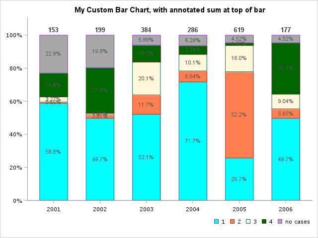
Here's how to create an annotate dataset suitable for use with sgplot. Hopefully I've understood the values you're wanting on the bar segments, and the value you wanted annotated at the top of each bar (... if not, it should be easy for you to modify).
proc sql noprint;
create table myanno as
select unique year, sum(number_of_cases) as year_sum
from mydat
group by year;
quit; run;

data myanno; set myanno;
length label $100 anchor x1space y1space textweight $50;
layer="front";
function="text"; textcolor="gray44"; textsize=10; textweight='bold';
width=100; widthunit='percent';
label=trim(left(put(year_sum,comma8.0)));
x1space='datavalue';
y1space='datapercent';
x1=year;
y1=100;
anchor='bottom';
run;

title "My Custom Bar Chart, with annotated sum at top of bar";
proc sgplot data=mydat dattrmap=myattrmap sganno=myanno pad=(bottom=5%) noborder;
vbarparm category=year  response=rel_freq /group=level groupdisplay=stack attrid=level
 seglabel seglabelattrs=(size=8pt color=gray55) seglabelformat=percentn7.2
 seglabelfitpolicy=none barwidth=0.6 missing;
xaxis grid type=discrete discreteorder=data;
xaxis display=(nolabel) valueattrs=(family="verdana" size=8pt) fitpolicy=rotate ValuesRotate=Vertical;
yaxis display=(nolabel) valueattrs=(family="verdana" size=8pt) offsetmax=.10;
keylegend / location=outside position=bottomright across=0 title="" valueattrs=(size=8pt family="verdana") outerpad=(top=0.2cm) noborder;
run;
- Mark as New
- Bookmark
- Subscribe
- Mute
- RSS Feed
- Permalink
- Report Inappropriate Content
1. Copy and paste the code you provided: It doesn't run.
2. You plot percentages (max value Y=1 ) and use YSYS=2 (data coordinates) but your annotate data has Y in the hundreds
- Mark as New
- Bookmark
- Subscribe
- Mute
- RSS Feed
- Permalink
- Report Inappropriate Content
- Mark as New
- Bookmark
- Subscribe
- Mute
- RSS Feed
- Permalink
- Report Inappropriate Content
>Is the max value allowed for Y=1?
Y displayed as 100% means Y=1 right?
So your chart displays Y values between 0 and 1. Now your annotate data specifies text to display at Y=300. How do you want this to happen?
@GraphGuy It seems out-of-plot annotate positions don't generate notes for SG like they do for SAS/Graph?
[Edit:
Looking at @GraphGuy 's code, I see that the SG annotate variables are different from the SAS/Graph ones.
Seemingly like the OP, I am an old SAS/Graph hand and didn't catch that.
Again, notes should be printed in the log when the annotate data is not usable though. They really should.]
- Mark as New
- Bookmark
- Subscribe
- Mute
- RSS Feed
- Permalink
- Report Inappropriate Content
- Mark as New
- Bookmark
- Subscribe
- Mute
- RSS Feed
- Permalink
- Report Inappropriate Content
Looks like you're trying to use the old SAS/Graph (gplot) style annotate dataset, with the new Base SAS (sgplot) graphics - that won't work. 🙂
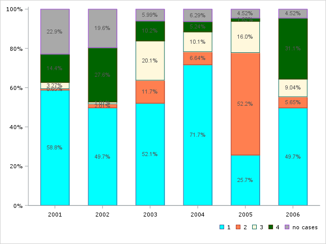
Here's a slightly cleaned-up version of your code, which might be a good starting place for you (or someone to help) add the sgplot-style annotate. (Does this graph look like you're wanting, so far?)
data mydat;
infile datalines;
input year	level $12.	number_of_cases;
datalines;
2001	1	        90
2001	2	        1
2001	3	        5
2001	4	        22
2001	no cases	35
2002	1	        99
2002	2	        4
2002	3	        2
2002	4	        55
2002	no cases	39
2003	1	        200
2003	2	        45
2003	3	        77
2003	4	        39
2003	no cases	23
2004	1	        205
2004	2	        19
2004	3	        29
2004	4	        15
2004	no cases	18
2005	1	        159
2005	2	        323
2005	3	        99
2005	4	        10
2005	no cases	28
2006	1	        88
2006	2	        10
2006	3	        16
2006	4	        55
2006	no cases	8
;
run;

proc sql noprint;
create table mydat as
select mydat.*,
sum(number_of_cases) as number_of_cases_sum
from mydat
group by year
order by year, level;
quit; run;

data mydat; set mydat;
format rel_freq percent7.0;
rel_freq=number_of_cases/number_of_cases_sum;
run;

data myattrmap;
	infile datalines;
	input id $6. value $10. fillcolor $8.;
	datalines;
level no cases  CXA9A9A9
level 1         CX00FFFF
level 2         CXFF7F50
level 3         CXFFF8DC
level 4         CX006400
;
run;

proc sgplot data=mydat dattrmap=myattrmap pad=(bottom=5%) noborder;
vbarparm category=year  response=rel_freq /group=level groupdisplay=stack attrid=level
 seglabel seglabelattrs=(size=8pt color=gray55) seglabelformat=percentn7.2
 seglabelfitpolicy=none barwidth=0.6 missing;
xaxis grid type=discrete discreteorder=data;
xaxis display=(nolabel) valueattrs=(family="verdana" size=8pt) fitpolicy=rotate ValuesRotate=Vertical;
yaxis display=(nolabel) valueattrs=(family="verdana" size=8pt);
keylegend / location=outside position=bottomright across=0 title="" valueattrs=(size=8pt family="verdana") outerpad=(top=0.2cm) noborder;
run; - Mark as New
- Bookmark
- Subscribe
- Mute
- RSS Feed
- Permalink
- Report Inappropriate Content
Since nobody jumped on this one, I'll go ahead and finish it...
Here's how to create an annotate dataset suitable for use with sgplot. Hopefully I've understood the values you're wanting on the bar segments, and the value you wanted annotated at the top of each bar (... if not, it should be easy for you to modify).
proc sql noprint;
create table myanno as
select unique year, sum(number_of_cases) as year_sum
from mydat
group by year;
quit; run;

data myanno; set myanno;
length label $100 anchor x1space y1space textweight $50;
layer="front";
function="text"; textcolor="gray44"; textsize=10; textweight='bold';
width=100; widthunit='percent';
label=trim(left(put(year_sum,comma8.0)));
x1space='datavalue';
y1space='datapercent';
x1=year;
y1=100;
anchor='bottom';
run;

title "My Custom Bar Chart, with annotated sum at top of bar";
proc sgplot data=mydat dattrmap=myattrmap sganno=myanno pad=(bottom=5%) noborder;
vbarparm category=year  response=rel_freq /group=level groupdisplay=stack attrid=level
 seglabel seglabelattrs=(size=8pt color=gray55) seglabelformat=percentn7.2
 seglabelfitpolicy=none barwidth=0.6 missing;
xaxis grid type=discrete discreteorder=data;
xaxis display=(nolabel) valueattrs=(family="verdana" size=8pt) fitpolicy=rotate ValuesRotate=Vertical;
yaxis display=(nolabel) valueattrs=(family="verdana" size=8pt) offsetmax=.10;
keylegend / location=outside position=bottomright across=0 title="" valueattrs=(size=8pt family="verdana") outerpad=(top=0.2cm) noborder;
run;
- Mark as New
- Bookmark
- Subscribe
- Mute
- RSS Feed
- Permalink
- Report Inappropriate Content
@GraphGuy: Great job Robert, that is exactly what I wanted. You have really helped me 😊
- Mark as New
- Bookmark
- Subscribe
- Mute
- RSS Feed
- Permalink
- Report Inappropriate Content
@GraphGuy Can you pass to the SG team the request to add notes in the log when the annotate data is not suitable, like SAS/Graph does?
Learn how use the CAT functions in SAS to join values from multiple variables into a single value.
Find more tutorials on the SAS Users YouTube channel.
SAS Training: Just a Click Away
Ready to level-up your skills? Choose your own adventure.


