- Home
- /
- Programming
- /
- Graphics
- /
- sgplot or sgrender
- RSS Feed
- Mark Topic as New
- Mark Topic as Read
- Float this Topic for Current User
- Bookmark
- Subscribe
- Mute
- Printer Friendly Page

- Mark as New
- Bookmark
- Subscribe
- Mute
- RSS Feed
- Permalink
- Report Inappropriate Content
Hi ,
I need a series plot with xaxis=subject and yaxis=risk with treatment groups a ,b and each subject has again different ht percentiles. so i need to plot 2nd percentile on the graph with red color(dotted pattern will be for trt=a and solid pattern for trt=b) and like wise 3rd percentile on graph with blue color(dotted pattern for trt=a, solid pattern for trt=b) and 4th percentile with orange color(dotted pattern for trt=a , solid pattern for trt=b). and i need to show legends as red=2nd percentile,blue=3rd percentile,orange=4th percentile,dotted line with no color as trt a, solid line with trt b.
so basically i need to show series plot of different percentile vs trt group.
SUBJ TRT RISK PERCENTILE
101 a 1.1 2nd percentile
101 a 1.2 3rd percentile
101 a 1.3 4th percentile
102 b 1.4 2nd percentile
102 b 1.3 3rd percentile
102 b 1.2 4th percentile
do i need to create 3 variable as var1,var2,var3 for 3 different percentiles because legends are not showing up
proc sgplot data=test;
series xaxis=subj yaxis=var1/ group=trt name='a';
series xaxis=subj yaxis=var2/ group=trt name='b';
series xaxis=subj yaxis=var3/ group=trt name='c';
keylegend 'a' 'b' 'c'
run;
above is sample code. keylegend just has short code.
even if i do this i am not able to create proper legend or do i need to create var1 to var6 (var1 to var3 for trt=a, var4 to var6 for trt=b) and then create colors to line and legend.
please advice?
thanks,
vk

- Mark as New
- Bookmark
- Subscribe
- Mute
- RSS Feed
- Permalink
- Report Inappropriate Content
Yes, you can do this using the LineColorGroup and LinePatternGroup options in the GTL SeriesPlot. You can plot risk by subject with group=percentile. However, your data is off a bit, you need trt to be same across a line. Here is the graph and code:
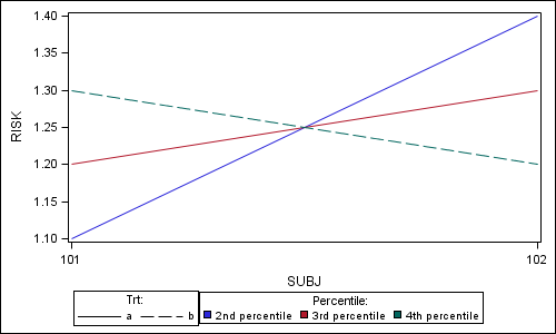
data values;
input SUBJ $ TRT $ RISK PERCENTILE $14-27;
datalines;
101 a 1.1 2nd percentile
101 a 1.2 3rd percentile
101 b 1.3 4th percentile
102 a 1.4 2nd percentile
102 a 1.3 3rd percentile
102 b 1.2 4th percentile
run;
proc template;
define statgraph PowerSeries;
begingraph;
layout lattice;
layout overlay;
seriesplot x=subj y=risk / group=percentile
linecolorgroup=percentile linepatterngroup=trt name='a';
endlayout;
sidebar / align=bottom spacefill=false;
layout gridded / columns=2;
discretelegend 'a' / title='Trt:' type=linepattern across=2;
discretelegend 'a' / title='Percentile:' type=linecolor across=3;
endlayout;
endsidebar;
endlayout;
endgraph;
end;
run;
ods listing;
ods graphics / reset width=5in height=3in imagename='PowerSeries';
proc sgrender data=values template=PowerSeries;
run;
- Mark as New
- Bookmark
- Subscribe
- Mute
- RSS Feed
- Permalink
- Report Inappropriate Content
Thanks sanjay. This is what i need.
.jpg")
Catch up on SAS Innovate 2026
Nearly 200 sessions are now available on demand in the Innovate Hub.
Watch Now →Learn how use the CAT functions in SAS to join values from multiple variables into a single value.

Find more tutorials on the SAS Users YouTube channel.
SAS Training: Just a Click Away
Ready to level-up your skills? Choose your own adventure.
-
2 replies
-
01-06-2013 11:21 PM
-
3397 views
-
0 likes
-
2 in conversation
-
