- Home
- /
- Programming
- /
- Graphics
- /
- Re: re: title inside graph
- RSS Feed
- Mark Topic as New
- Mark Topic as Read
- Float this Topic for Current User
- Bookmark
- Subscribe
- Mute
- Printer Friendly Page
- Mark as New
- Bookmark
- Subscribe
- Mute
- RSS Feed
- Permalink
- Report Inappropriate Content
Hi...I am new to using any of the graphing procedures and I am having difficulty getting the titles to appear inside the graph and having a legend included to distinguish different years for each month as the data contains 3 different years of Sales. Any help would be greatly appreciated....Thanks.
goptions reset=all border cback=white htitle=12pt ;
title 'Customer Sales';
title2 h=10pt 'Cost Per Customer - Monthly Average';
axis1 order=('Apr' 'May' 'Jun' 'Jul' 'Aug' 'Sep' 'Oct' 'Nov' 'Dec' 'Jan' 'Feb' 'Mar') label=(f="Arial/Bold" 'Month') offset=(5,5) width=1 ;
axis2 order=(600 to 1100 by 100) label=none major=(height=1.5) minor=(height=1) width=1;
legend1 label=(position=(bottom center));
proc gplot data=cost_per_customer;
bubble Total_Amount_Paid*Month1=num / haxis=axis1 vaxis=axis2 vminor=1 blabel bsize=12 bfill=solid bscale=area bcolor=bgr;
run;
quit;
Accepted Solutions
- Mark as New
- Bookmark
- Subscribe
- Mute
- RSS Feed
- Permalink
- Report Inappropriate Content
Instead of GPLOT, try SGPLOT as an alternative:
title 'Customer Sales';
title2 h=10pt 'Cost Per Customer - Monthly Average';
proc sgplot data=cost_per_customer;
xaxis values=('Apr' 'May' 'Jun' 'Jul' 'Aug' 'Sep' 'Oct' 'Nov' 'Dec' 'Jan' 'Feb' 'Mar') label='Month';
yaxis values=(600 to 1100 by 100) display=(nolabel) minor minorcount=1;
bubble y=Total_Amount_Paid x=Month1 size=num / group=year;
run;
quit;
- Mark as New
- Bookmark
- Subscribe
- Mute
- RSS Feed
- Permalink
- Report Inappropriate Content
Please upload a screenshot of your result/graph.
- Mark as New
- Bookmark
- Subscribe
- Mute
- RSS Feed
- Permalink
- Report Inappropriate Content
Hi...I included the output graph.
- Mark as New
- Bookmark
- Subscribe
- Mute
- RSS Feed
- Permalink
- Report Inappropriate Content
I have very little experience with graphics.
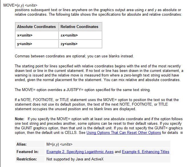
I understand that you want to move the titles into the graph frame.
Attached is a screenshot of MOVE= option (from SAS online doc.) that can be used with Tiltles, Footnotes and Notes.
Check if it helps.

- Mark as New
- Bookmark
- Subscribe
- Mute
- RSS Feed
- Permalink
- Report Inappropriate Content
It's not clear which ODS destination you're using, but trying specifying GTITLE on the destination statement to see if that make s a difference. AS for the grouping question, it is difficult to answer without knowing you data structure. Can you post your list of variables?
Thanks!
Dan.
- Mark as New
- Bookmark
- Subscribe
- Mute
- RSS Feed
- Permalink
- Report Inappropriate Content
Hi Dan.....the list of variables I have are:
Year
Total Amount Paid
Month1 ( name of month)
num ( Number of Customers)
I would like the bubbles for each month to represent the year that the bubble is associated with and to have the number of customers as bubble label included. Thanks.
- Mark as New
- Bookmark
- Subscribe
- Mute
- RSS Feed
- Permalink
- Report Inappropriate Content
Instead of GPLOT, try SGPLOT as an alternative:
title 'Customer Sales';
title2 h=10pt 'Cost Per Customer - Monthly Average';
proc sgplot data=cost_per_customer;
xaxis values=('Apr' 'May' 'Jun' 'Jul' 'Aug' 'Sep' 'Oct' 'Nov' 'Dec' 'Jan' 'Feb' 'Mar') label='Month';
yaxis values=(600 to 1100 by 100) display=(nolabel) minor minorcount=1;
bubble y=Total_Amount_Paid x=Month1 size=num / group=year;
run;
quit;
- Mark as New
- Bookmark
- Subscribe
- Mute
- RSS Feed
- Permalink
- Report Inappropriate Content
Thanks Dan...it worked perfectly!!!!
Catch up on SAS Innovate 2026
Nearly 200 sessions are now available on demand with the SAS Innovate Digital Pass.
Explore Now →Learn how use the CAT functions in SAS to join values from multiple variables into a single value.
Find more tutorials on the SAS Users YouTube channel.
SAS Training: Just a Click Away
Ready to level-up your skills? Choose your own adventure.


