- Home
- /
- Programming
- /
- Graphics
- /
- proc sgpanel y-axis with multiple scales
- RSS Feed
- Mark Topic as New
- Mark Topic as Read
- Float this Topic for Current User
- Bookmark
- Subscribe
- Mute
- Printer Friendly Page
- Mark as New
- Bookmark
- Subscribe
- Mute
- RSS Feed
- Permalink
- Report Inappropriate Content
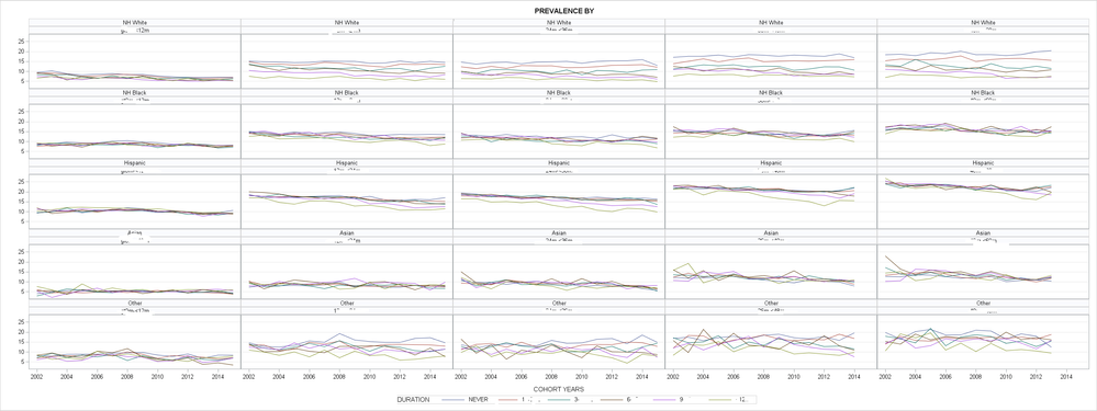
I'd like use multiple scales on y-axis using below max min values.
agecat1 max= 12 min=3; agecat2 max=20 min=6, agecat3 max=20 min=5 agecat4 max=24 min=8; agecat5 max=27, min=7.
Could you please help modify the code below for multiple scales?
proc sort data=data; by race agecat cat year; run;
ods graphics / height=2000 width=3000;
proc sgpanel data=data;
panelby race agecat/novarname onepanel LAYOUT=panel columns=5 ROWHEADERPOS=right COLHEADERPOS=bottom;
series y=rate x=year / group=cat lineattrs=(pattern=solid);
keylegend/title="legend title" position=bottom;
colaxis label='column title' fitpolicy=thin valuesformat=best4.0 values=(2002 to 2018 by 2);
rowaxis label='rowtitle' grid max=27.0;
title "title";
run;
using SAS 9.4.
- Mark as New
- Bookmark
- Subscribe
- Mute
- RSS Feed
- Permalink
- Report Inappropriate Content
It's a bit hard to understand your question; but if you're asking how to make the X axis have different scales, you can use the option on the PANELBY statement UNISCALE which lets you choose between having all column axes the same but row axes different, or all row axes the same and column axes different (this is what you want), or both the same.
- Mark as New
- Bookmark
- Subscribe
- Mute
- RSS Feed
- Permalink
- Report Inappropriate Content
- Mark as New
- Bookmark
- Subscribe
- Mute
- RSS Feed
- Permalink
- Report Inappropriate Content
- Mark as New
- Bookmark
- Subscribe
- Mute
- RSS Feed
- Permalink
- Report Inappropriate Content
Snoopy:
Do you know why I get error below?
4984 ods graphics / height=1500 width=4000;
4985 proc sgpanel data=r.all_cnt;
4986 panelby race ageyears/novarname onepanel LAYOUT=panel columns=5 ROWHEADERPOS=right
4986! COLHEADERPOS=bottom uniscale=row;
4987 series y=pr_obs x=year / group=bf lineattrs=(pattern=solid) uniscale=row;
--------
22
76
ERROR 22-322: Syntax error, expecting one of the following: ;, ATTRID, BREAK, CLUSTERWIDTH,
CURVELABEL, CURVELABELATTRS, CURVELABELPOS, DATALABEL, DATALABELATTRS,
DATALABELPOS, DISCRETEOFFSET, FILLEDOUTLINEDMARKERS, GROUP, GROUPDISPLAY,
GROUPORDER, LEGENDLABEL, LINEATTRS, MARKERATTRS, MARKERFILLATTRS,
MARKEROUTLINEATTRS, MARKERS, NAME, NOMISSINGGROUP, SMOOTHCONNECT, SPLITCHAR,
SPLITCHARNODROP, SPLITJUSTIFY, TIP, TIPFORMAT, TIPLABEL, TRANSPARENCY, URL.
ERROR 76-322: Syntax error, statement will be ignored.
4988 keylegend/title="BREASTFEEDING DURATION" position=bottom;
4989 format race race. ageyears ageyears. bf bf.;
4990 colaxis label='COHORT YEARS' fitpolicy=thin valuesformat=best4.0 values=(2002 to 2015 by 1);
4991 rowaxis label='PREVALENCE OF OBESITY' grid max=27.0;
4992 title "OBESITY PREVALENCE BY";
4993 run;
- Mark as New
- Bookmark
- Subscribe
- Mute
- RSS Feed
- Permalink
- Report Inappropriate Content
- Mark as New
- Bookmark
- Subscribe
- Mute
- RSS Feed
- Permalink
- Report Inappropriate Content
It works! Thanks
- Mark as New
- Bookmark
- Subscribe
- Mute
- RSS Feed
- Permalink
- Report Inappropriate Content
Don't you mean that you want different scales on your y-axes for different values of your ageat variable?
- Mark as New
- Bookmark
- Subscribe
- Mute
- RSS Feed
- Permalink
- Report Inappropriate Content
- Mark as New
- Bookmark
- Subscribe
- Mute
- RSS Feed
- Permalink
- Report Inappropriate Content
Ok. My first question is: why?
Usually you create a panel of graphs like this to be able to quickly compare characteristics of different group sin your data (in your example age and race). This comparability is worsened if you do not have the same values on your axes?
- Mark as New
- Bookmark
- Subscribe
- Mute
- RSS Feed
- Permalink
- Report Inappropriate Content
- Mark as New
- Bookmark
- Subscribe
- Mute
- RSS Feed
- Permalink
- Report Inappropriate Content
The reason to have a grid like this is to have the ability to compare left-to-right and up-to-down. So up and down makes sense: you have different races, and you want to be able to see the differences between asian and white or whatever. That's a good idea and makes perfect sense.
However, with the ages left to right, would you want to compare the newborns with the four year olds, by weight? I doubt it: you'd want to compare something *about* them, rather. So chart that. Or normalize your data, so instead of using actual weight/height, you normalize it to the 50th percentile for that age or something like that. But better I think would be to chart what you actually expect people to be looking at here, which I don't think is just the weight/height.
- Mark as New
- Bookmark
- Subscribe
- Mute
- RSS Feed
- Permalink
- Report Inappropriate Content
- Mark as New
- Bookmark
- Subscribe
- Mute
- RSS Feed
- Permalink
- Report Inappropriate Content
And this is why it's helpful to give complete information in your question.
If you're normalizing it to age percentile, then why do you want to adjust the row axes? I think you should not alter the row axes for the different ages if it's adjusted by percentile: your chart is, correctly, showing that different age ranges have a different prevalence of obesity.
- Mark as New
- Bookmark
- Subscribe
- Mute
- RSS Feed
- Permalink
- Report Inappropriate Content
Learn how use the CAT functions in SAS to join values from multiple variables into a single value.
Find more tutorials on the SAS Users YouTube channel.
SAS Training: Just a Click Away
Ready to level-up your skills? Choose your own adventure.


