- Home
- /
- Programming
- /
- Graphics
- /
- Re: proc sgpanel legend for group variable location=outside
- RSS Feed
- Mark Topic as New
- Mark Topic as Read
- Float this Topic for Current User
- Bookmark
- Subscribe
- Mute
- Printer Friendly Page
- Mark as New
- Bookmark
- Subscribe
- Mute
- RSS Feed
- Permalink
- Report Inappropriate Content
I have two major and few other minor problems in this plot. Major problems first. Each panel supposed to present line chart by 5 level of categorical variable, 'BF categories'. Instead these tangled lines appeared which doesn't make sense. I'd like to have each lines in each panel in different colors associated with a Legend outside the panel with information as below.
Any suggestions please? Attached is the summary data from a sampled data.
Legend:
red: 1-3 months
blue: 4-9 months
green: 10-12 months
brown: 13-24 months
et.c
PROC IMPORT DATAFILE= "...\plotdata.txt"
			OUT= B.plotdata
            DBMS=DLM REPLACE;
            GETNAMES=YES;
RUN;
proc sgpanel data=plotdata;
panelby race agegroup/ novarname onepanel LAYOUT=LATTICE columns=5 ROWHEADERPOS=right;
series y=pr_obs x=year/group=bf;
keylegend/  title="BF categories" position=bottom location=outside;
format race race. agegroup agegroup. year 4.0 bf bf.;
colaxis label='COHORT YEARS' fitpolicy=thin grid;
rowaxis label='PREVALENCE OF DISEASE' grid;
title 'PREVALENCE OF 'X' BY COHORT YEAR, AGE AND RACE';
run;
Accepted Solutions
- Mark as New
- Bookmark
- Subscribe
- Mute
- RSS Feed
- Permalink
- Report Inappropriate Content
It would look even worse with row headers on the outside. Perhaps the PANEL layout would be better for your graph.
ods graphics / height=1400 width=1200;
proc sgpanel data=plotdata;
panelby race agegroup/ novarname onepanel LAYOUT=Panel columns=5; - Mark as New
- Bookmark
- Subscribe
- Mute
- RSS Feed
- Permalink
- Report Inappropriate Content
What variable do you have that specifies those three groups you want. Don’t see anything relevant in the data.
- Mark as New
- Bookmark
- Subscribe
- Mute
- RSS Feed
- Permalink
- Report Inappropriate Content
- Mark as New
- Bookmark
- Subscribe
- Mute
- RSS Feed
- Permalink
- Report Inappropriate Content
I fixed a few minor problems in this version
PROC IMPORT DATAFILE= "&sasforum\datasets\plotdata.txt"
			OUT= plotdata
            DBMS=DLM REPLACE;
            GETNAMES=YES;
RUN;

proc sort data=plotdata; by race agegroup bf year; run;

ods graphics / height=1200 width=1200;
proc sgpanel data=plotdata;
panelby race agegroup/ novarname onepanel LAYOUT=LATTICE ROWHEADERPOS=right;
series y=pr_obs x=year / group=bf lineattrs=(pattern=solid);
keylegend/  title="BF categories" position=bottom;
*format race race. agegroup agegroup. year 4.0 bf bf.;
colaxis label='COHORT YEARS' fitpolicy=thin valuesformat=best4.0;
rowaxis label='PREVALENCE OF DISEASE';
title "PREVALENCE OF 'X' BY COHORT YEAR, AGE AND RACE";
run;
- Mark as New
- Bookmark
- Subscribe
- Mute
- RSS Feed
- Permalink
- Report Inappropriate Content
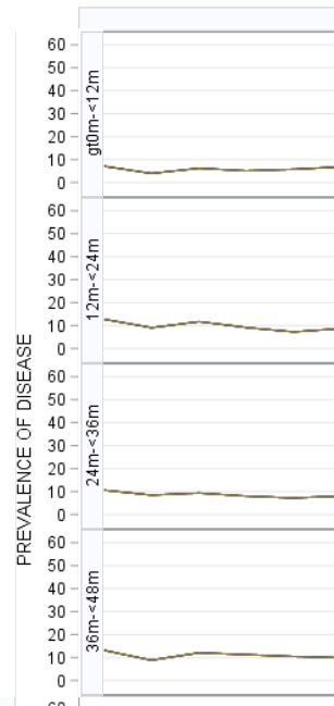
Great!!! Thanks Pgstat and Reeza. Below is the code with your inputs reflected. One last thing, because chart is getting large in size, I'd like to have ROWHEADERPOS=both COLHEADERPOS=both options for easire eyeballing. Currently, row and col headers I guess are interfered by axis titles at left and bottom. Is there anyway to have row/col headers stick to the body of the chart? not split by axis titles? Like in the image?
proc sort data=b.plotdata; by race agegroup bf year; run;
ods graphics / height=1200 width=4000;
proc sgpanel data=plotdata1;
panelby race agegroup/ novarname onepanel LAYOUT=LATTICE ROWHEADERPOS=both COLHEADERPOS=both;
series y=pr_obs x=year / group=bf lineattrs=(pattern=solid);
keylegend/ title="Categories" position=bottom;
*format race race. agegroup agegroup. bf bf.;
colaxis label='YEARS' fitpolicy=thin valuesformat=best4.0 values=(2002 to 2015 by 1);
rowaxis label='PREVALENCE OF DISEASE' grid;
title "TITLE";
run;
- Mark as New
- Bookmark
- Subscribe
- Mute
- RSS Feed
- Permalink
- Report Inappropriate Content
It would look even worse with row headers on the outside. Perhaps the PANEL layout would be better for your graph.
ods graphics / height=1400 width=1200;
proc sgpanel data=plotdata;
panelby race agegroup/ novarname onepanel LAYOUT=Panel columns=5; Catch up on SAS Innovate 2026
Nearly 200 sessions are now available on demand with the SAS Innovate Digital Pass.
Explore Now →Learn how use the CAT functions in SAS to join values from multiple variables into a single value.
Find more tutorials on the SAS Users YouTube channel.
SAS Training: Just a Click Away
Ready to level-up your skills? Choose your own adventure.


