- Home
- /
- Programming
- /
- Graphics
- /
- proc boxplot legend
- RSS Feed
- Mark Topic as New
- Mark Topic as Read
- Float this Topic for Current User
- Bookmark
- Subscribe
- Mute
- Printer Friendly Page

- Mark as New
- Bookmark
- Subscribe
- Mute
- RSS Feed
- Permalink
- Report Inappropriate Content
Hi,
I am creating a boxplot comparing 2 Trt arms, side by side, on different visits.
I am differentiating two arms by different colors. Now I want to create a legend to specify which color is for which arm. How can I do that?
I am not using overlay statement in proc boxplot.
I have four visits for TRT 1 . And same four visits for TRT 2. Visits are on xaxis I am creating 8 different values for visits in two TRT arms, 4 for each.
And then plotting these 8 values on xaxis , and then differing the TRT arms using cboxfill.
I have attached the graph for your reference.
Any help would be really appreciated.
Thanks
Accepted Solutions

- Mark as New
- Bookmark
- Subscribe
- Mute
- RSS Feed
- Permalink
- Report Inappropriate Content
Hi.
If you don't use SAS 9.2 or higher, most likely you'll have to use the annotate to add the legend.
Here is an example - using the sashelp.class;
*create the group color;
data temp;
set sashelp.class;
if sex = "F" then color="green";
if sex = "M" then color = "gray";
run;
goptions reset = all;
; Create the Annotate data set ;
data anno;
length function color $ 8 text $ 25 style $ 25;
xsys='3'; ysys='3';
/* Draw the first square */
color='green';
function='move'; x=80; y=82; output;
function='bar'; x=82; y=80; style='solid'; output;
/* Label the first square */
function='label'; x=83; y=81; position='6';
style="'Albany AMT/bold'"; size=1; text='Female'; output;
/* Draw the second square */
color='gray'; style='solid';
function='move'; x=80; y=78; output;
function='bar'; x=82; y=76; style='solid'; output;
/* Label the first square */
function='label'; x=83; y=77; position='6';
style="'Albany AMT/bold'"; ; size=1; text='Male'; output;
run;
proc sort data = temp;by sex;run;
proc format;
value $ gender "M" = "Male" "F" = "Female";quit;
goptions reset = all;
proc boxplot data = temp anno = anno;
plot age*sex/boxstyle = schematic cboxfill = (color);
format sex $gender.;
run;quit;
Best of luck!
Anca.


- Mark as New
- Bookmark
- Subscribe
- Mute
- RSS Feed
- Permalink
- Report Inappropriate Content
Can you attach the full program including data? Which release of SAS are you using?
- Mark as New
- Bookmark
- Subscribe
- Mute
- RSS Feed
- Permalink
- Report Inappropriate Content
Hi.
If you don't use SAS 9.2 or higher, most likely you'll have to use the annotate to add the legend.
Here is an example - using the sashelp.class;
*create the group color;
data temp;
set sashelp.class;
if sex = "F" then color="green";
if sex = "M" then color = "gray";
run;
goptions reset = all;
; Create the Annotate data set ;
data anno;
length function color $ 8 text $ 25 style $ 25;
xsys='3'; ysys='3';
/* Draw the first square */
color='green';
function='move'; x=80; y=82; output;
function='bar'; x=82; y=80; style='solid'; output;
/* Label the first square */
function='label'; x=83; y=81; position='6';
style="'Albany AMT/bold'"; size=1; text='Female'; output;
/* Draw the second square */
color='gray'; style='solid';
function='move'; x=80; y=78; output;
function='bar'; x=82; y=76; style='solid'; output;
/* Label the first square */
function='label'; x=83; y=77; position='6';
style="'Albany AMT/bold'"; ; size=1; text='Male'; output;
run;
proc sort data = temp;by sex;run;
proc format;
value $ gender "M" = "Male" "F" = "Female";quit;
goptions reset = all;
proc boxplot data = temp anno = anno;
plot age*sex/boxstyle = schematic cboxfill = (color);
format sex $gender.;
run;quit;
Best of luck!
Anca.
- Mark as New
- Bookmark
- Subscribe
- Mute
- RSS Feed
- Permalink
- Report Inappropriate Content
Thanks . Finally I am using annotation. I wish SAS would have some defined functionality to do this. BTW I am using SAS 9.2
- Mark as New
- Bookmark
- Subscribe
- Mute
- RSS Feed
- Permalink
- Report Inappropriate Content
With SAS 9.2M3, you can do this using GTL.
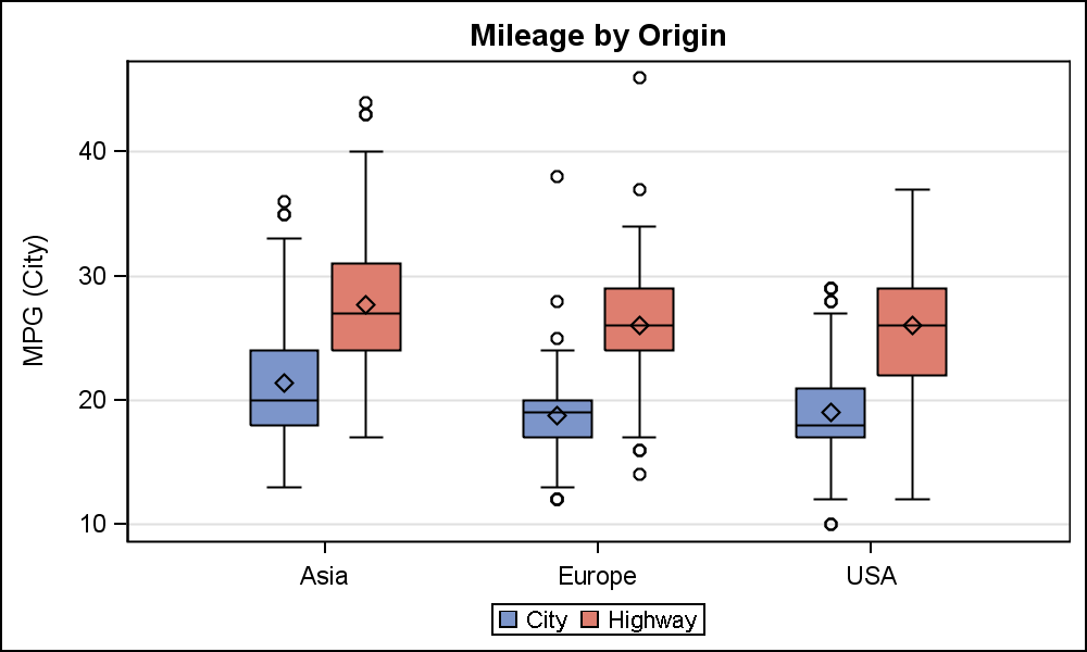
proc template;
define statgraph cars;
begingraph;
entrytitle 'Mileage by Origin';
layout overlay / xaxisopts=(display=(ticks tickvalues))
yaxisopts=(griddisplay=on) cycleattrs=true;
boxplot x=origin y=mpg_city / discreteoffset=-0.15 boxwidth=0.25
name='c' legendlabel='City';
boxplot x=origin y=mpg_highway / discreteoffset= 0.15 boxwidth=0.25
name='h' legendlabel='Highway';
discretelegend 'c' 'h';
endlayout;
endgraph;
end;
run;
proc sgrender data=sashelp.cars(where=(type ne 'Hybrid')) template=cars;
run;
- Mark as New
- Bookmark
- Subscribe
- Mute
- RSS Feed
- Permalink
- Report Inappropriate Content
Thanks Sanjay. Actually I was creating multiple graphs n same page. So I am not sure if I could have used it. For now, I have used annotation. Will explore this too for sure.
Thanks!
.jpg")
Catch up on SAS Innovate 2026
Nearly 200 sessions are now available on demand in the Innovate Hub.
Watch Now →Learn how use the CAT functions in SAS to join values from multiple variables into a single value.

Find more tutorials on the SAS Users YouTube channel.
SAS Training: Just a Click Away
Ready to level-up your skills? Choose your own adventure.
-
5 replies
-
01-22-2013 02:53 PM
-
10437 views
-
1 like
-
3 in conversation
-
