- Home
- /
- Programming
- /
- Graphics
- /
- need help creating a customised bar chat?
- RSS Feed
- Mark Topic as New
- Mark Topic as Read
- Float this Topic for Current User
- Bookmark
- Subscribe
- Mute
- Printer Friendly Page
- Mark as New
- Bookmark
- Subscribe
- Mute
- RSS Feed
- Permalink
- Report Inappropriate Content
How to and choose to add the color of my choice to the bar charts created using the sg plot procedure. Also, how to display the count figures and the same in percentages on top of each bars(outside on top of the bar) as a representation. For example, (2378, 44%) is a kind of representation that I am used to creating in excel on top of each of the bar charts. Can the same be done using sas graph ods graphics.
The code i am using creates simple bar charts that needs to be tweaked. Please advice
proc sgplot data=sample;
 vbar city /response=profit datalabel;
run;
Accepted Solutions
- Mark as New
- Bookmark
- Subscribe
- Mute
- RSS Feed
- Permalink
- Report Inappropriate Content
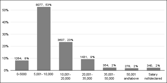
Here's one way to create the bar chart you attached, using SAS/Graph gchart ...
data my_data;
input customer_count salary_range $ 6-80;
bar_order+1;
datalines;
1264 0-5000
8077 5,001-10,000
3607 10,001-20,000
1431 20,001-35,000
354 35,001-50,000
278 50,001 and\above
340 Salary not\declared
;
run;
proc sql;
select sum(customer_count) into :total from my_data;
quit; run;
data my_data; set my_data;
percent_customers=customer_count/&total;
run;
data anno_labels; set my_data;
xsys='2'; ysys='2'; hsys='3'; when='a';
x=bar_order; y=percent_customers;
function='label'; position='2';
text=trim(left(put(customer_count,comma8.0)))||', '||trim(left(put(percent_customers,percentn7.1)));
run;
/* Create a user-defined-format to print the numeric bar_order as the salary_range */
proc sql noprint;
create table foo as select unique bar_order as start, salary_range as label from my_data;
quit; run;
data control; set foo;
fmtname = 'barfmt';
type = 'N';
end = START;
run;
proc format lib=work cntlin=control;
run;
axis1 label=none style=0 major=none minor=none;
axis2 label=none split='\';
pattern1 v=s c=gray88;
goptions htext=2.0 pct;
proc gchart data=my_data anno=anno_labels;
format percent_customers percentn6.0;
format bar_order barfmt.;
vbar bar_order / discrete type=sum sumvar=percent_customers
raxis=axis1 maxis=axis2 noframe coutline=gray44;
run;
- Mark as New
- Bookmark
- Subscribe
- Mute
- RSS Feed
- Permalink
- Report Inappropriate Content
datalabel=label_variable
Setting a color choice is more difficult than it seems.
Here's an example from the SAS docs. Some of these options may only be valid in SAS 9.4.
http://support.sas.com/documentation/cdl/en/grstatproc/67909/HTML/default/viewer.htm#p18q268a3zxcl3n...
- Mark as New
- Bookmark
- Subscribe
- Mute
- RSS Feed
- Permalink
- Report Inappropriate Content
Hi ,

Here you go, However i did not get how to show both numer and % .Hope this some what helps

proc sgplot data=newdata ;
 vbar city /response = profit  datalabel BARWIDTH = 0.2
 fillattrs=(COLOR=RED)  STAT=percent;
run;
- Mark as New
- Bookmark
- Subscribe
- Mute
- RSS Feed
- Permalink
- Report Inappropriate Content
Setting bar color for a non-grouped bar chart is very easy as shown by "Pearsoninst". Use DATALABEL option to either show the response value, or DATALABEL=column to display the value from another column (say Label). Note, if there are more than one observations per category, I believe the first value is shown. You can generate a Label colum that includes the information you want to show. If the Label column type is character, the label can be split on white space.
If your graph has a GROUP role, the groups are colored by their order in the data using GraphData1 - 12 colors defined in the style. You can use the STYLEATTS statement to change the list of colors.
- Mark as New
- Bookmark
- Subscribe
- Mute
- RSS Feed
- Permalink
- Report Inappropriate Content
@Jay54 Thank you, I have understood how to fill the color of my choice. However, my need is also to get the frequency statistics and percentages in the same graph report.
What I mean is like inside= statistic and outside=statistics in the vbar. I'd prefer to represent frequency outside on top on the bars and the percentages inside the bars.
For example, let's say i have a data set
city custumer_Count
LA 35
New york 49
Dallas 29
I want the customer_count figues in the dataset to be represented on top of the graphs(outside) and it's percentages inside the graph. Can yor or anybody reading this thread help?
- Mark as New
- Bookmark
- Subscribe
- Mute
- RSS Feed
- Permalink
- Report Inappropriate Content
What version of SAS are you using?
- Mark as New
- Bookmark
- Subscribe
- Mute
- RSS Feed
- Permalink
- Report Inappropriate Content
- Mark as New
- Bookmark
- Subscribe
- Mute
- RSS Feed
- Permalink
- Report Inappropriate Content
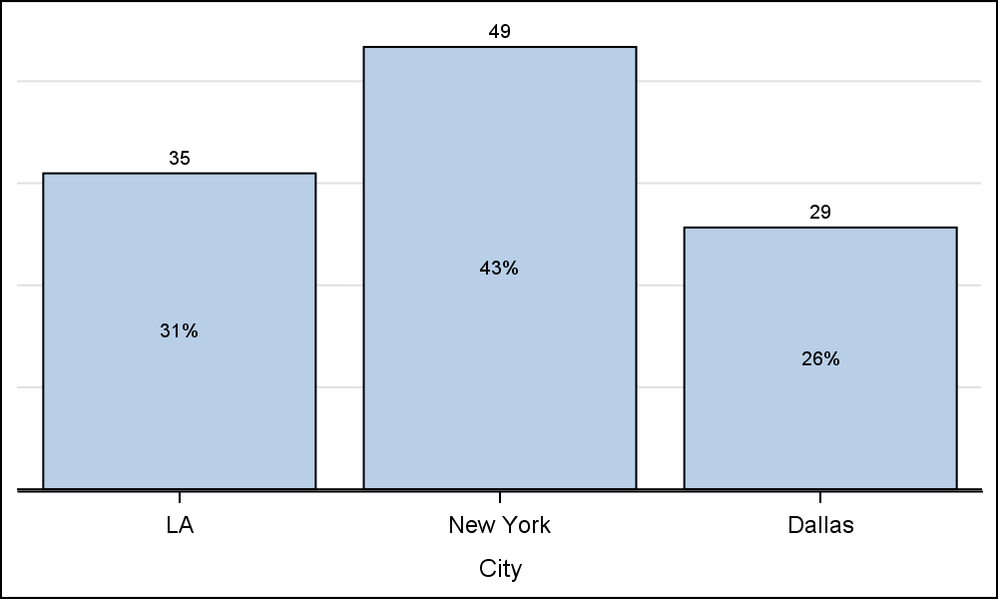
With SAS 9.4 you can use SEGLABEL to draw values in the bar and DATALABEL to draw values above the bar. Or you can use AXISTABLE. Compute the percent values as a new column.
proc sgplot data=customer2 nowall noborder;
vbarparm category=city response=percent / datalabel=count seglabel;
yaxis display=none grid;
run;
- Mark as New
- Bookmark
- Subscribe
- Mute
- RSS Feed
- Permalink
- Report Inappropriate Content
With VBARPARM (without stacked groups), you can still use the SCATTER plot with MARKERCHAR to overlay the segment values in the middle of the bar.
- Mark as New
- Bookmark
- Subscribe
- Mute
- RSS Feed
- Permalink
- Report Inappropriate Content
@Jay54 and @DanH_sasThank you for your responses. I'm afraid the VBARPARM doesn't seem to be functional in my SAS enterprise guide 5.1. I researched quite a bit on SAS online documentation, and I found proc ghcart is the only one that comes close to my requirement with inside= and outside=statistics to display the frequency and percentages in the vertical bars.
Although, i am close i am stuck in reshaping the bar sizes coz when bar is too small, it misses to display the percentages inside. Also, I am unable to find out ways to remove the default frequency label on the left side of the y axis. The names of the category variable is veritcally displayed while it should actually be diagonal.
Any further suggestions plz
- Mark as New
- Bookmark
- Subscribe
- Mute
- RSS Feed
- Permalink
- Report Inappropriate Content
Please attach a picture of what you want and sample data.
- Mark as New
- Bookmark
- Subscribe
- Mute
- RSS Feed
- Permalink
- Report Inappropriate Content
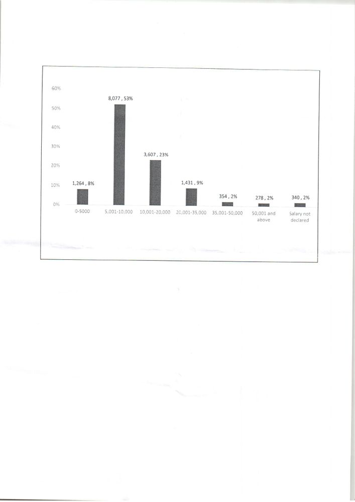
Thank you @Jay54 I appreciate your response. I have attached a pic of the excel graph that I would like.
The sample data is as follows:(Salary_range is a character variable and Customer count is numeric and there are no duplicates whatsoever and the attached graph is merely a representation in numbers as percentages and as simple as it looks in excel and I have been struggling to achieve the same in SAS. Please help if you can. Thanks once again
| Salary_range | Customer_count |
| 0-5000 | 1264 |
| 5001-10000 | 8077 |
| 10001-20000 | 3607 |
| 20001-35000 | 1431 |
| 35001-50000 | 354 |
| 50001 and above | 278 |
| Salary not declared | 340 |
- Mark as New
- Bookmark
- Subscribe
- Mute
- RSS Feed
- Permalink
- Report Inappropriate Content
Here's one way to create the bar chart you attached, using SAS/Graph gchart ...
data my_data;
input customer_count salary_range $ 6-80;
bar_order+1;
datalines;
1264 0-5000
8077 5,001-10,000
3607 10,001-20,000
1431 20,001-35,000
354 35,001-50,000
278 50,001 and\above
340 Salary not\declared
;
run;
proc sql;
select sum(customer_count) into :total from my_data;
quit; run;
data my_data; set my_data;
percent_customers=customer_count/&total;
run;
data anno_labels; set my_data;
xsys='2'; ysys='2'; hsys='3'; when='a';
x=bar_order; y=percent_customers;
function='label'; position='2';
text=trim(left(put(customer_count,comma8.0)))||', '||trim(left(put(percent_customers,percentn7.1)));
run;
/* Create a user-defined-format to print the numeric bar_order as the salary_range */
proc sql noprint;
create table foo as select unique bar_order as start, salary_range as label from my_data;
quit; run;
data control; set foo;
fmtname = 'barfmt';
type = 'N';
end = START;
run;
proc format lib=work cntlin=control;
run;
axis1 label=none style=0 major=none minor=none;
axis2 label=none split='\';
pattern1 v=s c=gray88;
goptions htext=2.0 pct;
proc gchart data=my_data anno=anno_labels;
format percent_customers percentn6.0;
format bar_order barfmt.;
vbar bar_order / discrete type=sum sumvar=percent_customers
raxis=axis1 maxis=axis2 noframe coutline=gray44;
run;

- Mark as New
- Bookmark
- Subscribe
- Mute
- RSS Feed
- Permalink
- Report Inappropriate Content
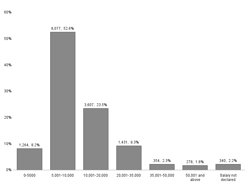
And if you are a SAS 9.4 SGPLOT user, here is the code you need. I used Robert code with some modifications. Thanks, Robert.
Note the "space" after the "-" in the salary_range values used as the split character.
data my_data;
input customer_count salary_range $ 6-80;
bar_order+1;
datalines;
1264 0-5000
8077 5,001- 10,000
3607 10,001- 20,000
1431 20,001- 35,000
354 35,001- 50,000
278 50,001 and\above
340 Salary not\declared
;
run;
proc sql;
select sum(customer_count) into :total from my_data;
quit; run;
data my_data; set my_data;
format percent_customers percent5.0;
percent_customers=customer_count/&total;
label=put(customer_count, 4.0) || ', ' || put(percent_customers, percent5.0);
run;
proc sgplot data=my_data nowall noborder;
vbarparm category=salary_range response=percent_customers / datalabelattrs=(size=8)
barwidth=0.6 datalabel=label fillattrs=(color=gray) nooutline;
xaxis display=(nolabel noline noticks);
yaxis display=(nolabel noline noticks) grid;
run;
- Mark as New
- Bookmark
- Subscribe
- Mute
- RSS Feed
- Permalink
- Report Inappropriate Content
@GraphGuy you are a star!, how did you gain this level of expertise and how long did it take? simple awesome!!!!!!!!!!!!!!!!!!!! Thank you so much
Catch up on SAS Innovate 2026
Dive into keynotes, announcements and breakthroughs on demand.
Explore Now →Learn how use the CAT functions in SAS to join values from multiple variables into a single value.
Find more tutorials on the SAS Users YouTube channel.
SAS Training: Just a Click Away
Ready to level-up your skills? Choose your own adventure.


