- Home
- /
- Programming
- /
- Graphics
- /
- how to do a dot plot for paired samples
- RSS Feed
- Mark Topic as New
- Mark Topic as Read
- Float this Topic for Current User
- Bookmark
- Subscribe
- Mute
- Printer Friendly Page
- Mark as New
- Bookmark
- Subscribe
- Mute
- RSS Feed
- Permalink
- Report Inappropriate Content
Hi,
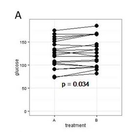
How do I do a plot that looks like this?
Any sample code would be highly appreciated.
Many thanks in advance.
YiFan
simple dot plot with connecting lines for paired samples:
Accepted Solutions
- Mark as New
- Bookmark
- Subscribe
- Mute
- RSS Feed
- Permalink
- Report Inappropriate Content
If you have a variable which identifies each pair then something like
proc sgplot data=have noautolegend nocycleattrs;
series x=treatment y=glucose / group=Pairidvariable markers Markerattrs= (symbol=CircleFilled)
;
run;
- Mark as New
- Bookmark
- Subscribe
- Mute
- RSS Feed
- Permalink
- Report Inappropriate Content
- Mark as New
- Bookmark
- Subscribe
- Mute
- RSS Feed
- Permalink
- Report Inappropriate Content
Here's one way using SGPLOT. The key thing is to get your data in the right format.
data have;
call streaminit(20);

do i=1 to 10;
glucose=rand('normal', 120, 10); A=10; output;
glucose=rand('normal', 120, 10); A=30;
output;
end;
run;

proc sgplot data=have;
series x=A y=glucose/group=i markers MARKERATTRS=(Symbol=circlefilled);
xaxis values=(0 to 40 by 10);
run;- Mark as New
- Bookmark
- Subscribe
- Mute
- RSS Feed
- Permalink
- Report Inappropriate Content
tyvm 🙂
Catch up on SAS Innovate 2026
Nearly 200 sessions are now available on demand with the SAS Innovate Digital Pass.
Explore Now →Learn how use the CAT functions in SAS to join values from multiple variables into a single value.
Find more tutorials on the SAS Users YouTube channel.
SAS Training: Just a Click Away
Ready to level-up your skills? Choose your own adventure.


