- Home
- /
- Programming
- /
- Code examples
- /
- Plotting Time Series Data
- RSS Feed
- Bookmark
- Subscribe
- Printer Friendly Page
- Report Inappropriate Content
Plotting Time Series Data
- Article History
- RSS Feed
- Bookmark
- Subscribe
- Printer Friendly Page
- Report Inappropriate Content
Overview
Graphic visualization of time series variables is helpful in identifying and interpreting relationships in data. High resolution color graphics plots convey the information quickly and concisely. This example makes use of the ODS graphics for PROC ARIMA and compares them to the graphics produced using the GPLOT procedure. The user will be able to plot forecasts and the associated 95% confidence band for an intervention model of driver casualties (deaths and serious injuries) in road accidents in Great Britain. The intervention variable is the passage of a mandatory seatbelt law in January, 1983.
Analysis
In January 1983, the British government passed a mandatory seatbelt law in order to reduce the number of casualties in road accidents. Seatbelt laws are often controversial. Opponents sometimes claim that they do not significantly reduce the number of casualties. A graphical analysis of the forecasted values and the upper and lower 95% confidence limits from an intervention model gives us valuable insights into the impact of the legislation. The driver casualties are taken from Harvey (1989). The INJURIES variable contains the number of deaths and serious injuries to car drivers on roads in Great Britain from January 1980 to December 1984. Twelve missing values are added to the end of the data set for use in the example. In January 1983, a mandatory seatbelt law took effect. The BELTLAW variable takes on the value 0 before January 1, 1983, and a value of 1 thereafter.
   data drivers;
      format date monyy.;
      input date:monyy5. injuries @@;
      beltlaw = (date ge '01jan83'd);
      datalines;
   jan80  1665  feb80  1361  mar80  1506  apr80  1360
   may80  1453  jun80  1522  jul80  1460  aug80  1552
   sep80  1548  oct80  1827  nov80  1737  dec80  1941
   jan81  1474  feb81  1458  mar81  1542  apr81  1404

   ... more lines ...

   sep84  1444  oct84  1575  nov84  1737  dec84  1763
   jan85  .     feb85  .     mar85  .     apr85  .
   may85  .     jun85  .     jul85  .     aug85  .
   sep85  .     oct85  .     nov85  .     dec85  .
   ;
   run;
The intervention model is estimated with the ARIMA procedure. Briefly, the procedure uses the input data set DRIVERS. The I statement identifies the variable INJURIES, the E statement estimates the ARIMA model specified, and the F statement outputs monthly forecasts to the output data set, FORE2. For a more thorough analysis of the intricacies of working with ARIMA models, see forecasting a Seasonal ARMA Process.
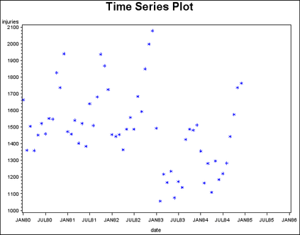
Before the introduction of ODS graphics, the GPLOT procedure had been used on many different levels. Simple plots can be produced with ease; for instance, the time series plot in Figure 1.1 of the variable INJURIES can be produced with the following statement:
 proc gplot data=drivers;
      plot injuries*date=1;
      symbol1 v=star c=blue;
      title "Time Series Plot";
   run;
   quit;
   title;

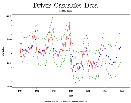
In the past, to achieve professional quality graphics, you would have run the ARIMA procedure, saved the output into a DATA set, and used the output in the GPLOT procedure. This would have required some formatting to achieve professional quality graphics. The following code produces the forecast plot in Figure 1.2 using the ARIMA and GPLOT procedures.
   proc arima data=drivers;
      i var=injuries crosscorr=beltlaw noprint;
      e input=beltlaw p=(1)(2 12);
      f lead=12 out=fore2 id=date interval=month;
   run;
   quit;
goptions cback=white ctitle=bl ctext=bl ftitle=centx
ftext=centx reset=(axis symbol);
proc gplot data=fore2;
format date year4.;
plot injuries*date=1
forecast*date=2
l95*date =3
u95*date =3 / overlay
haxis=axis1
vaxis=axis2
vminor=4
href='01jan83'd
lh=2;
title 'Driver Casualties Data';
title2 'Monthly Totals';
axis1 offset=(1 cm) label=('Year')
order=('01jan80'd to '01jan86'd by year);
axis2 label=(angle=90 'Casualties')
order=(750 to 2250 by 500);
symbol1 i=join l=1 c=red;
symbol2 h=2 pct v=star c=blue;
symbol3 l=20 i=join c=green;
footnote1 c=r f=centx ' --- Actual'
c=b f=centx ' * Forecast'
c=g f=centx ' --- U95/L95';
run;
quit;
title;
footnote;
It is always good form to specify the formating options for your graph in the GOPTIONS statement. The CBACK= option sets the color of the background, while the CTITLE= and CTEXT= options enable you to choose a font from among the many supported by SAS/GRAPH software for the title and text. In this example, the CENTX (Century Expanded) font is used for both the title and text. The RESET= option resets the title and the text.
The axes can be formatted using the AXISn definitions. The OFFSET= option specifies the amount of space to offset the first and last major tick marks from the origin and end of the axis. The LABEL= option enables you to label each axis in the graph. The ANGLE=90 option in the AXIS2 statement rotates the label 90 degrees. The ORDER= option specifies the data values in the order in which they are to appear on the axis.
The SYMBOL definitions are used to specify the shape (V= option), as well as the size (H= ) and color (C= ), of the plot symbols used to mark the data points. The I= option enables you to interpolate between data points by a number of methods. The type of line used is specified with the L= option. A value of L=1 corresponds to a solid line, while L=20 is a dashed line.
Footnotes can be used to provide additional information. In this example, a footnote is used to add a legend to the plot.
The GPLOT procedure uses the input data set FORE2. The OVERLAY option in the PLOT statement plots the time series INJURIES, FORECAST, L95, and U95 on the same graph using the symbols indicated. The HAXIS and VAXIS options specify the horizontal and vertical axes to be used in the plot. The VMINOR=4 option places four minor tick marks between each major tick mark on the vertical axis. The HREF= option draws a horizontal reference line at January 1, 1986, the date the mandatory seatbelt law took effect, and the LH= option specifies the line type.
With the introduction of ODS Graphics, the user need only turn on the graphics feature to have several standard graphics displayed. The statement ODS GRAPHICS ON; needs to be specified to enable this feature. In Table 1.1 , you can see an overview of the different graphs that are produced from the different ARIMA statements. More information about the ODS graphics in PROC ARIMA can be found in the SAS/ETS User's Guide, Version 9.2.
|
Associated Statement |
Plot Description |
|
FORECAST |
Forecast Plot |
|
ESTIMATE |
Residual Autocorrelation Plot |
|
ESTIMATE |
Residual Inverse Autocorrelation Plot |
|
ESTIMATE |
Residual Partial Autocorrelation Plot |
|
ESTIMATE |
Residual White Noise Probability Plot |
|
ESTIMATE |
Residual Histogram |
|
ESTIMATE |
Residual Normal Q-Q Plot |
|
ESTIMATE |
Residual Partial Autocorrelation Plot |
|
IDENTIFY |
Series Autocorrelation Plot |
|
IDENTIFY |
Series Inverse Autocorrelation Plot |
|
IDENTIFY |
Series Partial Autocorrelation Plot |
|
IDENTIFY |
Trend Analysis Plot |
|
IDENTIFY |
Cross Correlation Plot |
For better control of graphics, you can also specify global plot option ONLY in the PLOTS= option in the PROC ARIMA statement. This suppresses generation of default plots and produces plots specified in the subsequent FORECAST or any other plot options.
For example, specific plot requests are given by specifying a statement as follows:
PLOTS(ONLY)=(SERIES(CORR CROSSCORR) RESIDUAL(NORMAL SMOOTH))The SERIES(CORR CROSSCORR) option produces a panel of plots that are useful for the trend and correlation analysis of the series and cross-correlation plots respectively. The RESIDUAL(NORMAL SMOOTH) option produces the histogram and Q-Q plot with the NORMAL option and a scatter plot overlaid with a smooth fit with the SMOOTH option.
You can suppress the generation of all plots by using the PLOTS=NONE option. To produce all plots relevant for a particular analysis, use the PLOTS=ALL option. For more details about the various options available with ODS graphics, see SAS/ETS User's Guide, Version 9.2.
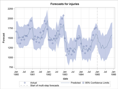
You will need to turn on the ODS graphics as shown below. The following code produces the ODS Forecast Plot in Figure 1.3. The PLOTS(ONLY)= FORECAST(FORECAST) option produces a plot that shows the one-step ahead forecasts as well as the multi-step ahead forecasts.
   ods graphics on;
   proc arima data=drivers plots(only)=(forecast(forecast));
      i var=injuries crosscorr=beltlaw;
      e input=beltlaw p=(1)(2 12);
      f lead=12 out=fore2 id=date interval=month;
   run;
   quit;
From the graphs, it appears that the passage of the seatbelt law caused a significant decrease in the number of road casualties.
References
-
Harvey, A.C. (1989), Forecasting, Structural Time Series Models and the Kalman Filter, Cambridge: Cambridge University Press.
-
SAS Institute Inc. (1996), Forecasting Examples for Business and Economics Using the SAS System, Cary, NC: SAS Institute Inc.
-
SAS Institute Inc. (1993), SAS/ETS User’s Guide, Version 6, Second Edition, Cary, NC: SAS Institute Inc.
-
SAS Institute Inc. (2008), SAS/ETS User’s Guide, Version 9.2, Second Edition, Cary, NC: SAS Institute Inc.
-
SAS Institute Inc. (1990), SAS/GRAPH Software: Reference, Version 6, First Edition, Volume 2, Cary, NC: SAS Institute Inc.
-
SAS Institute Inc. (2004), SAS/GRAPH Software: Reference, Version 9, Cary, NC: SAS Institute Inc.
Catch up on SAS Innovate 2026
Dive into keynotes, announcements and breakthroughs on demand.
Explore Now →SAS Training: Just a Click Away
Ready to level-up your skills? Choose your own adventure.

