Turn on suggestions
Auto-suggest helps you quickly narrow down your search results by suggesting possible matches as you type.
Showing results for
- Home
- /
- Programming
- /
- Graphics
- /
- how generate color between xerrorlower to xerrorupper in scatterplot(p...
Options
- RSS Feed
- Mark Topic as New
- Mark Topic as Read
- Float this Topic for Current User
- Bookmark
- Subscribe
- Mute
- Printer Friendly Page
- Mark as New
- Bookmark
- Subscribe
- Mute
- RSS Feed
- Permalink
- Report Inappropriate Content
Posted 08-30-2022 06:03 AM
(1268 views)
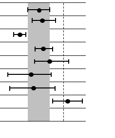
I am generating scatter plot with xerrorlower and yerrorlower (ranges) . How to fill up with color low to high .
Note: first line (range) is base for remaining records.
For you reference I am attaching one photo.
1 REPLY 1
- Mark as New
- Bookmark
- Subscribe
- Mute
- RSS Feed
- Permalink
- Report Inappropriate Content
You can use the COLORRESPONSE= option on the SCATTER statement to color the markers and bars according to some variable in your data set. In the following, I color by using the mean value:
data confidence;
input Var $ 1-2 Mean  LowerCI UpperCI;
datalines;
X1      1.2     0.1     4.2
X2      1.2     0.1     4.2
X3      50.0    48.7    60.3
X4      6.0     5.0     7.3
X5      6.1     5.0     7.3
X6      16.7    0.4     64.1
X7      66.4    55.2    69.6
;

proc sgplot data=confidence;
  scatter y=Var x=mean / xerrorupper=upperci xerrorlower=lowerci colorresponse=mean
          markerattrs=(symbol=CircleFilled) errorbarattrs=(thickness=2);
  yaxis grid;
run;How to Concatenate Values
Learn how use the CAT functions in SAS to join values from multiple variables into a single value.
Find more tutorials on the SAS Users YouTube channel.
SAS Training: Just a Click Away
Ready to level-up your skills? Choose your own adventure.


