- Home
- /
- Programming
- /
- Graphics
- /
- Can SGPANEL plot grouped VBOX and have a colaxis showing tic marks?
- RSS Feed
- Mark Topic as New
- Mark Topic as Read
- Float this Topic for Current User
- Bookmark
- Subscribe
- Mute
- Printer Friendly Page
- Mark as New
- Bookmark
- Subscribe
- Mute
- RSS Feed
- Permalink
- Report Inappropriate Content
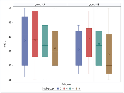
Consider this sample
data plotdata(keep=group id subgroup metric);
  do group = 'A', 'B';
    do subgroup = 2, 4, 6, 8;
      do _n_ = 1 to 15;
        id = (group='B') * 100 + _n_;
        metric = rand('integer', 25, 50);
        output;
      end;
    end;
  end;
run;

proc sgpanel data=plotdata;
  panelby group;
  vbox metric / group = subgroup;
  colaxis label='Subgroup' grid;
run;

ods html close;
What is wanted is a plot showing the same boxes, but each group panel showing a colaxis with the subgroup values (2,4,6,8) as tic marks and the boxes above the marks.
I would turn off the legend with SGPANEL option NOAUTOLEGEND
Accepted Solutions
- Mark as New
- Bookmark
- Subscribe
- Mute
- RSS Feed
- Permalink
- Report Inappropriate Content
After adding the CATEGORY option, you might also want to add the NOAUTOLEGEND option to the SGPANEL procedure statement. That way, the legend is suppressed. It does not add anything to the graph once you display the tick marks.
proc sgpanel data=plotdata noautolegend;
  panelby group;
  vbox metric / group = subgroup category = subgroup;
  colaxis label='Subgroup' grid;
run;- Mark as New
- Bookmark
- Subscribe
- Mute
- RSS Feed
- Permalink
- Report Inappropriate Content
Just add CATEGORY=subgroup to your VBOX statement:
vbox metric / group = subgroup category = subgroup;- Mark as New
- Bookmark
- Subscribe
- Mute
- RSS Feed
- Permalink
- Report Inappropriate Content
After adding the CATEGORY option, you might also want to add the NOAUTOLEGEND option to the SGPANEL procedure statement. That way, the legend is suppressed. It does not add anything to the graph once you display the tick marks.
proc sgpanel data=plotdata noautolegend;
  panelby group;
  vbox metric / group = subgroup category = subgroup;
  colaxis label='Subgroup' grid;
run;Catch up on SAS Innovate 2026
Dive into keynotes, announcements and breakthroughs on demand.
Explore Now →Learn how use the CAT functions in SAS to join values from multiple variables into a single value.
Find more tutorials on the SAS Users YouTube channel.
SAS Training: Just a Click Away
Ready to level-up your skills? Choose your own adventure.


