- Home
- /
- Programming
- /
- Graphics
- /
- help on SGPLOT
- RSS Feed
- Mark Topic as New
- Mark Topic as Read
- Float this Topic for Current User
- Bookmark
- Subscribe
- Mute
- Printer Friendly Page
- Mark as New
- Bookmark
- Subscribe
- Mute
- RSS Feed
- Permalink
- Report Inappropriate Content
Hi,
I am new in SAS and would appreciate it if someone can help on SGPLOT.
I want to use SGPLOT (not SGPANEL) to make 3 separate plots, one for each ID number. is it possible? How?
The dataset and a SAS code for a plot of all 3 IDs in one graph are attached.
My question is how to make 3 separate plots, one for each ID number using SGPLOT not SGPANEL.
Thanks!!
John
- Mark as New
- Bookmark
- Subscribe
- Mute
- RSS Feed
- Permalink
- Report Inappropriate Content
Use the BY statement:
proc sgplot data=SCORE;
BY ID;
series x=time y=SCORE1;
series x=time y=SCORE2/y2axis;
xaxis label='time';
run;
If you ever want to do this when the ID variable is not already sorted, you will need to call PROC SORT first to sort the data by the ID variable.
If this isn't what you want, you can also use the WHERE statement as the first line of the PROC. For example,
WHERE ID=1;
- Mark as New
- Bookmark
- Subscribe
- Mute
- RSS Feed
- Permalink
- Report Inappropriate Content
Is there any reason you cannot use the "BY" statement?
proc sgplot data=SCORE;
by id;
series x=time y=SCORE1;
series x=time y=SCORE2/y2axis;
xaxis label='time';
yaxis label='SCORE1';
y2axis label='SCORE2';
run;
- Mark as New
- Bookmark
- Subscribe
- Mute
- RSS Feed
- Permalink
- Report Inappropriate Content
I have SAS 9.2 and want to make box plot with groups. Something like the below code that works very well on 9.3:
title 'Cholesterol by Death Cause';
proc sgplot data=heart;
vbox cholesterol / category=deathcause group=sex clusterwidth=0.5;
xaxis display=(nolabel);
run;
run;
Is there a work around for the above in 9.2 ?
Thanks,
Priya.
- Mark as New
- Bookmark
- Subscribe
- Mute
- RSS Feed
- Permalink
- Report Inappropriate Content
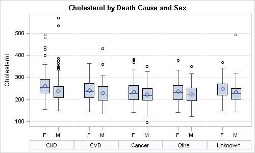
To "simulate" the group behavior in SAS 9.2, you can use proc SGPANEL. You can get most of the graph, except the coloring of the groups:

%let gpath='C:\';
%let dpi=100;
ods listing style=htmlblue gpath = &gpath image_dpi=&dpi;
/*--Use smaller strings for Death Cause and Sex--*/
data heart;
set sashelp.heart;
if (findw(deathcause, 'Cerebral')) then deathcause='CVD';
if (findw(deathcause, 'Coronary')) then deathcause='CHD';
if (findw(sex, 'Female')) then sex='F';
if (findw(sex, 'Male')) then sex='M';
run;
/*--Use SGPANEL to create a paneled graph that looks like a grouped box plot--*/
title 'Cholesterol by Death Cause and Sex';
ods graphics / reset width=5in height=3in imagename='BoxPanel';
proc sgpanel data=heart;
panelby deathcause / layout=columnlattice onepanel noborder colheaderpos=bottom novarname;
vbox cholesterol / category=sex;
colaxis display=(nolabel);
rowaxis grid;
run;
- Mark as New
- Bookmark
- Subscribe
- Mute
- RSS Feed
- Permalink
- Report Inappropriate Content
Thanks Sanjay for the prompt help.
- Mark as New
- Bookmark
- Subscribe
- Mute
- RSS Feed
- Permalink
- Report Inappropriate Content
Yes, there are multiple ways to do this:
- With SAS 9.3, you can use GROUPDISPLAY=Cluster with scatter plots too. This is the easiest and most scalable. See blog article with Mean Change plot.
- With SAS 9.2, if your data is in multi-column format (one column for each treatment), you can use DiscreteOffset in GTL. See my blog article on DiscreteOffsets. This will work for multiple treatments.
- With SAS 9.2 SGPLOT, you can use axis offsets if you have only two treatments to acheive the separation. Map one treatment to X axis, other to X2, and then use a small offset on X2. It will separate the two markers, thought one will be slightly off center.
- Mark as New
- Bookmark
- Subscribe
- Mute
- RSS Feed
- Permalink
- Report Inappropriate Content
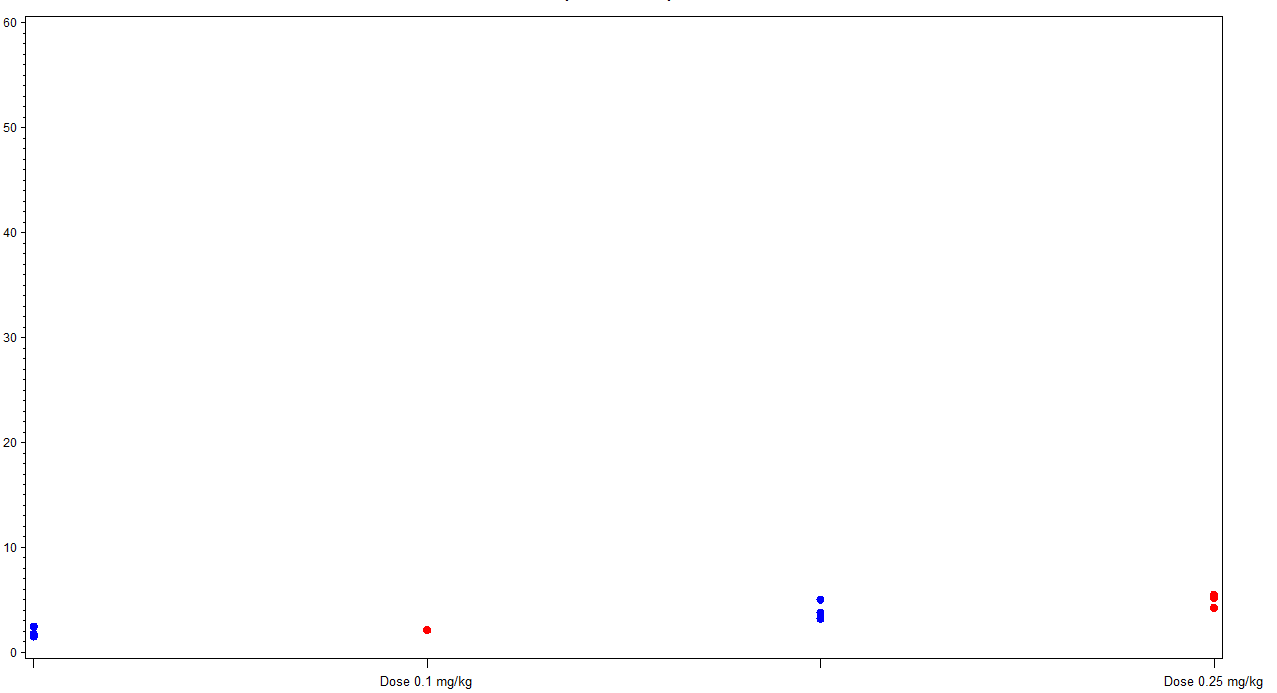
Thanks Sanjay for the quick reply. I did some data manipulation and the attached graph. But, I am not sure how to reduce the space b/w the two tick marks i.e. red and the blue should be together as they both belong to the same dose group. Can you guide me please? Thanks

- Mark as New
- Bookmark
- Subscribe
- Mute
- RSS Feed
- Permalink
- Report Inappropriate Content
Please attach program with data.
- Mark as New
- Bookmark
- Subscribe
- Mute
- RSS Feed
- Permalink
- Report Inappropriate Content
This is the dummy data. Basically I want the two study groups to display side by side...
data test;
input dose $ study $ value;
datalines;
0.1mg/kg s1 10
0.1mg/kg s2 20
0.2mg/kg s1 30
0.2mg/kg s2 40
run;
data test1;
set test;
if study="s1" and dose ="0.1mg/kg" then d1=1;
if study="s2" and dose ="0.1mg/kg" then d1=2;
if study="s1" and dose ="0.2mg/kg" then d1=3;
if study="s2" and dose ="0.2mg/kg" then d1=4;
run;
symbol1 v=dot c= blue ;
symbol2 v=dot c=red;
proc gplot data = test1 ;
plot value*d1=study/;
run;
quit;
- Mark as New
- Bookmark
- Subscribe
- Mute
- RSS Feed
- Permalink
- Report Inappropriate Content
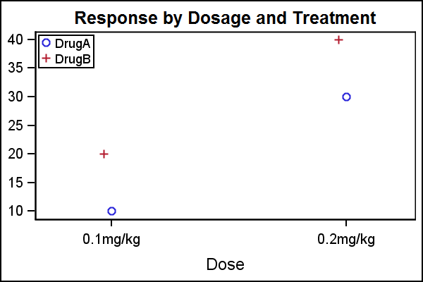
nThis is GPLOT code, not SGPLOT. I assume you have SAS 9.2. Here is the quick way using SGPLOT:

data test;
input Dose $ DrugA DrugB;
datalines;
0.1mg/kg 10 20
0.2mg/kg 30 40
run;
%let gpath='C:\Work\Blogs\Communities\images';
ods listing image_dpi=200 gpath=&gpath;
ods graphics / reset width=3in height=2in imagename='Dosage';
title 'Response by Dosage and Treatment';
proc sgplot data=test;
scatter x=dose y=DrugA;
scatter x=dose y=DrugB / x2axis;
yaxis display=(nolabel);
xaxis offsetmin=0.2 offsetmax=0.18;
x2axis offsetmin=0.18 offsetmax=0.2 display=none;
keylegend / location=inside position=topleft across=1;
run;
To place each marker equally on each side of the tick mark you need to use SAS 9.2 GTL. or SAS 9.3 SGPLOT.
Message was edited by: Sanjay Matange - Moved the legend position
- Mark as New
- Bookmark
- Subscribe
- Mute
- RSS Feed
- Permalink
- Report Inappropriate Content
Here's a modification of your gplot code, that also creates the side-by-side plot...
data test;
input dose $ study $ value;
datalines;
0.1mg/kg s1 10
0.1mg/kg s2 20
0.2mg/kg s1 30
0.2mg/kg s2 40
run;
/* Convert dose into numeric x_var */
proc sort data=test out=test;
by dose;
run;
data test; set test;
label x_var='Dose';
by dose;
if first.dose then x_var+1;
run;
/* Create user-defined format, so numeric x_var prints as text value */
proc sql noprint;
create table foo as select unique x_var, dose from test;
select max(x_var)+1 into :max from test;
quit; run;
data control; set foo (rename = ( x_var=start dose=label));
fmtname = 'myfmt';
type = 'N';
end = START;
run;
proc format lib=work cntlin=control;
run;
/* move the values (colored dots) a little to the left and right */
data test; set test;
if study='s1' then x_var=x_var-.05;
if study='s2' then x_var=x_var+.05;
run;
axis1 minor=none order=(0 to 50 by 10) offset=(0,0);
axis2 minor=none order=(0 to &max by 1) offset=(0,0)
value=(t=1 '' t=&max '') /* blank out the 0 and n+1 labels */
;
legend1 position=(top left inside) repeat=1 cborder=black;
symbol1 v=circle h=3 c=blue ;
symbol2 v=circle h=3 c=red;
title1 "Custom SAS/Graph with side-by-side markers";
proc gplot data=test;
format x_var myfmt.; /* apply the user-defined format */
plot value*x_var=study /
vaxis=axis1 haxis=axis2
autohref chref=graydd
autovref cvref=graydd
vzero
legend=legend1;
run;
- Mark as New
- Bookmark
- Subscribe
- Mute
- RSS Feed
- Permalink
- Report Inappropriate Content
Thanks Robert for your help. My code is working.
Catch up on SAS Innovate 2026
Dive into keynotes, announcements and breakthroughs on demand.
Explore Now →Learn how use the CAT functions in SAS to join values from multiple variables into a single value.
Find more tutorials on the SAS Users YouTube channel.
SAS Training: Just a Click Away
Ready to level-up your skills? Choose your own adventure.


