- Home
- /
- Programming
- /
- Graphics
- /
- comparability of population pyramids
- RSS Feed
- Mark Topic as New
- Mark Topic as Read
- Float this Topic for Current User
- Bookmark
- Subscribe
- Mute
- Printer Friendly Page

- Mark as New
- Bookmark
- Subscribe
- Mute
- RSS Feed
- Permalink
- Report Inappropriate Content
Hi,
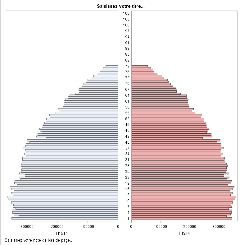
It is easy to produce a population pyramids throught the butterfly model of the ods graphics designer
proc template;
define statgraph sgdesign;
dynamic _AGE _H1914 _AGE2 _F1914;
begingraph / designwidth=776 designheight=791;
entrytitle halign=center 'Saisissez votre titre...';
entryfootnote halign=left 'Saisissez votre note de bas de page...';
layout lattice / rowdatarange=data columndatarange=data columns=2
rowgutter=10 columngutter=10 columnweights=(0.5 0.5);
layout overlay / xaxisopts=( reverse=true)
yaxisopts=( display=(LINE));
barchart x=_AGE y=_H1914 / name='bar(h)'
datatransparency=0.5
orient=horizontal
clusterwidth=1.0;
endlayout;
layout overlay / yaxisopts=( display=(TICKVALUES LINE));
barchart x=_AGE2 y=_F1914 / name='bar(h)2'
datatransparency=0.5
orient=horizontal
discreteoffset=0.01
clusterwidth=1.0
fillattrs=GraphData2;
endlayout;
endlayout;
endgraph;
end;
run;
proc sgrender data=INED.SERPIS template=sgdesign;
dynamic _AGE="AGE" _H1914="H1914" _AGE2="AGE" _F1914="F1914";
run;
Now i feel to be in a no throught road if i have differents source files for example
one covering the ages from 0 to 80 and another with age from 0 to 106
The aspect of the resulting graphics of age pyramids are not standard and thus not comparable
rowdatarange=data columndatarange=data produce differents heights of pyramids
Is there a way through axis explicit definition in GTL to fix this problem?
Has anybody a good idea to overcome this problem? What i search is pyramids of the same structure
with age from 0 to 106 even if a population (ex the working part of a population) stops before
let's say 85!
TIA
Andre


- Mark as New
- Bookmark
- Subscribe
- Mute
- RSS Feed
- Permalink
- Report Inappropriate Content
I know that i can add empty lines in the data
data t80;
set ined.t80 end=fin;
output;
if fin then do;
do i=80 to 106;
age=i ; h1914=0; f1914=0; output;
end;end;
run;
and then obtaining the searched result but i search a code gtl programming solution.
Andre

- Mark as New
- Bookmark
- Subscribe
- Mute
- RSS Feed
- Permalink
- Report Inappropriate Content
I've usually seen population pyramids use binned groups, ie age ranges instead of the continuous range.
If you add a step that preformats your data into the bins you won't have this problem.
Usually 5 year age groups are used and anything over 100 is lumped into one group:
0-4
5-9
10-14
..
100+
- Mark as New
- Bookmark
- Subscribe
- Mute
- RSS Feed
- Permalink
- Report Inappropriate Content
Hi Reeza
Finaly in the mean time i went a step further to solve my problem
by this modification on both sides
| layout overlay / yaxisopts=( |
display=(TICKVALUES LINE)
discreteopts=( tickvaluelist=( "1" "2" "3" "4" "5" "6" "7" "8" "9" "10" "11" "12" "13" "14" "15" "16" "17" "18" "19"
"20" "21" "22" "23" "24" "25" "26" "27" "28" "29" "30" "31" "32" "33" "34" "35" "36" "37" "38" "39" "40"
"41" "42" "43" "44" "45" "46" "47" "48" "49" "50" "51" "52" "53" "54" "55" "56" "57" "58" "59" "60"
"61" "62" "63" "64" "65" "66" "67" "68" "69" "70" "71" "72" "73" "74" "75" "76" "77" "78" "79" "80"
"81" "82" "83" "84" "85" "86" "87" "88" "89" "90" "91" "92" "93" "94" "95" "96" "97" "98" "99" "100"
"101" "102" "103" "104" "105" "106") ) ;
the graph are now independent of the data
 );
);
); |

- Mark as New
- Bookmark
- Subscribe
- Mute
- RSS Feed
- Permalink
- Report Inappropriate Content
Looks like you are trying to get uniform Y axis across different SGRENDER steps. I cannot think of any automatic way to do this (like you can in SGPLOT). This is so because in SGPLOT, you are always working on one layout Overlay, so it is possible to make the axes uniform. In SGRENDER, there is no such simplicity. Your template can have any complex structure with multiple axes (like you ahve).
To achieve this result across different data sets, you will have to determine the range of the Y axis as union from both (or more) data sets into macro variables, and set it on the Y axis for each graph.
.jpg")
Catch up on SAS Innovate 2026
Nearly 200 sessions are now available on demand with the SAS Innovate Digital Pass.
Explore Now →Learn how use the CAT functions in SAS to join values from multiple variables into a single value.

Find more tutorials on the SAS Users YouTube channel.
SAS Training: Just a Click Away
Ready to level-up your skills? Choose your own adventure.
-
4 replies
-
06-17-2014 06:03 AM
-
4430 views
-
3 likes
-
3 in conversation
-
