- Home
- /
- Programming
- /
- Graphics
- /
- change multiple group series plot line thickness and output to rtf
- RSS Feed
- Mark Topic as New
- Mark Topic as Read
- Float this Topic for Current User
- Bookmark
- Subscribe
- Mute
- Printer Friendly Page
- Mark as New
- Bookmark
- Subscribe
- Mute
- RSS Feed
- Permalink
- Report Inappropriate Content
Hi,everyone,
I want to draw a series plot for multiple groups.
I want to use self-defined values of line thickness for each group and output the results to a rtf file.
I wrote a sample code with sas built-in dataset "Stock" as follows
proc template;
define statgraph Graph;
dynamic _DATE _CLOSE _STOCK;
begingraph;
   layout lattice / rowdatarange=data columndatarange=data rowgutter=10 columngutter=10;
      layout overlay;
         seriesplot x=_DATE y=_CLOSE / group=_STOCK name='series' connectorder=xaxis lineattrs=(thickness=5 );
      endlayout;
   endlayout;
endgraph;
end;
run;
ODS RTF FILE="C:\Users\SAS_Fun\Desktop\test.rtf" ;

proc sgrender data=WORK.STOCKS template=Graph;
dynamic _DATE="DATE" _CLOSE="CLOSE" _STOCK="STOCK";
run;
ODS RTF CLOSE;
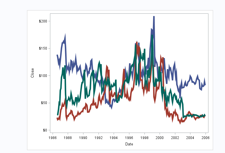
In the SAS viewer,it showed like this:
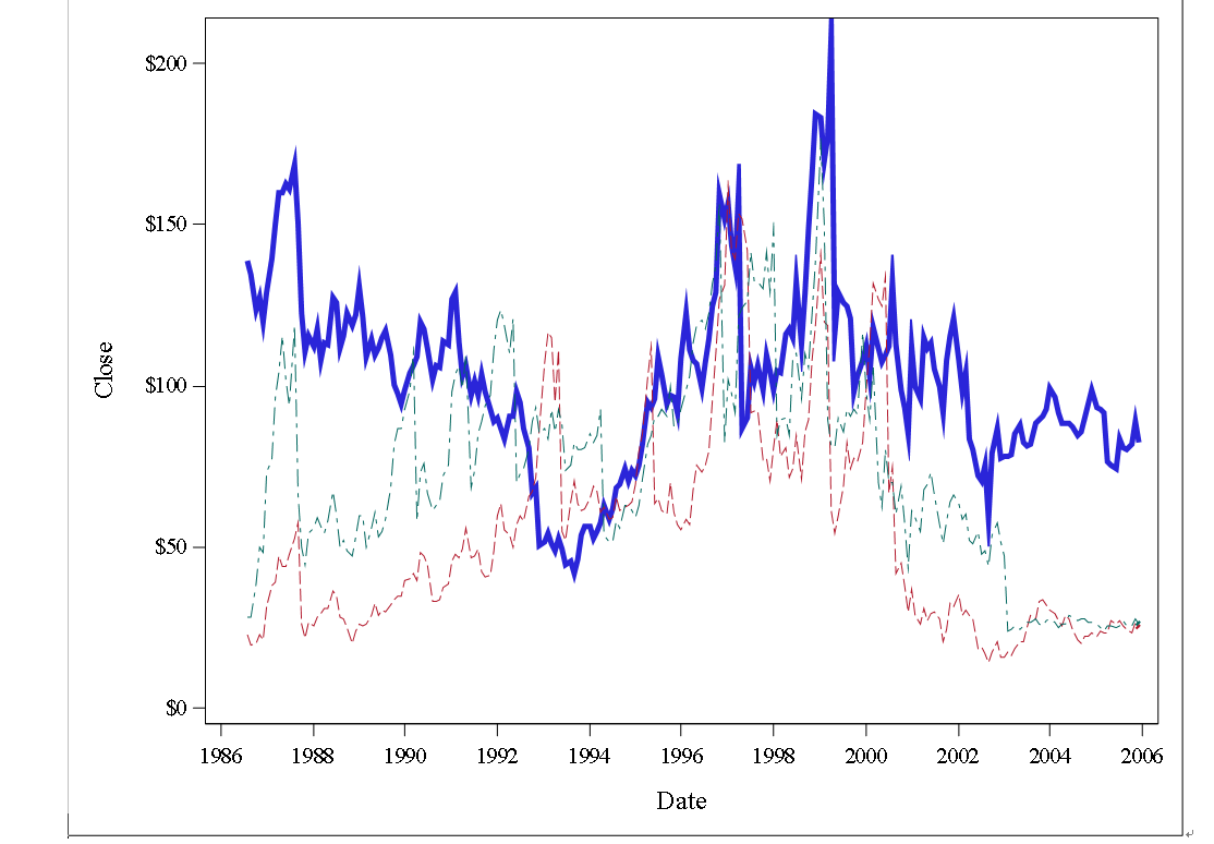
However,in the rtf file,it showed as follows
Would you please help me with that,thank you so much!
Accepted Solutions
- Mark as New
- Bookmark
- Subscribe
- Mute
- RSS Feed
- Permalink
- Report Inappropriate Content
Try setting ODS GRAPHICS option ATTRPRIORITY=COLOR to get all solid lines with 3 colors.
What is the SAS release you are using? Maybe the output is scalable (EMF) and not working well. You can try setting OUTPUTFMT=PNG to see if that works better.
- Mark as New
- Bookmark
- Subscribe
- Mute
- RSS Feed
- Permalink
- Report Inappropriate Content
Thank you so much,Sanjay!
It works very well,thank you again!
Learn how use the CAT functions in SAS to join values from multiple variables into a single value.
Find more tutorials on the SAS Users YouTube channel.
SAS Training: Just a Click Away
Ready to level-up your skills? Choose your own adventure.


