- Home
- /
- Programming
- /
- Graphics
- /
- change multiple group series plot line thickness and output to rtf
- RSS Feed
- Mark Topic as New
- Mark Topic as Read
- Float this Topic for Current User
- Bookmark
- Subscribe
- Mute
- Printer Friendly Page
- Mark as New
- Bookmark
- Subscribe
- Mute
- RSS Feed
- Permalink
- Report Inappropriate Content
Hi,everyone,
I want to draw a series plot for multiple groups.
I want to use self-defined values of line thickness for each group and output the results to a rtf file.
I wrote a sample code with sas built-in dataset "Stock" as follows
proc template;
define statgraph Graph;
dynamic _DATE _CLOSE _STOCK;
begingraph;
   layout lattice / rowdatarange=data columndatarange=data rowgutter=10 columngutter=10;
      layout overlay;
         seriesplot x=_DATE y=_CLOSE / group=_STOCK name='series' connectorder=xaxis lineattrs=(thickness=5 );
      endlayout;
   endlayout;
endgraph;
end;
run;
ODS RTF FILE="C:\Users\SAS_Fun\Desktop\test.rtf" ;

proc sgrender data=WORK.STOCKS template=Graph;
dynamic _DATE="DATE" _CLOSE="CLOSE" _STOCK="STOCK";
run;
ODS RTF CLOSE;
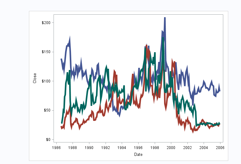
In the SAS viewer,it showed like this:
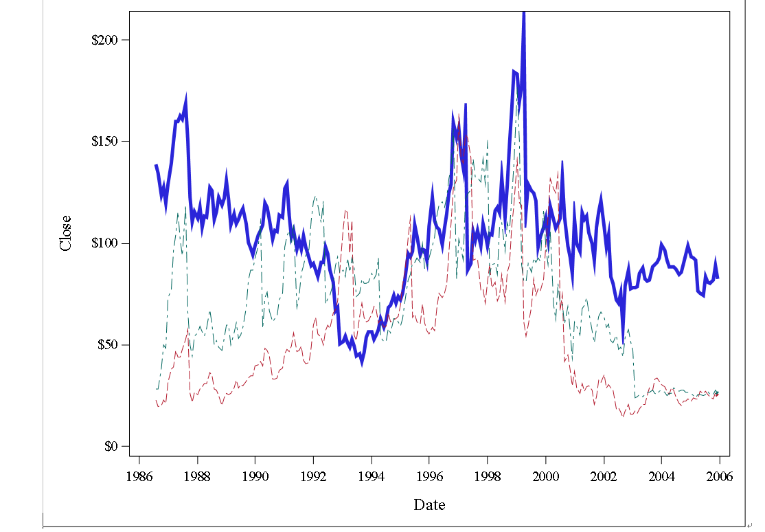
However,in the rtf file,it showed as follows
Would you please help me with that,thank you so much!
Accepted Solutions
- Mark as New
- Bookmark
- Subscribe
- Mute
- RSS Feed
- Permalink
- Report Inappropriate Content
Try setting ODS GRAPHICS option ATTRPRIORITY=COLOR to get all solid lines with 3 colors.
What is the SAS release you are using? Maybe the output is scalable (EMF) and not working well. You can try setting OUTPUTFMT=PNG to see if that works better.
- Mark as New
- Bookmark
- Subscribe
- Mute
- RSS Feed
- Permalink
- Report Inappropriate Content
Thank you so much,Sanjay!
It works very well,thank you again!
Catch up on SAS Innovate 2026
Nearly 200 sessions are now available on demand with the SAS Innovate Digital Pass.
Explore Now →Learn how use the CAT functions in SAS to join values from multiple variables into a single value.
Find more tutorials on the SAS Users YouTube channel.
SAS Training: Just a Click Away
Ready to level-up your skills? Choose your own adventure.


