- Home
- /
- Programming
- /
- Graphics
- /
- Re: can sas plot this graph?
- RSS Feed
- Mark Topic as New
- Mark Topic as Read
- Float this Topic for Current User
- Bookmark
- Subscribe
- Mute
- Printer Friendly Page
- Mark as New
- Bookmark
- Subscribe
- Mute
- RSS Feed
- Permalink
- Report Inappropriate Content
Hi all,
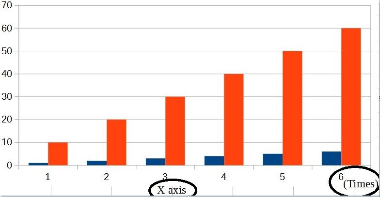
I would like to plot graph as below.
X-axis has 2 labels.
what's the command i should do?
proc sgplot data=tmp;
series x=rownum y=avg ;
xaxis label="X axis";
run;

Accepted Solutions
- Mark as New
- Bookmark
- Subscribe
- Mute
- RSS Feed
- Permalink
- Report Inappropriate Content
You probably want to combine the LABEL= option for the XAXIS statement with teh global FOOTNOTE statement.
Experiment with using the FOOTNOTE JUSTIFY= option to get what you want.
You might also need to move the legend around. Here's an example to get started:
footnote justify=center "X axis";
proc sgplot data=sashelp.class;
   vbar age / group=sex response=height stat=mean groupdisplay=cluster;
   xaxis label="(Time)" labelpos=right;
   keylegend / position=topleft location=inside;
run;
- Mark as New
- Bookmark
- Subscribe
- Mute
- RSS Feed
- Permalink
- Report Inappropriate Content
What version of SAS do you have?
Have you looked at annotate?
- Mark as New
- Bookmark
- Subscribe
- Mute
- RSS Feed
- Permalink
- Report Inappropriate Content
You probably want to combine the LABEL= option for the XAXIS statement with teh global FOOTNOTE statement.
Experiment with using the FOOTNOTE JUSTIFY= option to get what you want.
You might also need to move the legend around. Here's an example to get started:
footnote justify=center "X axis";
proc sgplot data=sashelp.class;
   vbar age / group=sex response=height stat=mean groupdisplay=cluster;
   xaxis label="(Time)" labelpos=right;
   keylegend / position=topleft location=inside;
run;
- Mark as New
- Bookmark
- Subscribe
- Mute
- RSS Feed
- Permalink
- Report Inappropriate Content
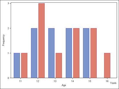
Here is how to do this with SG annotation:
data anno;
function="text";
drawspace="layoutpercent";
anchor="topright";
x1=100; y1=7;
label="Years";
run;

proc sgplot data=sashelp.class noautolegend sganno=anno;
vbar age / group=sex groupdisplay=cluster barwidth=0.8;
run;Catch up on SAS Innovate 2026
Nearly 200 sessions are now available on demand with the SAS Innovate Digital Pass.
Explore Now →Learn how use the CAT functions in SAS to join values from multiple variables into a single value.
Find more tutorials on the SAS Users YouTube channel.
SAS Training: Just a Click Away
Ready to level-up your skills? Choose your own adventure.


