- Home
- /
- Programming
- /
- Graphics
- /
- can sas plot this graph?
- RSS Feed
- Mark Topic as New
- Mark Topic as Read
- Float this Topic for Current User
- Bookmark
- Subscribe
- Mute
- Printer Friendly Page


- Mark as New
- Bookmark
- Subscribe
- Mute
- RSS Feed
- Permalink
- Report Inappropriate Content
Hi all,
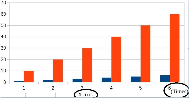
I would like to plot graph as below.
X-axis has 2 labels.
what's the command i should do?
proc sgplot data=tmp;
series x=rownum y=avg ;
xaxis label="X axis";
run;
Accepted Solutions


- Mark as New
- Bookmark
- Subscribe
- Mute
- RSS Feed
- Permalink
- Report Inappropriate Content
You probably want to combine the LABEL= option for the XAXIS statement with teh global FOOTNOTE statement.
Experiment with using the FOOTNOTE JUSTIFY= option to get what you want.
You might also need to move the legend around. Here's an example to get started:
footnote justify=center "X axis";
proc sgplot data=sashelp.class;
   vbar age / group=sex response=height stat=mean groupdisplay=cluster;
   xaxis label="(Time)" labelpos=right;
   keylegend / position=topleft location=inside;
run;


- Mark as New
- Bookmark
- Subscribe
- Mute
- RSS Feed
- Permalink
- Report Inappropriate Content
What version of SAS do you have?
Have you looked at annotate?
- Mark as New
- Bookmark
- Subscribe
- Mute
- RSS Feed
- Permalink
- Report Inappropriate Content
You probably want to combine the LABEL= option for the XAXIS statement with teh global FOOTNOTE statement.
Experiment with using the FOOTNOTE JUSTIFY= option to get what you want.
You might also need to move the legend around. Here's an example to get started:
footnote justify=center "X axis";
proc sgplot data=sashelp.class;
   vbar age / group=sex response=height stat=mean groupdisplay=cluster;
   xaxis label="(Time)" labelpos=right;
   keylegend / position=topleft location=inside;
run;


- Mark as New
- Bookmark
- Subscribe
- Mute
- RSS Feed
- Permalink
- Report Inappropriate Content
Here is how to do this with SG annotation:
data anno;
function="text";
drawspace="layoutpercent";
anchor="topright";
x1=100; y1=7;
label="Years";
run;

proc sgplot data=sashelp.class noautolegend sganno=anno;
vbar age / group=sex groupdisplay=cluster barwidth=0.8;
run;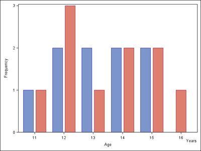

Call for content now open!
It's your turn to help shape SAS Innovate 2027. Share your expertise and inspire the SAS community.
Learn how use the CAT functions in SAS to join values from multiple variables into a single value.

Find more tutorials on the SAS Users YouTube channel.
SAS Training: Just a Click Away
Ready to level-up your skills? Choose your own adventure.
-
3 replies
-
10-06-2016 09:29 AM
-
3429 views
-
6 likes
-
4 in conversation
-


