- Home
- /
- Programming
- /
- Graphics
- /
- blockplot of numbers to be coloured in KM plot
- RSS Feed
- Mark Topic as New
- Mark Topic as Read
- Float this Topic for Current User
- Bookmark
- Subscribe
- Mute
- Printer Friendly Page
- Mark as New
- Bookmark
- Subscribe
- Mute
- RSS Feed
- Permalink
- Report Inappropriate Content
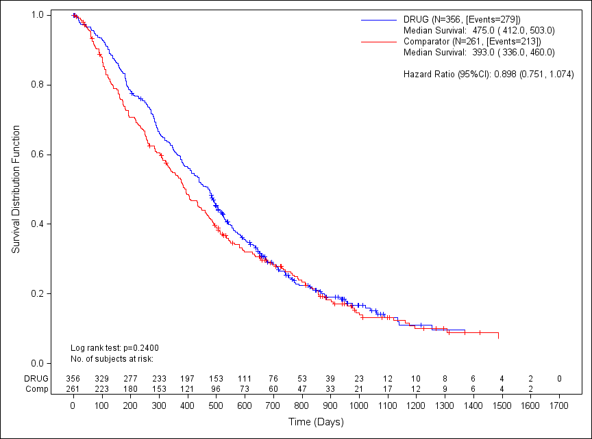
I have this pretty KM/results plot using 9.3 proc template

What I would like is the numbers at the bottom of the plot to be the same colour as the KM bit. ie the numbers for drug to be blue and the comp to be red.
I assumed using class="signvar" in the blockplot statement it would do this but, as you can see all Im getting is black.
code is:
proc template;
define statgraph SurvivalPlotAtRisk_Outside_Scatter;
dynamic _x _cens _surv _trt _Xlabel _ylabel _min _max _by _num;
begingraph;
discreteattrmap name="colorbysign" / ignorecase=true;
value "Comp" /
fillattrs=GraphData1(color=red )
markerattrs=GraphData1(color=red )
lineattrs=GraphData1(color=red );
value "DRUG" /
fillattrs=GraphData1(color=blue )
markerattrs=GraphData1(color=blue )
lineattrs=GraphData1(color=blue );
enddiscreteattrmap;
legenditem type=line name="DRUG" / LABEL="DRUG (N=&NT1, [Events=&nevent1])" lineattrs=GraphData1(color=blue THICKNESS=1)
labelattrs=(size=9 family="Arial") ;
legenditem type=marker name="DRUG2" / LABEL="Median Survival: &Med_DRUG " lineattrs=GraphData1(color=blue THICKNESS=10)
labelattrs=(size=9 family="Arial") markerattrs=(size=0);;
legenditem type=line name="Comp" / LABEL="Comparator (N=&NT2, [Events=&nevent2])" lineattrs=GraphData1(color=red THICKNESS=1)
labelattrs=(size=9 family="Arial");;
legenditem type=marker name="Comp2" / LABEL="Median Survival: &med_comp" lineattrs=GraphData1(color=red THICKNESS=10)
labelattrs=(size=9 family="Arial") markerattrs=(size=0);;
legenditem type=marker name="BLANK" / LABEL="" lineattrs=GraphData1
labelattrs=(size=9 family="Arial") markerattrs=(size=0);;
legenditem type=marker name="HR" / LABEL="Hazard Ratio (95%CI): &HR" lineattrs=GraphData1(color=black THICKNESS=10)
labelattrs=(size=9 family="Arial") markerattrs=(size=0);;
legenditem type=marker name="PValue" / LABEL="Log rank test: p=&PValue" lineattrs=GraphData1(color=black THICKNESS=10)
labelattrs=(size=8 family="Arial") markerattrs=(size=0);;
legenditem type=marker name="risk" / LABEL="No. of subjects at risk:" lineattrs=GraphData1(color=black THICKNESS=10)
labelattrs=(size=8 family="Arial") markerattrs=(size=0);;
discreteattrvar attrvar=signvar var=_trt attrmap="colorbysign";
layout overlay / yaxisopts=(linearopts=(viewmin=0))
xaxisopts=( linearopts=
( tickvaluesequence=(start=_min end=_max increment=_by) )
label=_xlabel )
yaxisopts=(label=_ylabel );
stepplot x=_x y=_surv / group=signvar lineattrs=(pattern=solid) name='s';
scatterplot x=_x y=_cens / markerattrs=(symbol=plus) GROUP=signvar ;
innermargin;
blockplot x=_x block=_num / class="signvar"
display=(values label) valuehalign=start
valueattrs=(size=8 ) labelattrs=(size=8);
endinnermargin;
discretelegend "PValue" "risk"/ /*title=_label*/ titleattrs=(size=9 family="Arial")
BORDER=false across=1
location=inside
halign=left valign=bottom ;
discretelegend "DRUG" "DRUG2" "Comp" "Comp2" "BLANK" "HR"/ /*title=_label*/ titleattrs=(size=9 family="Arial")
BORDER=false across=1
location=inside
halign=right valign=top ;
endlayout;
endgraph;
end;
run;
proc sgrender data=fig_surv2 template=SurvivalPlotAtRisk_Outside_Scatter;
dynamic _x = 'surover'
_cens = 'censval'
_surv = 'survival'
_trt = 'trtpn'
_Ylabel = 'Survival Distribution Function'
_xlabel = 'Time (Days)'
_min='0'
_max='1700'
_by='100'
_num='left'
;
run;
Accepted Solutions
- Mark as New
- Bookmark
- Subscribe
- Mute
- RSS Feed
- Permalink
- Report Inappropriate Content
In SAS 9.4, this would be trivial. You would use an AXISTABLE instead of a BLOCKPLOT, and you would have the control you need to color the text by class (along with a lot of other features). However, to do this in SAS 9.3, you will need to use a little scatterplot trickery. In the example below, I create a discrete scatterplot on the Y2 axis and adjust the axis offsets so that the two plots do not collide. Then, I just use the MARKERCHARACTER options to plot the text and GROUP role to color it.
Hope this helps!
Dan
proc means data=sashelp.class nway;
class age sex;
var height;
output out=tempdata mean=;
run;
proc template;
define statgraph plot;
begingraph;
layout overlay / yaxisopts=(offsetmin=0.1) y2axisopts=(offsetmax=0.95);
seriesplot x=age y=height / group=sex;
scatterplot x=age y=sex / group=sex yaxis=y2 markercharacter=height;
endlayout;
endgraph;
end;
run;
proc sgrender data=tempdata template=plot;
format height F5.2;
run;
- Mark as New
- Bookmark
- Subscribe
- Mute
- RSS Feed
- Permalink
- Report Inappropriate Content
oh..I missed the response for this. I'll give it a go...thanks.
- Mark as New
- Bookmark
- Subscribe
- Mute
- RSS Feed
- Permalink
- Report Inappropriate Content
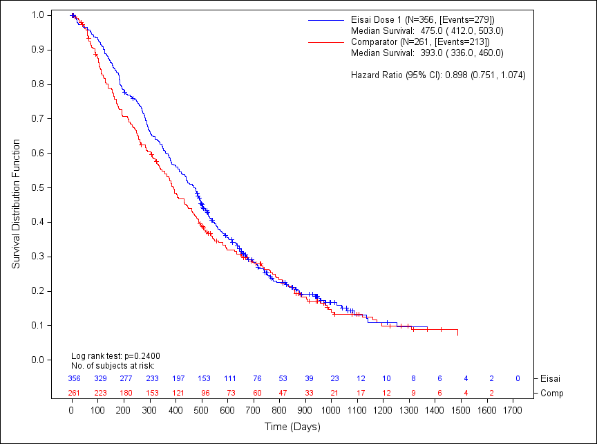
Thanks it worked fine. The only thing I had to change was to add a pad to my legend (text) items at the bottom and to create a new re-ordered treatment variable.
have attached an image of the plot Ive created.

- Mark as New
- Bookmark
- Subscribe
- Mute
- RSS Feed
- Permalink
- Report Inappropriate Content
Since you are using GTL, you can put the at risk table in a separate cell below the survival curves and get the treatment labels to the left.
- Mark as New
- Bookmark
- Subscribe
- Mute
- RSS Feed
- Permalink
- Report Inappropriate Content
Sanjay,
I can only do that in 9.4 though? Im using sas 9.3.
Adie.
- Mark as New
- Bookmark
- Subscribe
- Mute
- RSS Feed
- Permalink
- Report Inappropriate Content
You can do that with SAS 9.3. The AXISTABLE statement Dan mentioned is new in SAS 9.4. You are not using axistable but scatterplot with markercharacter. This is available since SAS 9.2.
- Mark as New
- Bookmark
- Subscribe
- Mute
- RSS Feed
- Permalink
- Report Inappropriate Content
Thanks. Im guessing this would use a multi layout plot rather than the one I have as the moment.
Im going to leave it as is as my code is way too complex and sods law would say it would take me longer to recode, what seems to be simple changes has knock onto to other bits (ie the simple change to scatter plot messed up my legend).
Learn how use the CAT functions in SAS to join values from multiple variables into a single value.
Find more tutorials on the SAS Users YouTube channel.
SAS Training: Just a Click Away
Ready to level-up your skills? Choose your own adventure.


