- Home
- /
- Programming
- /
- Graphics
- /
- X Axis - Create Tick lines
- RSS Feed
- Mark Topic as New
- Mark Topic as Read
- Float this Topic for Current User
- Bookmark
- Subscribe
- Mute
- Printer Friendly Page
- Mark as New
- Bookmark
- Subscribe
- Mute
- RSS Feed
- Permalink
- Report Inappropriate Content
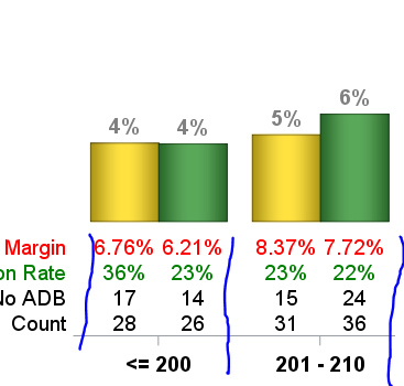
I am using SAS 9.4 and I've created a cluster grouped VBAR (2 types in the group). Below the VBAR I've add 4 vlines. I am trying to add tick lines in the bottom x axis to visually segregate the data below the chart aligning with the vbars above. I've attached a pic and I show (in blue) lines I'd like to add. Of course, I'd like straight lines not my messy illustration.

Accepted Solutions
- Mark as New
- Bookmark
- Subscribe
- Mute
- RSS Feed
- Permalink
- Report Inappropriate Content
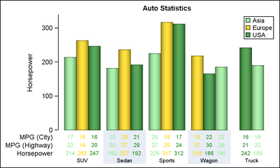
With SAS 9.4M3, you can do a graph like this with fewer lines of code. Note use of color bands to separate the columns. AxisTable does not have options to draw the column borders. VBARBASIC is used if the color bands are to be hidden using the BAND. Else you can just use VBAR.
title h=10pt 'Auto Statistics';
proc sgplot data=sashelp.cars(where=(type ne 'Hybrid')) noborder;
  format mpg_city mpg_highway horsepower 3.0;
  styleattrs datacolors=(lightgreen gold forestgreen)
             datacontrastcolors=(lightgreen gold forestgreen)
             axisextent=data;
  band x=type lower=0 upper=340 / fill nooutline fillattrs=graphwalls;
  vbarbasic type / response=horsepower dataskin=pressed stat=mean name='a'
       group=origin groupdisplay=cluster baselineattrs=(thickness=0);
  xaxistable mpg_city mpg_highway horsepower / class=origin classdisplay=cluster
       stat=mean colorgroup=origin location=inside;
  xaxis display=(noticks nolabel noline) colorbands=even colorbandsattrs=(transparency=0.4);
  keylegend 'a' / location=inside position=topright across=1 title='';
  yaxis offsetmax=0;
run;
- Mark as New
- Bookmark
- Subscribe
- Mute
- RSS Feed
- Permalink
- Report Inappropriate Content
Please share your code and (some) data so it is easier to provide a solution.
- Mark as New
- Bookmark
- Subscribe
- Mute
- RSS Feed
- Permalink
- Report Inappropriate Content
- Mark as New
- Bookmark
- Subscribe
- Mute
- RSS Feed
- Permalink
- Report Inappropriate Content
This example
http://support.sas.com/kb/35/132.html
shows one way of adding a table of other values below an axis that aligns with the ticks.
- Mark as New
- Bookmark
- Subscribe
- Mute
- RSS Feed
- Permalink
- Report Inappropriate Content
I thought using Vline with VBar there may be a simple solution I am missing. Thank you for your help.
- Mark as New
- Bookmark
- Subscribe
- Mute
- RSS Feed
- Permalink
- Report Inappropriate Content
- Mark as New
- Bookmark
- Subscribe
- Mute
- RSS Feed
- Permalink
- Report Inappropriate Content
Unfortunately, you did not attach any data. So it is not possible to run your code.
With SAS 9.4, you can use the XAXISTABLE to display the tabular data. Is there a reason you are not using it?
Here are some examples:
http://blogs.sas.com/content/graphicallyspeaking/?s=xaxistable
http://blogs.sas.com/content/graphicallyspeaking/2013/12/16/grouped-bar-chart-with-statisticstable/
GROUPDISPLAY=CLUSTER can now be used with the XAXISTABLE.
- Mark as New
- Bookmark
- Subscribe
- Mute
- RSS Feed
- Permalink
- Report Inappropriate Content
With SAS 9.4M3, you can do a graph like this with fewer lines of code. Note use of color bands to separate the columns. AxisTable does not have options to draw the column borders. VBARBASIC is used if the color bands are to be hidden using the BAND. Else you can just use VBAR.
title h=10pt 'Auto Statistics';
proc sgplot data=sashelp.cars(where=(type ne 'Hybrid')) noborder;
  format mpg_city mpg_highway horsepower 3.0;
  styleattrs datacolors=(lightgreen gold forestgreen)
             datacontrastcolors=(lightgreen gold forestgreen)
             axisextent=data;
  band x=type lower=0 upper=340 / fill nooutline fillattrs=graphwalls;
  vbarbasic type / response=horsepower dataskin=pressed stat=mean name='a'
       group=origin groupdisplay=cluster baselineattrs=(thickness=0);
  xaxistable mpg_city mpg_highway horsepower / class=origin classdisplay=cluster
       stat=mean colorgroup=origin location=inside;
  xaxis display=(noticks nolabel noline) colorbands=even colorbandsattrs=(transparency=0.4);
  keylegend 'a' / location=inside position=topright across=1 title='';
  yaxis offsetmax=0;
run;
- Mark as New
- Bookmark
- Subscribe
- Mute
- RSS Feed
- Permalink
- Report Inappropriate Content
Sanjay - perfect! I thought I reviewed all the great work you've done. I missed this one. Thanks again.
Catch up on SAS Innovate 2026
Dive into keynotes, announcements and breakthroughs on demand.
Explore Now →Learn how use the CAT functions in SAS to join values from multiple variables into a single value.
Find more tutorials on the SAS Users YouTube channel.
SAS Training: Just a Click Away
Ready to level-up your skills? Choose your own adventure.


