- Home
- /
- Programming
- /
- Graphics
- /
- Re: Trying to put percentage in the right vertical axis.
- RSS Feed
- Mark Topic as New
- Mark Topic as Read
- Float this Topic for Current User
- Bookmark
- Subscribe
- Mute
- Printer Friendly Page
- Mark as New
- Bookmark
- Subscribe
- Mute
- RSS Feed
- Permalink
- Report Inappropriate Content
Good day! So I'm learning to use SAS and I've been all day trying to put percentages in the y axis, but the right one. My current graph already uses reflines but I want to replace the reflines for a percentage scale from 0 to 100% in 10 by 10. Is there a way to do it?
I'm on SAS 9.3
- Mark as New
- Bookmark
- Subscribe
- Mute
- RSS Feed
- Permalink
- Report Inappropriate Content
- Mark as New
- Bookmark
- Subscribe
- Mute
- RSS Feed
- Permalink
- Report Inappropriate Content
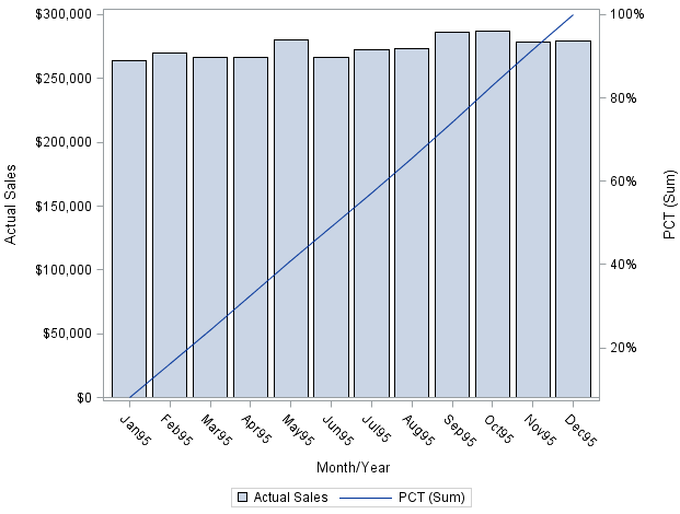
Like this?
proc summary data=SASHELP.PRDSAL2 ;
  where YEAR eq 1995;
  class MONYR;
  var ACTUAL PREDICT;
  output out=SUMMARY  sum=;
run;

data PLOT;
  if _N_=1 then set SUMMARY(where=(MONYR eq .) rename=(ACTUAL=TOTAL) );
  set SUMMARY(where=(MONYR ne .) );
  retain TOTAL;
  PCT+ACTUAL/TOTAL;
  format PCT percent10.1;
run;

proc sgplot data=PLOT;
  vbar monyr / response=ACTUAL ;
  vline monyr / response=PCT y2axis;
run;
(modified from https://communities.sas.com/t5/SAS-GRAPH-and-ODS-Graphics/using-second-y2axis-with-proc-sgplot-vbar/...)
April 27 – 30 | Gaylord Texan | Grapevine, Texas
Registration is open
Walk in ready to learn. Walk out ready to deliver. This is the data and AI conference you can't afford to miss.
Register now and lock in 2025 pricing—just $495!
Learn how use the CAT functions in SAS to join values from multiple variables into a single value.
Find more tutorials on the SAS Users YouTube channel.
SAS Training: Just a Click Away
Ready to level-up your skills? Choose your own adventure.


