- Home
- /
- Programming
- /
- Graphics
- /
- Re: Too few bins in Proc GAREABAR
- RSS Feed
- Mark Topic as New
- Mark Topic as Read
- Float this Topic for Current User
- Bookmark
- Subscribe
- Mute
- Printer Friendly Page
- Mark as New
- Bookmark
- Subscribe
- Mute
- RSS Feed
- Permalink
- Report Inappropriate Content
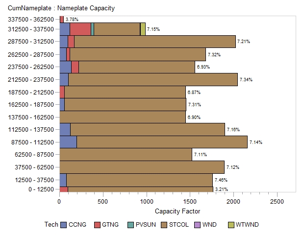
I'm trying to create what amounts to a curve made up of different colored bars where the width and length of the bar varies according to the size of two different variables. There are about 700+ bars, each with a different width and length. It seems like PROC GAREABAR would do the trick, but when I use it, the procedure automatically creates bin ranges for my y-axis variable, so I get a bunch of equally sized bars with different sized "bins" for the y-variable (cumnameplate). What I want is a bar for each level of "cumnameplate" with a width equal to "nameplate" and length equal to "capfac." Can anyone help me to stop SAS from doing this and just create the bars as is? I can't find an option to format the bin width in this procedure. I've included my code, a picture of the chart, and attached some data. Thanks for your help!
My code:
proc gareabar data=charts;
hbar cumnameplate*nameplate /
subgroup=tech
sumvar=capfac
discrete
wstat=sum;
where year=1990;
run;
This is what is looks like:

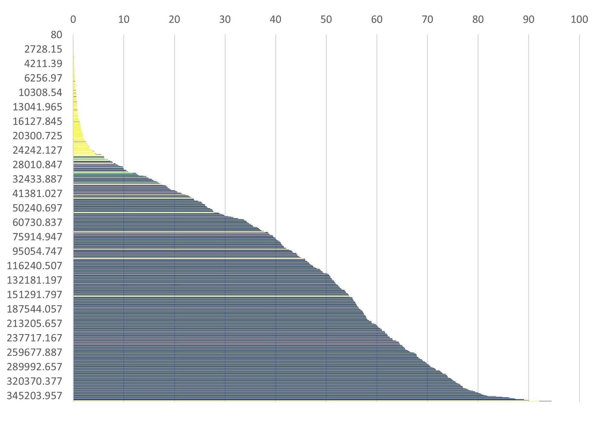
This is basically what I want it to look like, except that I don't want equally sized bars. I want the bars to be the width of the nameplate variable:

- Mark as New
- Bookmark
- Subscribe
- Mute
- RSS Feed
- Permalink
- Report Inappropriate Content
How are you going to display the results? Almost any media smaller than a commercial movie screen is going to be too small for viewers to see the width differences of more than 700 categories.
If I really wanted to do something similar I would probably add a variable to group the data into about 20 of your y values and use that as a by value to generate a series of plots using the same characteristics.
You are likely looking for a discrete setting for midpoint options. Also if you have a format assigned to your y axis variable that could be grouping the data.
- Mark as New
- Bookmark
- Subscribe
- Mute
- RSS Feed
- Permalink
- Report Inappropriate Content
Thanks for the response. My goal is not to have readers be able to differentiate between the different bars, but to look at the overall curve produced by the bars. I want the color of the bars to indicate ranges of technologies used to generate electricity. I will check into the format to be sure I haven't inadvertently grouped the data in some way. My guess is that SAS automatically groups them when you have too many bars to display, but the problem is I want that many bars displayed.
- Mark as New
- Bookmark
- Subscribe
- Mute
- RSS Feed
- Permalink
- Report Inappropriate Content
You'll like need to define an extremely large graphics output area: goptions vsize=60in; or similar for GAREABAR. If the width wasn't as critical a needle plot might be adequate to show the shape. You could calculate the appropriate width and then adjust y values to center so there would be varied spacing between the needles.
- Mark as New
- Bookmark
- Subscribe
- Mute
- RSS Feed
- Permalink
- Report Inappropriate Content
I managed to get GAREABAR to give me all of the bars by changing the numeric variable to a character variable, but the chart still looks pretty bad. Because there are so many bars, they visually seem to overlap each other, and so there's no apparent color differentiation between the different technologies. I think I will probably try to figure something else out, most likely with a scatter chart. I'll leave this as unanswered in case anyone else has any ideas for how to make the chart work.
- Mark as New
- Bookmark
- Subscribe
- Mute
- RSS Feed
- Permalink
- Report Inappropriate Content
With the shape that you showed previously, you might be able to work with a step plot of some sort.
700 colors aren't likely to be helpful unless possibly using some sort of gradient.
Possibly a butterfly chart where one direction is the value and the other direction indicates the number of records might convey some of what you are getting at.
Learn how use the CAT functions in SAS to join values from multiple variables into a single value.
Find more tutorials on the SAS Users YouTube channel.
SAS Training: Just a Click Away
Ready to level-up your skills? Choose your own adventure.


