- Home
- /
- Programming
- /
- Graphics
- /
- Re: Split format label for xaxis values with PROC SGPLOT
- RSS Feed
- Mark Topic as New
- Mark Topic as Read
- Float this Topic for Current User
- Bookmark
- Subscribe
- Mute
- Printer Friendly Page
- Mark as New
- Bookmark
- Subscribe
- Mute
- RSS Feed
- Permalink
- Report Inappropriate Content
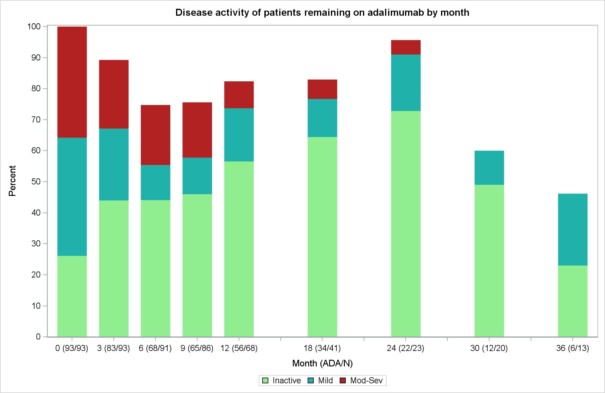
I am trying to split the formmated xasix values in two lines with PROC SGPLOT but it is not working. Anybody has idea how to do that with SGPLOT (not GCHART)?
ods html gpath="&figuredir" image_dpi=200 ;
ods graphics/reset=index scale=off /*border=off*/ imagename="Descriptive Figure - PGA v1" width=10in height=6.5in;
title1 "Disease activity of patients remaining on adalimumab by month";
footnote;

proc sgplot data=freq dattrmap=attrmap2;
   vbar time / group=pgagrp  response=percent2  name="grouping"   BARWIDTH=0.7 NOOUTLINE  attrid=pgagrp     ;
   xaxis type=linear values=(0 to 36 by 3) label="Month (ADA/N)" fitpolicy=split SPLITCHAR=" ";
   yaxis label='Percent' values=(0 to 100 by 10);
   keylegend "grouping"   ;
   format   pgagrp pgagrptwo. time tfmttwo. percent2 7.1;
run;

ods graphics off;Accepted Solutions
- Mark as New
- Bookmark
- Subscribe
- Mute
- RSS Feed
- Permalink
- Report Inappropriate Content
Aah, that's right. It collapses all the blanks together into one blank value. You will need to use non breaking space for each of the blank value. Note, each one has to be different, so they don't get lumped into one category. See: http://blogs.sas.com/content/graphicallyspeaking/2012/09/03/doing-more-with-nbsp/
- Mark as New
- Bookmark
- Subscribe
- Mute
- RSS Feed
- Permalink
- Report Inappropriate Content
Use the SPLITALWAYS fitpolicy instead of the SPLIT policy. The SPLIT policy splits only when there is a collision.
- Mark as New
- Bookmark
- Subscribe
- Mute
- RSS Feed
- Permalink
- Report Inappropriate Content
I just tried fitpolicy=SPLITALWAYS but it did not work.
- Mark as New
- Bookmark
- Subscribe
- Mute
- RSS Feed
- Permalink
- Report Inappropriate Content
Sorry, I just picked up on the fact that you are using TYPE=LINEAR. In that case, the SPLIT policies have no effect. They work only for DISCRETE axes.
- Mark as New
- Bookmark
- Subscribe
- Mute
- RSS Feed
- Permalink
- Report Inappropriate Content
The value is numeric but the formatted value is discrete. SAS does not have options for that situation?
- Mark as New
- Bookmark
- Subscribe
- Mute
- RSS Feed
- Permalink
- Report Inappropriate Content
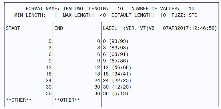
Can you show us what your tfmttwo format definition looks like?
- Mark as New
- Bookmark
- Subscribe
- Mute
- RSS Feed
- Permalink
- Report Inappropriate Content
Here is the format:
- Mark as New
- Bookmark
- Subscribe
- Mute
- RSS Feed
- Permalink
- Report Inappropriate Content
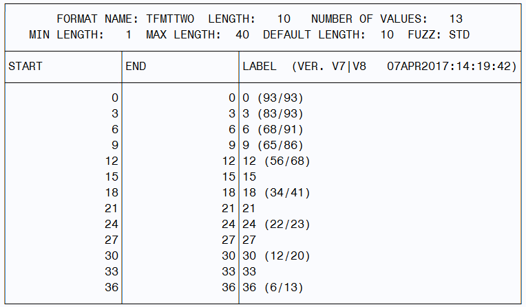
Here is a workaround. You could remove the TYPE=Linear, and keep the discrete behavior. Include all values 1-36 by 3 in the category column, with missing response for the ones you don't want (15, 21, etc). Then, you can get the gaps on the x axis, and set FitPolicy=SplitAlways. Use format or VALUESDISPLAY to control x-axis tick display.
- Mark as New
- Bookmark
- Subscribe
- Mute
- RSS Feed
- Permalink
- Report Inappropriate Content
I edited the format and removed TYPE=LINEAR. Now it splits but how can I hide the values I don't want: 15, 21, 27. 33?
ods html gpath="&figuredir" image_dpi=200 ;
ods graphics/reset=index scale=off /*border=off*/ imagename="test" width=10in height=6.5in;
title1 "Disease activity of patients remaining on adalimumab by month";
proc sgplot data=freq dattrmap=attrmap2;
   vbar time / group=pgagrp  response=percent2  name="grouping"   BARWIDTH=0.7 NOOUTLINE  attrid=pgagrp     ;
   xaxis    values=(0 to 36 by 3)       label="Month (ADA/N)" fitpolicy=SPLITALWAYS  SPLITCHAR=" ";
   yaxis label='Percent' values=(0 to 100 by 10);
   keylegend "grouping"
   format   pgagrp pgagrptwo. time tfmttwo. percent2 7.1;
run;
ods graphics off;
- Mark as New
- Bookmark
- Subscribe
- Mute
- RSS Feed
- Permalink
- Report Inappropriate Content
Cool. Two ways. One, you can put that in your format, make those values blank. Or, you can use VALUESDISPLAY option on the x-axis.
- Mark as New
- Bookmark
- Subscribe
- Mute
- RSS Feed
- Permalink
- Report Inappropriate Content
I tried making them blank in the format but I don't think it worked.
- Mark as New
- Bookmark
- Subscribe
- Mute
- RSS Feed
- Permalink
- Report Inappropriate Content
Aah, that's right. It collapses all the blanks together into one blank value. You will need to use non breaking space for each of the blank value. Note, each one has to be different, so they don't get lumped into one category. See: http://blogs.sas.com/content/graphicallyspeaking/2012/09/03/doing-more-with-nbsp/
- Mark as New
- Bookmark
- Subscribe
- Mute
- RSS Feed
- Permalink
- Report Inappropriate Content
If your UDF is not aggregating data, then you could try putting the format on the VALUESFORMAT option on the axis and not on the column. Would be easier to help if you attach the full program with data so we can run it and try various options.
- Mark as New
- Bookmark
- Subscribe
- Mute
- RSS Feed
- Permalink
- Report Inappropriate Content
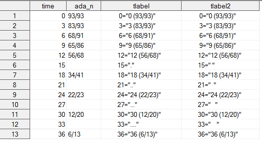
I used the method
xaxis=translate(xaxis, 'A0'x, '.');
you described in the webpage to create the format and it worked!!! Thanks so much!!!
data time_all2;
 merge tfmt time_all;
  by time;
  if time=15 then tlabel=put(time,best12.)||"="||quote('.') ;
  if time=21 then tlabel=put(time,best12.)||"="||quote('..') ;
  if time=27 then tlabel=put(time,best12.)||"="||quote('...') ;
  if time=33 then tlabel=put(time,best12.)||"="||quote('....') ;
  	tlabel2=translate(tlabel, 'A0'x, '.');
run;

proc sql;
 select tlabel2 into :tlabel separated by " "
  from time_all2;
quit;

proc format;
 value tfmttwo &tlabel  ;
run;
proc sgplot data=freq dattrmap=attrmap2;
vbar time / group=pgagrp response=percent2 name="grouping" BARWIDTH=0.7 NOOUTLINE attrid=pgagrp ;
xaxis values=(0 to 36 by 3) label="Month (ADA/N)" fitpolicy=SPLITALWAYS SPLITCHAR=" " ;
yaxis label='Percent' values=(0 to 100 by 10);
keylegend "grouping" ;
format pgagrp pgagrptwo. time tfmttwo. percent2 7.1;
run;
April 27 – 30 | Gaylord Texan | Grapevine, Texas
Registration is open
Walk in ready to learn. Walk out ready to deliver. This is the data and AI conference you can't afford to miss.
Register now and save with the early bird rate—just $795!
Learn how use the CAT functions in SAS to join values from multiple variables into a single value.
Find more tutorials on the SAS Users YouTube channel.
SAS Training: Just a Click Away
Ready to level-up your skills? Choose your own adventure.


