- Home
- /
- Programming
- /
- Graphics
- /
- Re: Some problems when plotting scatterplot by using GTL in SAS Studio...
- RSS Feed
- Mark Topic as New
- Mark Topic as Read
- Float this Topic for Current User
- Bookmark
- Subscribe
- Mute
- Printer Friendly Page
- Mark as New
- Bookmark
- Subscribe
- Mute
- RSS Feed
- Permalink
- Report Inappropriate Content
Hey guys,
I'm new to draw plots by using GTL in sas. Recently I was trying to draw scatter plots but some problems occured when i was trying a scatterplot within "layout overlay" block. I used SASHELP.CLASSFIT as my training dataset where x=height and y=weight with group=sex. Also, i wanted to display the plot seperately by using groupdisplay=cluster but I faied. it seemed that the scatterplot was still displayed in a overlay mode. So I'm wondering why the groupdisplay option has no effect? (I run all sas codes in SAS studio 3.8 environment)
here is my code:
ods _all_ close;
ods graphics / reset width=900px height=450px;
ods html style=htmlblue path=odsout file="3-scatter.html";
proc template;
  define statgraph myscatter;
    begingraph /;
      entrytitle "Height and Weight by Sex";
      layout overlay / ;
        scatterplot x=height y=weight /
           group=sex groupdisplay=cluster name="scatter" markerattrs=(size=12 symbol=starfilled);
      endlayout;
    endgraph;
  end;
run;

proc sgrender data=sashelp.classfit template=myscatter;
run;
by the way, I was also wondering how to costomize markers with different colors (i.e., green and ) between male(sex=M) and female(sex=F) but i don't know how.
Thanks in advance for any suggestions!
Myren
Accepted Solutions
- Mark as New
- Bookmark
- Subscribe
- Mute
- RSS Feed
- Permalink
- Report Inappropriate Content
Previously your x variable was 'Height", with "Sex" as the group variable. Now, your x variable is sex. Change it back to height to get the different groups within each value of weight. Make sure to set the axis TYPE=DISCRETE.
- Mark as New
- Bookmark
- Subscribe
- Mute
- RSS Feed
- Permalink
- Report Inappropriate Content
GroupDisplay=Cluster is effective when one of the axes is discrete. You can make your XAXIS discrete to see the effect by setting TYPE=Discrete in the XaxisOpts bundle on the Layout Overlay statement.
Use the DATACOLORS option on the BEGINGRAPH statement to set group colors.
- Mark as New
- Bookmark
- Subscribe
- Mute
- RSS Feed
- Permalink
- Report Inappropriate Content
For SCATTER marker colors, you need to use the DataContrastColors option.
DataColors is used for "fill" colors.
- Mark as New
- Bookmark
- Subscribe
- Mute
- RSS Feed
- Permalink
- Report Inappropriate Content
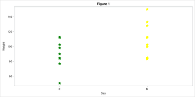
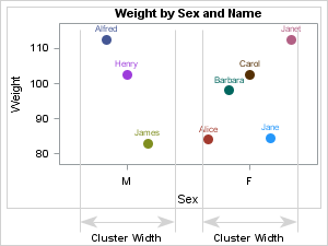
Thanks for your suggestion where I learned a lot. I succeed changing marker colors by DATACONTRASTCOLORS and displaying scatters by using a discrete xaxis(See figure 1 below). However, it seemed that there was still a liitle difference, compared with the example plot in sas reference document (the figure on the right, also see sas document URL here). Perhaps the example here uses a different type of layout? (lattice for example)
- Mark as New
- Bookmark
- Subscribe
- Mute
- RSS Feed
- Permalink
- Report Inappropriate Content
Previously your x variable was 'Height", with "Sex" as the group variable. Now, your x variable is sex. Change it back to height to get the different groups within each value of weight. Make sure to set the axis TYPE=DISCRETE.
- Mark as New
- Bookmark
- Subscribe
- Mute
- RSS Feed
- Permalink
- Report Inappropriate Content
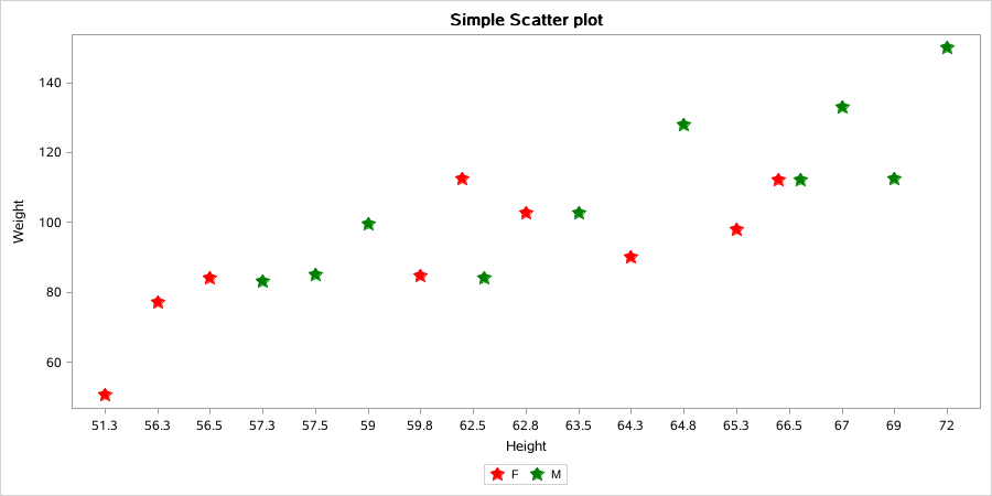
Thanks for your reminding. I tried but it seemed that no changes ocurred. here is my code:
/*1-Basic scatter plot-*/
ods _all_ close;
ods graphics / reset width=900px height=450px;
ods html style=htmlblue path=odsout file="3-scatter.html";
proc template;
  define statgraph myscatter;
    begingraph / datacontrastcolors=(red green);
      entrytitle "Simple Scatter plot";
      layout overlay /
      	xaxisopts=(type=discrete);
        scatterplot x=height y=weight / group=sex groupdisplay=cluster name="scatter" markerattrs=(size=12 symbol=starfilled);
        discretelegend "scatter";
      endlayout;
    endgraph;
  end;
run;

proc sgrender data=sashelp.classfit template=myscatter;
run;
result:
Catch up on SAS Innovate 2026
Nearly 200 sessions are now available on demand with the SAS Innovate Digital Pass.
Explore Now →Learn how use the CAT functions in SAS to join values from multiple variables into a single value.
Find more tutorials on the SAS Users YouTube channel.
SAS Training: Just a Click Away
Ready to level-up your skills? Choose your own adventure.


