- Home
- /
- Programming
- /
- Graphics
- /
- SGPLOT: Vbar graph Data with Different color and Pattern
- RSS Feed
- Mark Topic as New
- Mark Topic as Read
- Float this Topic for Current User
- Bookmark
- Subscribe
- Mute
- Printer Friendly Page
- Mark as New
- Bookmark
- Subscribe
- Mute
- RSS Feed
- Permalink
- Report Inappropriate Content
I am trying to create Vbar histrogram chart using SGPLOT. I am having difficulty in adjusting the patterns and colors for the Bars. I am looking if ' trt=1" Data Bar as 'Grey filled and any Pattern" and other one as 'Solid filled black color' . Thank you for your suggestions. I tried some codes using SAS documentation but not able to achieve it.
data have;
input visit$  trt$  pct crit ;
datalines;
visit1      1      	15         	1
visit1      1    	20       	2
visit1      1   	30      	3
visit1      2    	14         	1
visit1      2     	25         	2
visit1      2     	21         	3
;
run;
ods graphics on/ width=8 in height=4 in   ;
ods html;
proc sgplot data=have;
*styleattrs datacolors=(black grey) ;
	vbar crit / response=pct group=trt groupdisplay=cluster
				  fillpattern nofill clusterwidth=0.7;*fillpatternattrs=(pattern=r1 )fillpattern nofill 	;
	  xaxis display=(nolabel);
	  yaxis grid;
run;
ods listing close;
ods _all_ close;
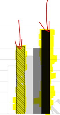
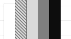
Sample of Bars ( highlighted)
Accepted Solutions
- Mark as New
- Bookmark
- Subscribe
- Mute
- RSS Feed
- Permalink
- Report Inappropriate Content
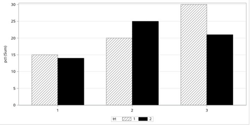
@Reeza is correct -- we do not currently support fill patterns in discrete attribute maps. Therefore, we have to take a "positional" approach here.
First, make sure your data is sorted by "trt". Next, set both the DATACOLORS and DATACONTRASTCOLORS on the STYLESATTRS statement to account for each value of "trt". For each "patterned" bar, set the DATACOLOR to be white. The black solid bar should be set to black. For the DATACONTRASTCOLORS (which affects the lines), set the first color to grey and the second color to black (effectively giving you a solid black bar). Now, for each value of "trt" set a pattern in DATAFILLPATTERNS (the pattern for the black bars does not matter, as it will disappear).
data have;
input visit$  trt$  pct crit ;
datalines;
visit1      1      	15         	1
visit1      1       20          2
visit1      1       30          3
visit1      2       14         	1
visit1      2       25          2
visit1      2       21          3
;
run;
ods graphics on/ width=8 in height=4 in   ;
ods html;
proc sgplot data=have;
styleattrs datacolors=(white black) datacontrastcolors=(grey black) datafillpatterns=(r1 r1);
	vbar crit / response=pct group=trt groupdisplay=cluster fillpattern clusterwidth=0.7;
    xaxis display=(nolabel);
    yaxis grid;
run;
Hope this helps!
Dan
- Mark as New
- Bookmark
- Subscribe
- Mute
- RSS Feed
- Permalink
- Report Inappropriate Content
Note that you can use a Discrete Attribute Map but I don't see a way to control the fillpattern with the map so may need both approaches.
Example in docs is similar to yours for colour
https://documentation.sas.com/doc/en/pgmsascdc/9.4_3.5/grstatproc/n18szqcwir8q2nn10od9hhdh2ksj.htm
- Mark as New
- Bookmark
- Subscribe
- Mute
- RSS Feed
- Permalink
- Report Inappropriate Content
Thank you @Reeza . I think I messed up the section. thank you for your reference. I will look into the reference.
- Mark as New
- Bookmark
- Subscribe
- Mute
- RSS Feed
- Permalink
- Report Inappropriate Content
@Reeza is correct -- we do not currently support fill patterns in discrete attribute maps. Therefore, we have to take a "positional" approach here.
First, make sure your data is sorted by "trt". Next, set both the DATACOLORS and DATACONTRASTCOLORS on the STYLESATTRS statement to account for each value of "trt". For each "patterned" bar, set the DATACOLOR to be white. The black solid bar should be set to black. For the DATACONTRASTCOLORS (which affects the lines), set the first color to grey and the second color to black (effectively giving you a solid black bar). Now, for each value of "trt" set a pattern in DATAFILLPATTERNS (the pattern for the black bars does not matter, as it will disappear).
data have;
input visit$  trt$  pct crit ;
datalines;
visit1      1      	15         	1
visit1      1       20          2
visit1      1       30          3
visit1      2       14         	1
visit1      2       25          2
visit1      2       21          3
;
run;
ods graphics on/ width=8 in height=4 in   ;
ods html;
proc sgplot data=have;
styleattrs datacolors=(white black) datacontrastcolors=(grey black) datafillpatterns=(r1 r1);
	vbar crit / response=pct group=trt groupdisplay=cluster fillpattern clusterwidth=0.7;
    xaxis display=(nolabel);
    yaxis grid;
run;
Hope this helps!
Dan
- Mark as New
- Bookmark
- Subscribe
- Mute
- RSS Feed
- Permalink
- Report Inappropriate Content
Thank you @DanH_sas for detailed explanation. This served my requirement. However I have one question for my knowledge purpose.
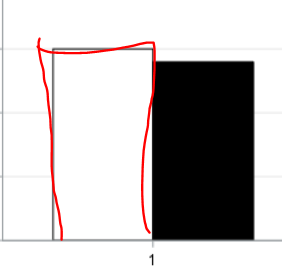
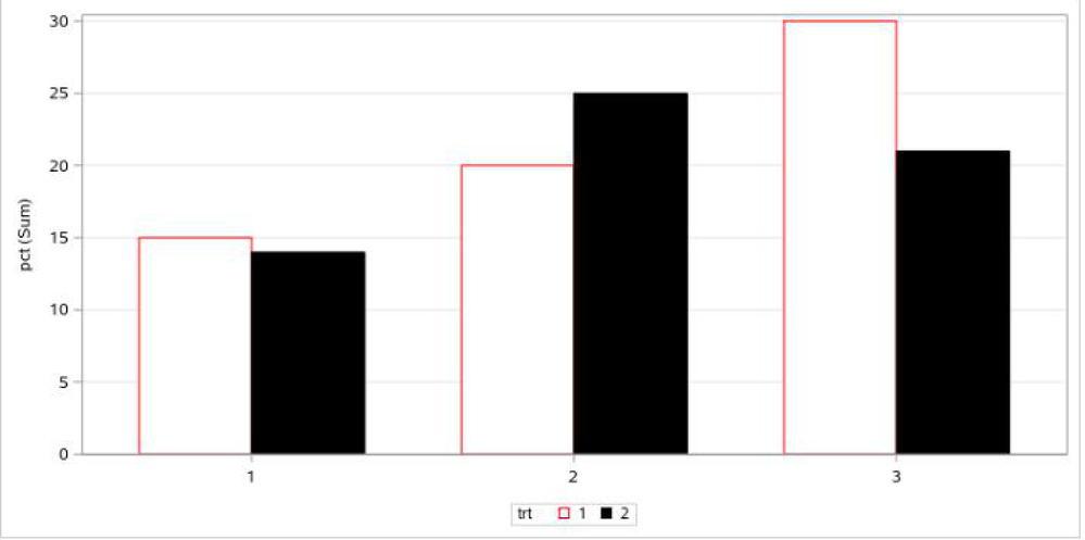
1. Just curious. Is there any option in 'styleattr' that will change the outline of the bar ( I mean border of the bar)? Like if If I wanna change to Red border.
- Mark as New
- Bookmark
- Subscribe
- Mute
- RSS Feed
- Permalink
- Report Inappropriate Content
Turning off the fill patterns on the bar charge and changing the "grey" to "red" in the DATACONTRASTCOLORS will give you that result.Now, that being said, dropping the fill patterns opens up the possibility of using discrete attribute maps (mentioned by @Reeza), which is normally more desirable than depending on data positions. For an example of these attribute maps, see page 9 of a style paper I did a while back (https://support.sas.com/resources/papers/proceedings17/SAS0675-2017.pdf).
- Mark as New
- Bookmark
- Subscribe
- Mute
- RSS Feed
- Permalink
- Report Inappropriate Content
Thank you. Really appreciate your help.
- Mark as New
- Bookmark
- Subscribe
- Mute
- RSS Feed
- Permalink
- Report Inappropriate Content
You show only two levels of TRT in the example. Is that the actual case of your data or do you have more levels? This is important as if there are more than 2 levels this leaves a lot of information out: "if ' trt=1" Data Bar as 'Grey filled and any Pattern" and other one as 'Solid filled black color'" . When you start specifying descriptions you should for all the values of the variable.
- Mark as New
- Bookmark
- Subscribe
- Mute
- RSS Feed
- Permalink
- Report Inappropriate Content
Thank you for your response. Yes for now I only have only two levels.
- Mark as New
- Bookmark
- Subscribe
- Mute
- RSS Feed
- Permalink
- Report Inappropriate Content
This is called Experience and smartness( which I am trying to achieve). @ballardw When you asked this question, I was not sure I would be needed to do more than two categories of trt.
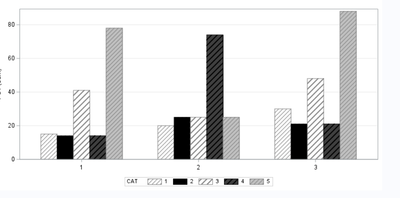
Here I come up with a scenario where our people want specific patterns in 5 different groups ( I feel stupid 😂that I should have continued with your question and gotten an answer when I posted this initially).
I used @DanH_sas code to generate a basic graph.
1. How can I control the patterns as in small snippets in the order of 'cat.' order of cat is 1( white), 2( grey with black),.... 5( black filled).
2. I want to learn how I can place the 'cat 'legend in Vertical instead of horizontally
3. can we Place the legend as two columns X 3 rows kind ..with 'cat'
4. Control the y-axis automatically based on the highest values and round to the nearest number ending with '0' ( depends on the interval, but in my case interval is 20 between two values on the axis).
Example: in my data, cat 5 has the highest pct = 88, so I want my y-axis maximum to be 100
@DanH_sas @ballardw @Reeza I really appreciate if you can shed some light on this.
data have;
input visit$  cat$  pct crit ;
datalines;
visit1      1      	15         	1
visit1      1       20          2
visit1      1       30          3
visit1      2       14         	1
visit1      2       25          2
visit1      2       21          3
visit1      3       41         	1
visit1      3       25          2
visit1      3       48         	3
visit1      4       14         	1
visit1      4       74          2
visit1      4       21          3
visit1      5       78        	1
visit1      5       25          2
visit1      5       88          3

;
run;
ods graphics on/ width=8 in height=4 in border =off   ;
ods html;
proc sgplot data=have;
styleattrs datacolors=(white black) datacontrastcolors=(grey black) datafillpatterns=(r1 r2);
	vbar crit / response=pct group=cat groupdisplay=cluster fillpattern clusterwidth=0.7;
    xaxis display=(nolabel);
    yaxis grid;
run;
- Mark as New
- Bookmark
- Subscribe
- Mute
- RSS Feed
- Permalink
- Report Inappropriate Content
Unfortunately, we do not currently have pattern support in the discrete attribute map functionality. However, the GTL program below should give you what you want, provided that "cat" is in sorted order:
proc template;
define statgraph barchart;
begingraph / datacontrastolors=(white grey lightgrey grey black) datacolors=(white)
             datafillpatterns=(S L2 S S S) attrpriority=none;
layout overlay / xaxisopts=(display=(ticks tickvalues line)) yaxisopts=(griddisplay=on);
   barchart  category=crit response=pct / group=cat Display=all NAME="VBAR" groupdisplay=cluster
             clusterwidth=0.7 outlineattrs=(color=black);
   DiscreteLegend "VBAR"/ title="cat";
endlayout;
endgraph;
end;
run;

data have;
input visit$  cat$  pct crit ;
datalines;
visit1      1      	15         	1
visit1      1       20          2
visit1      1       30          3
visit1      2       14         	1
visit1      2       25          2
visit1      2       21          3
visit1      3       41         	1
visit1      3       25          2
visit1      3       48         	3
visit1      4       14         	1
visit1      4       74          2
visit1      4       21          3
visit1      5       78        	1
visit1      5       25          2
visit1      5       88          3

;
run;
ods graphics on/ width=8 in height=4 in border =off   ;
ods html;
proc sgrender data=have template=barchart; run;
ods html close;- Mark as New
- Bookmark
- Subscribe
- Mute
- RSS Feed
- Permalink
- Report Inappropriate Content
Thank you, @DanH_sas for the quick solution. That's incredible.
Can you please help on this, as will that I mentioned in a recent post, (I do not have much experience in template)
2. I want to learn how I can place the 'cat 'legend in Vertical instead of horizontally below the graph
3. can we Place the legend as two columns X 3 rows kind ..with 'cat'
4. Control the y-axis automatically based on the highest values and round to the nearest number ending with '0' ( depends on the interval, but in my case interval is 20 between two values on the axis).
- Mark as New
- Bookmark
- Subscribe
- Mute
- RSS Feed
- Permalink
- Report Inappropriate Content
Here are the changes to the template:
proc template;
define statgraph barchart;
begingraph / datacontrastolors=(white grey lightgrey grey black) datacolors=(white)
             datafillpatterns=(S L2 S S S) attrpriority=none;
layout overlay / xaxisopts=(display=(ticks tickvalues line)) yaxisopts=(griddisplay=on linearopts=(thresholdmax=1));
   barchart  category=crit response=pct / group=cat Display=all NAME="VBAR" groupdisplay=cluster
             clusterwidth=0.7 outlineattrs=(color=black);
   DiscreteLegend "VBAR"/ title="cat" halign=right across=2;
endlayout;
endgraph;
end;
run;- Mark as New
- Bookmark
- Subscribe
- Mute
- RSS Feed
- Permalink
- Report Inappropriate Content
Thank you, @DanH_sas it worked for me. The only thing I changed is I used "valign= bottom" as per my requirement in legend (of course I learned "align" concepts from your code). Thanks again.
- Mark as New
- Bookmark
- Subscribe
- Mute
- RSS Feed
- Permalink
- Report Inappropriate Content
Might have been a better idea to start a new thread and reference this one.
1. How can I control the patterns as in small snippets in the order of 'cat.' order of cat is 1( white), 2( grey with black),.... 5( black filled).
Sort the data by the Cat variable. Then make sure that the styleattrs overrides are in the order needed. Which means a value for every cat level in each attribute.
2. I want to learn how I can place the 'cat 'legend in Vertical instead of horizontally
Not sure what this means. Have the text run vertically? Have the color/pattern example taller than they are wide? Have the entries stacked above each other?
possibly related:
3. can we Place the legend as two columns X 3 rows kind ..with 'cat'
The KEYLEGEND statement controls appearance of the legend. The options DOWN= and ACROSS=, number of rows and columns can be specified. Note that if you do not specify enough total items, such as Down*Across=4 and there are 5 categories then results are problematic. If you use: Keylegend /across=1; then you get one column and the items are vertically stacked.
4. Control the y-axis automatically based on the highest values and round to the nearest number ending with '0' ( depends on the interval, but in my case interval is 20 between two values on the axis).
The XAXIS, YAXIS, XAXIS2 and YAXIS2 statements control appearance of axis labels. I'm not sure how "automatic" you expect the result to be. SAS normally does a fair job with regular interval marks. If you don't like those then you can supply a VALUES list. So something like a Values=(0 to 200 by 20) might be a start. Then add the VALUESHINT option. So if the range of values stops at 88 then the tick values will be "reasonable" but may not exactly meet your desire depending on where in the interval the maximum (or minimum) values appear. Or delve into macro language for getting summary values matching the plot data and then use those values to create a macro variable to hold the desired range in a values statement.
Catch up on SAS Innovate 2026
Nearly 200 sessions are now available on demand with the SAS Innovate Digital Pass.
Explore Now →Learn how use the CAT functions in SAS to join values from multiple variables into a single value.
Find more tutorials on the SAS Users YouTube channel.
SAS Training: Just a Click Away
Ready to level-up your skills? Choose your own adventure.

