- Home
- /
- Programming
- /
- Graphics
- /
- Re: SGPLOT SCATTER with Quantile Bins?
- RSS Feed
- Mark Topic as New
- Mark Topic as Read
- Float this Topic for Current User
- Bookmark
- Subscribe
- Mute
- Printer Friendly Page
- Mark as New
- Bookmark
- Subscribe
- Mute
- RSS Feed
- Permalink
- Report Inappropriate Content
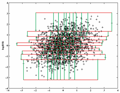
The following scatter plot divides the observations into 10 groups using y-axis first and then 10 subgroups for each using x-axis second.
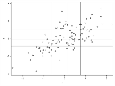
Can I do this dependent grouping in SAS? This is my simple trial of independent grouping in SAS, but I cannot limit the length of each LINEPARM in SGPLOT, so wonder whether dependent grouping is available.
Here is the code.
data _01;
do i=1 to 100;
x=rannor(1);
y=x+rannor(1);
output;
end;
run;
proc iml;
use _01;
read all var{x y};
call qntl(xq,x);
call qntl(yq,y);
call symputx("xq",rowcat(char(xq)`+" "));
call symputx("yq",rowcat(char(yq)`+" "));
quit;
proc sgplot noautolegend;
scatter x=x y=y;
lineparm x=%scan(&xq.,1," ") y=0 slope=.;
lineparm x=%scan(&xq.,2," ") y=0 slope=.;
lineparm x=%scan(&xq.,3," ") y=0 slope=.;
lineparm x=0 y=%scan(&yq.,1," ") slope=0;
lineparm x=0 y=%scan(&yq.,2," ") slope=0;
lineparm x=0 y=%scan(&yq.,3," ") slope=0;
run;
Thanks.
Accepted Solutions
- Mark as New
- Bookmark
- Subscribe
- Mute
- RSS Feed
- Permalink
- Report Inappropriate Content
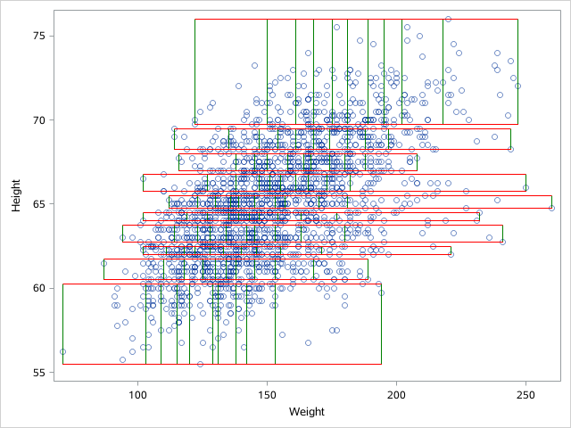
OK . How about this one.
data heart;
set sashelp.heart(obs=2000 keep=height weight
where=(height is not missing and weight is not missing)) ;
run;

proc rank data=heart out=have groups=10 ties=high;
var height;
ranks r_height;
run;
proc sort data=have;by r_height;run;
proc rank data=have out=have1 groups=10 ties=high;
by r_height;
var weight;
ranks r_weight;
run;
proc sql;
create table have2 as
select a.*,r_weight,min_w,max_w from (
select r_height,min(height) as min_h,max(height) as max_h,
min(weight) as min_w2,max(weight) as max_w2
 from have1
  group by r_height) as a
left join (
select r_height,r_weight,min(weight) as min_w,max(weight) as max_w
 from have1
  group by r_height,r_weight) as b
on a.r_height=b.r_height;
quit;

data have3;
 set have2;
 by r_height;
 if first.r_height then do;
 o_y=max_h;o_x=min_w;
 y=min_h;x=min_w;

 o_y2=max_h;o_x2=min_w2;
 y2=max_h;x2=max_w2;
 output;
 end;

 o_y=max_h;o_x=max_w;
 y=min_h;x=max_w;

 o_y2=min_h;o_x2=min_w2;
 y2=min_h;x2=max_w2;

 output;
run;

data want;
 set heart have3;
run;
proc sgplot data=want noautolegend;
scatter x=weight y=height/ transparency=0.5;
vector x=x y=y / xorigin=o_x yorigin=o_y noarrowheads lineattrs=(color=green);
vector x=x2 y=y2 / xorigin=o_x2 yorigin=o_y2 noarrowheads lineattrs=(color=red);
run;- Mark as New
- Bookmark
- Subscribe
- Mute
- RSS Feed
- Permalink
- Report Inappropriate Content
What version of SAS are you using?
- Mark as New
- Bookmark
- Subscribe
- Mute
- RSS Feed
- Permalink
- Report Inappropriate Content
It is SAS 9.4 TS1M5.
- Mark as New
- Bookmark
- Subscribe
- Mute
- RSS Feed
- Permalink
- Report Inappropriate Content
The DRAWING of it is definitely possible, using things such as annotation, VECTOR plot, of possibly POLYGON plot. The tricky part to making it look like the original figure is to figure out the min/max points within each bin. @Rick_SAS , any way to get this information from PROC IML?
- Mark as New
- Bookmark
- Subscribe
- Mute
- RSS Feed
- Permalink
- Report Inappropriate Content
Sure. use the QNTL function unconditionally for the Y axis (horizontal bins), then subset (use LOC function) and use the QNTL function again on each strip to subdivide in the direction of the X axis. I performed similar computations in my article about the 2-D bin plot, but I was interested in using evenly spaced cutpoints in each direction (thus a regular grid) whereas the OP is interested in quantile-based cutpoints. I suggest using rectangles and the polygon plot for overlaying the grid.
It's a great question! I'd write the program but I'm trying to finish a task. I'll look at it later unless someone else programs it first.
- Mark as New
- Bookmark
- Subscribe
- Mute
- RSS Feed
- Permalink
- Report Inappropriate Content
OK . How about this one.
data heart;
set sashelp.heart(obs=2000 keep=height weight
where=(height is not missing and weight is not missing)) ;
run;

proc rank data=heart out=have groups=10 ties=high;
var height;
ranks r_height;
run;
proc sort data=have;by r_height;run;
proc rank data=have out=have1 groups=10 ties=high;
by r_height;
var weight;
ranks r_weight;
run;
proc sql;
create table have2 as
select a.*,r_weight,min_w,max_w from (
select r_height,min(height) as min_h,max(height) as max_h,
min(weight) as min_w2,max(weight) as max_w2
 from have1
  group by r_height) as a
left join (
select r_height,r_weight,min(weight) as min_w,max(weight) as max_w
 from have1
  group by r_height,r_weight) as b
on a.r_height=b.r_height;
quit;

data have3;
 set have2;
 by r_height;
 if first.r_height then do;
 o_y=max_h;o_x=min_w;
 y=min_h;x=min_w;

 o_y2=max_h;o_x2=min_w2;
 y2=max_h;x2=max_w2;
 output;
 end;

 o_y=max_h;o_x=max_w;
 y=min_h;x=max_w;

 o_y2=min_h;o_x2=min_w2;
 y2=min_h;x2=max_w2;

 output;
run;

data want;
 set heart have3;
run;
proc sgplot data=want noautolegend;
scatter x=weight y=height/ transparency=0.5;
vector x=x y=y / xorigin=o_x yorigin=o_y noarrowheads lineattrs=(color=green);
vector x=x2 y=y2 / xorigin=o_x2 yorigin=o_y2 noarrowheads lineattrs=(color=red);
run;- Mark as New
- Bookmark
- Subscribe
- Mute
- RSS Feed
- Permalink
- Report Inappropriate Content
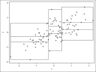
Here I also attach my version.
data a;
do i=1 to 100;
x=rannor(1);
y=x+rannor(1);
output;
end;
run;
proc iml;
use a;
read all var{x y};
call qntl(qx,x,do(0,1,1/3));
call qntl(q1,y[loc(x<=qx[2])],do(0,1,1/3));
call qntl(q2,y[loc(x>qx[2] & x<=qx[3])],do(0,1,1/3));
call qntl(q3,y[loc(x>qx[3])],do(0,1,1/3));
qy=q1||q2||q3;
b=j(45,2);
do i=1 to 3;
do j=1 to 3;
do k=1 to 5;
if k=1 then b[15*i+5*j+k-20,]=qx[i]||qy[j,i];
else if k=2 then b[15*i+5*j+k-20,]=qx[i]||qy[j+1,i];
else if k=3 then b[15*i+5*j+k-20,]=qx[i+1]||qy[j+1,i];
else if k=4 then b[15*i+5*j+k-20,]=qx[i+1]||qy[j,i];
else b[15*i+5*j+k-20,]=qx[i]||qy[j,i];
end;
end;
end;
create b(rename=(col1=x1 col2=y1)) from b;
append from b;
quit;
data b;
set b;
if mod(_n_,5)=1 then function="polyline";
else function="polycont";
drawspace="datavalue";
linethickness=1;
run;
proc sgplot data=a sganno=b;
scatter x=x y=y;
run;
quit;
And the output here.
Thanks.
- Mark as New
- Bookmark
- Subscribe
- Mute
- RSS Feed
- Permalink
- Report Inappropriate Content
The original request was for partitioning by the Y quantiles first, then partitioning by X within each Y region. However, the picture looks like the subdivisions are first by X and then by Y.
- Mark as New
- Bookmark
- Subscribe
- Mute
- RSS Feed
- Permalink
- Report Inappropriate Content
The Y and then X example.
data a;
do i=1 to 100;
x=rannor(1);
y=x+rannor(1);
output;
end;
run;
proc iml;
use a;
read all var{x y};
call qntl(qy,y,do(0,1,1/3));
call qntl(q1,x[loc(y<=qy[2])],do(0,1,1/3));
call qntl(q2,x[loc(y>qy[2] & y<=qy[3])],do(0,1,1/3));
call qntl(q3,x[loc(y>qy[3])],do(0,1,1/3));
qx=q1||q2||q3;
b=j(45,2);
do i=1 to 3;
do j=1 to 3;
do k=1 to 5;
if k=1 then b[15*i+5*j+k-20,]=qx[j,i]||qy[i];
if k=2 then b[15*i+5*j+k-20,]=qx[j+1,i]||qy[i];
if k=3 then b[15*i+5*j+k-20,]=qx[j+1,i]||qy[i+1];
if k=4 then b[15*i+5*j+k-20,]=qx[j,i]||qy[i+1];
if k=5 then b[15*i+5*j+k-20,]=qx[j,i]||qy[i];
end;
end;
end;
create b(rename=(col1=x1 col2=y1)) from b;
append from b;
quit;
data b;
set b;
if mod(_n_,5)=1 then function="polyline";
else function="polycont";
drawspace="datavalue";
linethickness=1;
run;
ods listing gpath="!userprofile\desktop\";
ods graphics/reset;
ods results=off;
proc sgplot data=a sganno=b;
scatter x=x y=y;
run;
ods results=on;
quit;
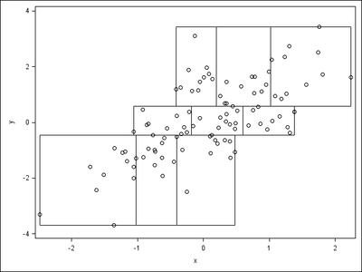
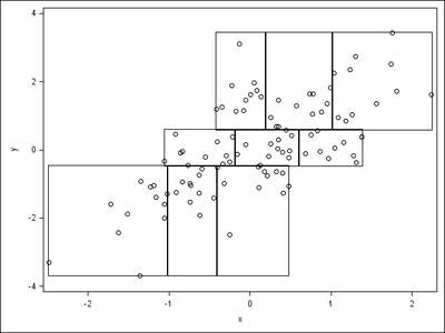
And the results.
Actually, in SGANNO, I tried RECTANGLE first as POLYLINE requires 5 observations for each bin while RECTANGLE requires only 1, but I realized that the RECTANGLE output is slightly ugly as follows.
data a;
do i=1 to 100;
x=rannor(1);
y=x+rannor(1);
output;
end;
run;
proc iml;
use a;
read all var{x y};
call qntl(qy,y,do(0,1,1/3));
call qntl(q1,x[loc(y<=qy[2])],do(0,1,1/3));
call qntl(q2,x[loc(y>qy[2] & y<=qy[3])],do(0,1,1/3));
call qntl(q3,x[loc(y>qy[3])],do(0,1,1/3));
qx=q1||q2||q3;
b=j(9,4);
do i=1 to 3;
do j=1 to 3;
b[3*i+j-3,]=qx[j,i]||qy[i]||qx[j+1,i]-qx[j,i]||qy[i+1]-qy[i];
end;
end;
create b(rename=(col1=x1 col2=y1 col3=width col4=height)) from b;
append from b;
quit;
data b;
set b;
function="rectangle";
drawspace="datavalue";
anchor="bottomleft";
linethickness=1;
widthunit="data";
heightunit="data";
run;
ods listing gpath="!userprofile\desktop\";
ods graphics/reset;
ods results=off;
proc sgplot data=a sganno=b;
scatter x=x y=y;
run;
ods results=on;
quit;
It seems RECTANGLE draws the lines one pixel outside the region, while POLYLINE draw the exact lines.
POLYLINE seems to be better than RECTANGLE.
Learn how use the CAT functions in SAS to join values from multiple variables into a single value.
Find more tutorials on the SAS Users YouTube channel.
SAS Training: Just a Click Away
Ready to level-up your skills? Choose your own adventure.
