- Home
- /
- Programming
- /
- Graphics
- /
- SAS GTL Axis Headers
- RSS Feed
- Mark Topic as New
- Mark Topic as Read
- Float this Topic for Current User
- Bookmark
- Subscribe
- Mute
- Printer Friendly Page
- Mark as New
- Bookmark
- Subscribe
- Mute
- RSS Feed
- Permalink
- Report Inappropriate Content
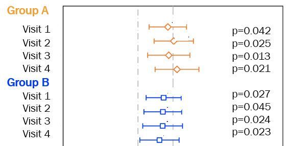
I am attempting to create a graph that resembles the following:
I have been able to create something similar using SAS GTL scatterplot with xerrorlower and xerrorupper options. I figure I can add the p values using the annotate facility. However, I am stuck on how to create headers (Group A, Group B) for the visits along the y-axis. Adding color to the headers (as shown above) would also be great, but not a requirement. Any general guidance on this would be appreciated!
Accepted Solutions
- Mark as New
- Bookmark
- Subscribe
- Mute
- RSS Feed
- Permalink
- Report Inappropriate Content
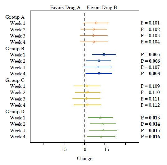
It is much easier to use the AxisTables in GTL or SGPLOT to create this kind of a graph. See the ForestPlot example in recent paper: http://support.sas.com/rnd/datavisualization/papers/2018/2180-2018.pdf
- Mark as New
- Bookmark
- Subscribe
- Mute
- RSS Feed
- Permalink
- Report Inappropriate Content
Thank you very much, Sanjay! That is an excellent paper and a great introduction to AxisTables - which I have not used before. I was able to create exactly what I needed. Your help, as always, is much appreciated!
Catch up on SAS Innovate 2026
Dive into keynotes, announcements and breakthroughs on demand.
Explore Now →Learn how use the CAT functions in SAS to join values from multiple variables into a single value.
Find more tutorials on the SAS Users YouTube channel.
SAS Training: Just a Click Away
Ready to level-up your skills? Choose your own adventure.


