- Home
- /
- Programming
- /
- Graphics
- /
- Re: Proportionally Sized Bubble Plots
- RSS Feed
- Mark Topic as New
- Mark Topic as Read
- Float this Topic for Current User
- Bookmark
- Subscribe
- Mute
- Printer Friendly Page
- Mark as New
- Bookmark
- Subscribe
- Mute
- RSS Feed
- Permalink
- Report Inappropriate Content
Hey there,
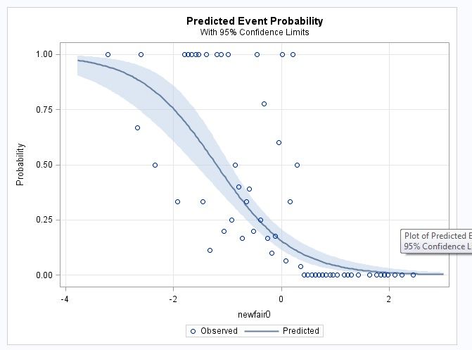
I have here an example of logistic regression, which spits out the graph of probabilty curve. On this graph, each dot represent all kids that scored a certain standard score (z score) on the NEWFAIR0 test. Now, I want the dots to reflect the numerus they represent, such that if a dot represents one kid, it should be smaller, and if it represents, say, 15 kids, it should be bigger. A dot in my data can represent from 1 to 31 kids. Here is my data and my code for logistic regression, but I dont know how to make the size of the dots proportional to the numerus of kids they represent. Thanks!!
data done4; input newfair0 parentdys N;
datalines;
-3.21 1 1
-2.67 2 3
-2.6 1 1
-2.34 2 4
-1.93 1 3
-1.8 1 1
-1.73 2 2
-1.66 2 2
-1.59 2 2
-1.53 1 1
-1.46 1 3
-1.39 1 1
-1.33 1 9
-1.19 2 2
-1.12 3 3
-1.06 1 5
-0.99 2 2
-0.92 1 4
-0.85 1 2
-0.79 2 5
-0.72 2 12
-0.65 1 3
-0.59 9 23
-0.52 1 5
-0.45 1 1
-0.38 1 4
-0.32 7 9
-0.25 1 6
-0.18 1 10
-0.11 3 17
-0.05 3 5
0.02 1 1
0.09 2 31
0.16 1 3
0.22 2 2
0.29 1 2
0.36 1 25
0.42 0 6
0.49 0 6
0.56 0 1
0.63 0 9
0.69 0 5
0.76 0 4
0.83 0 23
0.9 0 3
0.96 0 5
1.03 0 2
1.16 0 3
1.23 0 5
1.3 0 1
1.43 0 1
1.64 0 1
1.77 0 1
1.84 0 5
1.91 0 3
1.97 0 1
2.11 0 7
2.24 0 2
2.44 0 3
;
run;
ods graphics on;
proc logistic data=done4 plots(only)=(roc(id=obs) effect);
model parentdys/n=newfair0 / scale=none
clparm=wald
clodds=pl
rsquare;
units newfair0=1.00;
run;
ods graphics off;

Accepted Solutions
- Mark as New
- Bookmark
- Subscribe
- Mute
- RSS Feed
- Permalink
- Report Inappropriate Content
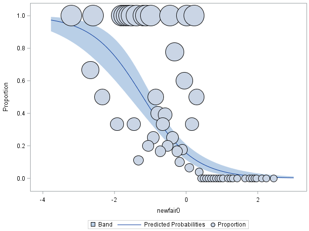
Something like this. You have to add the bubble size you want.
ods graphics on;
ods output EffectPlot=EffectPlot;

proc logistic data=done4 plots(only)=(roc(id=obs) effect);
model parentdys/n=newfair0 / scale=none
clparm=wald
clodds=pl
rsquare;
units newfair0=1.00; output out=t/ profile;
run;

ods graphics off;

proc sgplot data= EffectPlot;
  band   x=_XVAR     upper=_UPPER  lower=_LOWER ;
  spline x=_XVAR     y=_PROB;
  bubble x=_XVAR_OBS y=_PROPORTION size=_PROPORTION ;
run;
- Mark as New
- Bookmark
- Subscribe
- Mute
- RSS Feed
- Permalink
- Report Inappropriate Content
- Mark as New
- Bookmark
- Subscribe
- Mute
- RSS Feed
- Permalink
- Report Inappropriate Content
Thank you. I have already looked at that website. Even though it is helpful in general, it does not help a lot in my case where the probabilities on the y axis are generated by the log regression, so you cannot define them as y=.... in the proc template. That's my main issue - what the code would be for y
- Mark as New
- Bookmark
- Subscribe
- Mute
- RSS Feed
- Permalink
- Report Inappropriate Content
There are times when to get the graph you want you generate a data set from a procedure and plot that with tools with more controls.
Most of the analysis procedure charts are designed more for analysis than publication.
- Mark as New
- Bookmark
- Subscribe
- Mute
- RSS Feed
- Permalink
- Report Inappropriate Content
Thanks. Any ideas how i could do that in my case?
- Mark as New
- Bookmark
- Subscribe
- Mute
- RSS Feed
- Permalink
- Report Inappropriate Content
Something like this. You have to add the bubble size you want.
ods graphics on;
ods output EffectPlot=EffectPlot;

proc logistic data=done4 plots(only)=(roc(id=obs) effect);
model parentdys/n=newfair0 / scale=none
clparm=wald
clodds=pl
rsquare;
units newfair0=1.00; output out=t/ profile;
run;

ods graphics off;

proc sgplot data= EffectPlot;
  band   x=_XVAR     upper=_UPPER  lower=_LOWER ;
  spline x=_XVAR     y=_PROB;
  bubble x=_XVAR_OBS y=_PROPORTION size=_PROPORTION ;
run;
- Mark as New
- Bookmark
- Subscribe
- Mute
- RSS Feed
- Permalink
- Report Inappropriate Content
Thanks!! That's exactly what I needed - a code that gets me started from somewhere. Will look into it in more detail.
Catch up on SAS Innovate 2026
Nearly 200 sessions are now available on demand with the SAS Innovate Digital Pass.
Explore Now →Learn how use the CAT functions in SAS to join values from multiple variables into a single value.
Find more tutorials on the SAS Users YouTube channel.
SAS Training: Just a Click Away
Ready to level-up your skills? Choose your own adventure.


