- Home
- /
- Programming
- /
- Graphics
- /
- Proportionally Sized Bubble Plots
- RSS Feed
- Mark Topic as New
- Mark Topic as Read
- Float this Topic for Current User
- Bookmark
- Subscribe
- Mute
- Printer Friendly Page
- Mark as New
- Bookmark
- Subscribe
- Mute
- RSS Feed
- Permalink
- Report Inappropriate Content
Hey there,
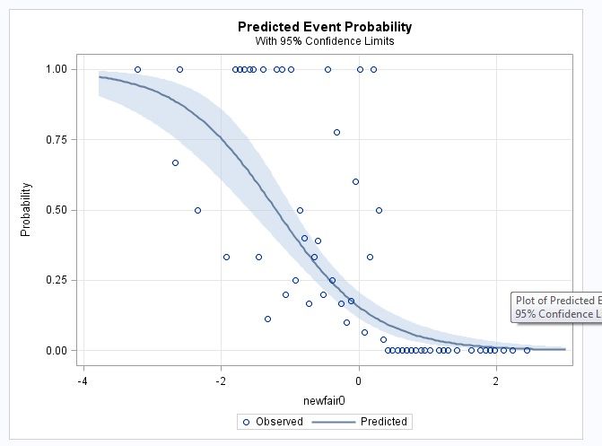
I have here an example of logistic regression, which spits out the graph of probabilty curve. On this graph, each dot represent all kids that scored a certain standard score (z score) on the NEWFAIR0 test. Now, I want the dots to reflect the numerus they represent, such that if a dot represents one kid, it should be smaller, and if it represents, say, 15 kids, it should be bigger. A dot in my data can represent from 1 to 31 kids. Here is my data and my code for logistic regression, but I dont know how to make the size of the dots proportional to the numerus of kids they represent. Thanks!!
data done4; input newfair0 parentdys N;
datalines;
-3.21 1 1
-2.67 2 3
-2.6 1 1
-2.34 2 4
-1.93 1 3
-1.8 1 1
-1.73 2 2
-1.66 2 2
-1.59 2 2
-1.53 1 1
-1.46 1 3
-1.39 1 1
-1.33 1 9
-1.19 2 2
-1.12 3 3
-1.06 1 5
-0.99 2 2
-0.92 1 4
-0.85 1 2
-0.79 2 5
-0.72 2 12
-0.65 1 3
-0.59 9 23
-0.52 1 5
-0.45 1 1
-0.38 1 4
-0.32 7 9
-0.25 1 6
-0.18 1 10
-0.11 3 17
-0.05 3 5
0.02 1 1
0.09 2 31
0.16 1 3
0.22 2 2
0.29 1 2
0.36 1 25
0.42 0 6
0.49 0 6
0.56 0 1
0.63 0 9
0.69 0 5
0.76 0 4
0.83 0 23
0.9 0 3
0.96 0 5
1.03 0 2
1.16 0 3
1.23 0 5
1.3 0 1
1.43 0 1
1.64 0 1
1.77 0 1
1.84 0 5
1.91 0 3
1.97 0 1
2.11 0 7
2.24 0 2
2.44 0 3
;
run;
ods graphics on;
proc logistic data=done4 plots(only)=(roc(id=obs) effect);
model parentdys/n=newfair0 / scale=none
clparm=wald
clodds=pl
rsquare;
units newfair0=1.00;
run;
ods graphics off;

Accepted Solutions
- Mark as New
- Bookmark
- Subscribe
- Mute
- RSS Feed
- Permalink
- Report Inappropriate Content
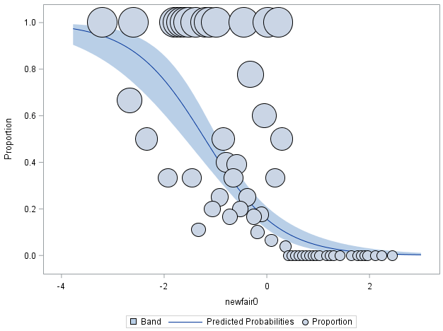
Something like this. You have to add the bubble size you want.
ods graphics on;
ods output EffectPlot=EffectPlot;

proc logistic data=done4 plots(only)=(roc(id=obs) effect);
model parentdys/n=newfair0 / scale=none
clparm=wald
clodds=pl
rsquare;
units newfair0=1.00; output out=t/ profile;
run;

ods graphics off;

proc sgplot data= EffectPlot;
  band   x=_XVAR     upper=_UPPER  lower=_LOWER ;
  spline x=_XVAR     y=_PROB;
  bubble x=_XVAR_OBS y=_PROPORTION size=_PROPORTION ;
run;
- Mark as New
- Bookmark
- Subscribe
- Mute
- RSS Feed
- Permalink
- Report Inappropriate Content
- Mark as New
- Bookmark
- Subscribe
- Mute
- RSS Feed
- Permalink
- Report Inappropriate Content
Thank you. I have already looked at that website. Even though it is helpful in general, it does not help a lot in my case where the probabilities on the y axis are generated by the log regression, so you cannot define them as y=.... in the proc template. That's my main issue - what the code would be for y
- Mark as New
- Bookmark
- Subscribe
- Mute
- RSS Feed
- Permalink
- Report Inappropriate Content
There are times when to get the graph you want you generate a data set from a procedure and plot that with tools with more controls.
Most of the analysis procedure charts are designed more for analysis than publication.
- Mark as New
- Bookmark
- Subscribe
- Mute
- RSS Feed
- Permalink
- Report Inappropriate Content
Thanks. Any ideas how i could do that in my case?
- Mark as New
- Bookmark
- Subscribe
- Mute
- RSS Feed
- Permalink
- Report Inappropriate Content
Something like this. You have to add the bubble size you want.
ods graphics on;
ods output EffectPlot=EffectPlot;

proc logistic data=done4 plots(only)=(roc(id=obs) effect);
model parentdys/n=newfair0 / scale=none
clparm=wald
clodds=pl
rsquare;
units newfair0=1.00; output out=t/ profile;
run;

ods graphics off;

proc sgplot data= EffectPlot;
  band   x=_XVAR     upper=_UPPER  lower=_LOWER ;
  spline x=_XVAR     y=_PROB;
  bubble x=_XVAR_OBS y=_PROPORTION size=_PROPORTION ;
run;
- Mark as New
- Bookmark
- Subscribe
- Mute
- RSS Feed
- Permalink
- Report Inappropriate Content
Thanks!! That's exactly what I needed - a code that gets me started from somewhere. Will look into it in more detail.
Catch up on SAS Innovate 2026
Dive into keynotes, announcements and breakthroughs on demand.
Explore Now →Learn how use the CAT functions in SAS to join values from multiple variables into a single value.
Find more tutorials on the SAS Users YouTube channel.
SAS Training: Just a Click Away
Ready to level-up your skills? Choose your own adventure.


