- Home
- /
- Programming
- /
- Graphics
- /
- Re: Proc SGplot - formatting X axis
- RSS Feed
- Mark Topic as New
- Mark Topic as Read
- Float this Topic for Current User
- Bookmark
- Subscribe
- Mute
- Printer Friendly Page
- Mark as New
- Bookmark
- Subscribe
- Mute
- RSS Feed
- Permalink
- Report Inappropriate Content
Hi,
Please see the attached.
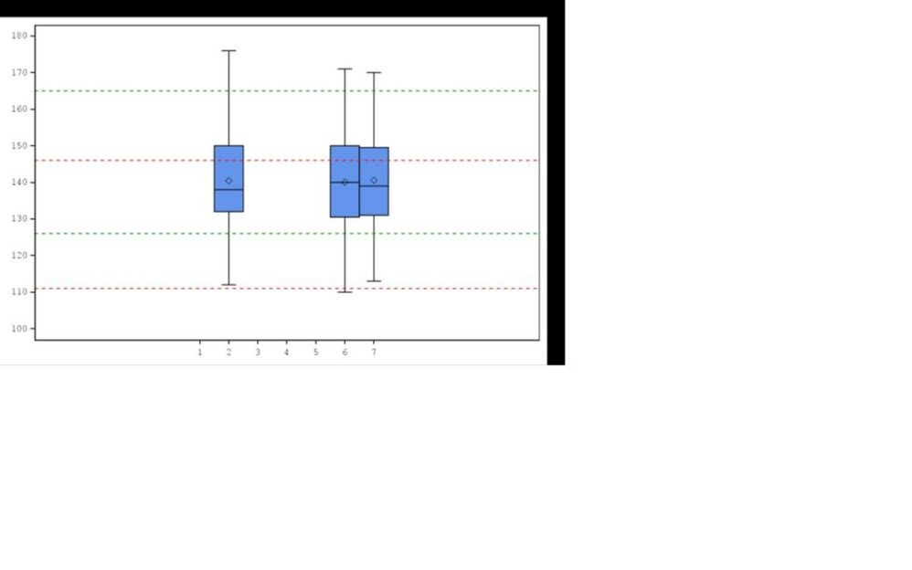
Obvious question - I need the values on X axis to be spread the entire axis equidistant.
Here is my code
%let colour = %str(red|green|blue);
proc sgplot data=final noautolegend;
vbox aval / category=avisitn datalabel=usubjid boxwidth=1;
%do i = 1 %to &n.;
%let col&i = %scan(&colour,&i,'|');
refline &&minref&i &&maxref&i / axis=y lineattrs=(pattern=shortdash color=&&col&i);
%end;
yaxis type=linear values=(&minval. to &maxval. by &byvar.) label=%sysfunc(compbl("¶m."));
xaxis type=linear values=(1 2 3 4 5 6 7) label="Visit";
run;
It seems there is something obvious that I'm missing here. Any help would be appreciated.
Thanks,
D
Accepted Solutions
- Mark as New
- Bookmark
- Subscribe
- Mute
- RSS Feed
- Permalink
- Report Inappropriate Content
Somethings are not matching between the graph and the code you have.provided. You have provided x-axis label of "Visit", but I don't see it on the axis. Also, I assume the AVISITN values are from 1-7, but it it is not cleary what is causing the large offsets on left or right. I suggest try setting xaxis offsetmin=0 offsetmax=0 to see if the axis stretches the full width. If yes, you could put in the right fractional value to get what you want. But, still it is not clear what is causing the offsets.
It would be easier to help if you send a program with built in (sample) data as part of the program. Then we can try running your program. Which SAS release do you have?
I ran this code and it worked for me. I removed DataLabel=usubjid and the macro lines for reference lines. Note I did get the "Visit" label on the x-axis.
data final;
  do avisitn=2, 6, 7;
    do j=1 to 100;
	  aval=100+80*ranuni(2);
	  output;
	end;
  end;
run;

proc sgplot data=final noautolegend;
vbox aval / category=avisitn  boxwidth=1  ;
xaxis type=linear values=(1 2 3 4 5 6 7) label="Visit" ;
run;- Mark as New
- Bookmark
- Subscribe
- Mute
- RSS Feed
- Permalink
- Report Inappropriate Content
Downloading of Microsoft Office documents is discouraged, as it is a security risk. So, I can't see the problem.
Paige Miller
- Mark as New
- Bookmark
- Subscribe
- Mute
- RSS Feed
- Permalink
- Report Inappropriate Content
Can't paste the plot here. Don't know how to present the plot.
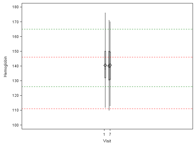
Main problem is - the values on x axis are concentrated near the centre, taking 1/3 of the total space on x axis. So the rest 2/3 are just empty. I want the values to be spread equally on the entire x axis
- Mark as New
- Bookmark
- Subscribe
- Mute
- RSS Feed
- Permalink
- Report Inappropriate Content
Attach plot as pdf file?
Paige Miller
- Mark as New
- Bookmark
- Subscribe
- Mute
- RSS Feed
- Permalink
- Report Inappropriate Content
Somethings are not matching between the graph and the code you have.provided. You have provided x-axis label of "Visit", but I don't see it on the axis. Also, I assume the AVISITN values are from 1-7, but it it is not cleary what is causing the large offsets on left or right. I suggest try setting xaxis offsetmin=0 offsetmax=0 to see if the axis stretches the full width. If yes, you could put in the right fractional value to get what you want. But, still it is not clear what is causing the offsets.
It would be easier to help if you send a program with built in (sample) data as part of the program. Then we can try running your program. Which SAS release do you have?
I ran this code and it worked for me. I removed DataLabel=usubjid and the macro lines for reference lines. Note I did get the "Visit" label on the x-axis.
data final;
  do avisitn=2, 6, 7;
    do j=1 to 100;
	  aval=100+80*ranuni(2);
	  output;
	end;
  end;
run;

proc sgplot data=final noautolegend;
vbox aval / category=avisitn  boxwidth=1  ;
xaxis type=linear values=(1 2 3 4 5 6 7) label="Visit" ;
run;- Mark as New
- Bookmark
- Subscribe
- Mute
- RSS Feed
- Permalink
- Report Inappropriate Content
Hi Sanjay,
The label for x-axis and y-axis are not shown on the attached file as I copied the plot from a pdf output onto a MS word doc.
The AVISITN is from 1-7, yes.
Without the macro lines for refline and datalabel=usubjid, I'm getting the same plot as you have got.
My guess is the probably the refline statement is causing the problem but can't figure out why?
I'll try the offsetmin and offsetmax as you've suggested. If that doesn't work, I'll put a sample data with my code.
- Mark as New
- Bookmark
- Subscribe
- Mute
- RSS Feed
- Permalink
- Report Inappropriate Content
We can better help debug this if you include the full code, with all the macro variables and sample data so we can run the program to see the results. If you have long usubjid data labels, they will contribute of offsets. But I don't see any data labels either.
- Mark as New
- Bookmark
- Subscribe
- Mute
- RSS Feed
- Permalink
- Report Inappropriate Content
Hi Sanjay,
The offsetmin/max = 0.1 worked. Thanks for that.
But I'm still unsure why the problem occured at the first place. So I ran my code without those options. Here is my code and output and attached is the data (sample) in pdf.
%macro labplot(paramcd = , minval = , maxval= , byvar= );
options mprint mlogic;
data adlb;
set adam.adlb;
where saffl = "Y" and aval ne . and paramcd = "%qupcase(¶mcd)";
param = propcase(param);
keep usubjid avisitn avisit paramcd param trtan aval anrlo anrhi;
run;
proc sort data = adlb out=final;
by usubjid;
run;
proc sql noprint;
select param
into: param
from final;
select count(distinct anrlo)
into: n
from final;
select distinct anrlo
into: minref1 - : minref%cmpres(&n.)
from final;
select distinct anrhi
into: maxref1 - : maxref%cmpres(&n.)
from final;
quit;
%let colour = %str(red|green|blue);
ods graphics on / reset=all imagefmt=png outputfmt=PNG border=off height=100% width=100% antialias=on imagename="hemoglobin";
proc sgplot data=final noautolegend;
vbox aval / category=avisitn datalabel=usubjid boxwidth=1;
%do i = 1 %to &n.;
%let col&i = %scan(&colour,&i,'|');
refline &&minref&i &&maxref&i / axis=y lineattrs=(pattern=shortdash color=&&col&i);
%end;
yaxis type=linear values=(&minval. to &maxval. by &byvar.) label=%sysfunc(compbl("¶m."));
xaxis type=linear values=(1 2 3 4 5 6 7) label="Visit" /*offsetmin=0.1 offsetmax=0.1*/;
run;
ods graphics off;
%mend labplot;
%labplot(paramcd = HGB, minval=100, maxval=180, byvar=10);
- Mark as New
- Bookmark
- Subscribe
- Mute
- RSS Feed
- Permalink
- Report Inappropriate Content
If you can send a simple program with built in data (like my example) that shows the problem, you have a better chance to get more help from the community. With a program using macros and data in pdf, it is much harder to help debug the issue.
- Mark as New
- Bookmark
- Subscribe
- Mute
- RSS Feed
- Permalink
- Report Inappropriate Content
Without using the macro, I'm getting what I want. It's only when I use the macro, the offset problem occurs. Anyway using offsetmin/max=0.1 solve my problem.
Thanks for the solution. I'll be mindful about the data while I ask question next time.
- Mark as New
- Bookmark
- Subscribe
- Mute
- RSS Feed
- Permalink
- Report Inappropriate Content
Run the code with options MPRINT symbolgen;
compare the log of the run with the code you have that generated the desired graph before you added any macro variables.
Did you by any chance generate an earlier version of the graph of OFFSETMAX on the XAXIS and not replace the actual output file for some reason such as open in another program to view the result?
You may want to look at your ODS Graphics options and ODS PDF.
- Mark as New
- Bookmark
- Subscribe
- Mute
- RSS Feed
- Permalink
- Report Inappropriate Content
- Mark as New
- Bookmark
- Subscribe
- Mute
- RSS Feed
- Permalink
- Report Inappropriate Content
Catch up on SAS Innovate 2026
Dive into keynotes, announcements and breakthroughs on demand.
Explore Now →Learn how use the CAT functions in SAS to join values from multiple variables into a single value.
Find more tutorials on the SAS Users YouTube channel.
SAS Training: Just a Click Away
Ready to level-up your skills? Choose your own adventure.


