Turn on suggestions
Auto-suggest helps you quickly narrow down your search results by suggesting possible matches as you type.
Showing results for
- Home
- /
- Programming
- /
- Graphics
- /
- Plot multiple values on the same axis
Options
- RSS Feed
- Mark Topic as New
- Mark Topic as Read
- Float this Topic for Current User
- Bookmark
- Subscribe
- Mute
- Printer Friendly Page
🔒 This topic is solved and locked.
Need further help from the community? Please
sign in and ask a new question.
- Mark as New
- Bookmark
- Subscribe
- Mute
- RSS Feed
- Permalink
- Report Inappropriate Content
Posted 01-31-2018 04:57 PM
(1547 views)
Hello SAS experts,
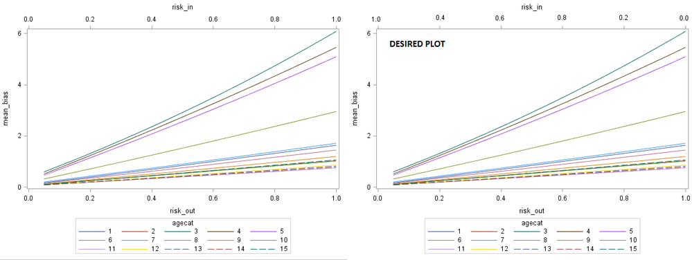
I'd like to create a Desired Plot on the right in the image?
Any comments or demo codes highly appreciated.
Acknowledgement: The code here was suggested by DanH_sas.
proc import datafile="...\plot.txt"
out=plot
dbms=tab replace;
guessingrows=max;
run;
proc sgplot data=PLOT /*data attached*/;
series x=risk_out y=mean_bias / group=agecat;
series x=risk_in y=mean_bias / group=agecat x2axis transparency=1;
run;
1 ACCEPTED SOLUTION
Accepted Solutions
- Mark as New
- Bookmark
- Subscribe
- Mute
- RSS Feed
- Permalink
- Report Inappropriate Content
To get that graph, you will also need a REVERSE:
proc import datafile="...\plot.txt"
out=plot
dbms=tab replace;
guessingrows=max;
run;
proc sgplot data=PLOT /*data attached*/;
series x=risk_out y=mean_bias / group=agecat;
series x=risk_in y=mean_bias / group=agecat x2axis transparency=1;
x2axis reverse;
run;
Hope this helps!
Dan
1 REPLY 1
- Mark as New
- Bookmark
- Subscribe
- Mute
- RSS Feed
- Permalink
- Report Inappropriate Content
To get that graph, you will also need a REVERSE:
proc import datafile="...\plot.txt"
out=plot
dbms=tab replace;
guessingrows=max;
run;
proc sgplot data=PLOT /*data attached*/;
series x=risk_out y=mean_bias / group=agecat;
series x=risk_in y=mean_bias / group=agecat x2axis transparency=1;
x2axis reverse;
run;
Hope this helps!
Dan
Catch up on SAS Innovate 2026
Nearly 200 sessions are now available on demand with the SAS Innovate Digital Pass.
Explore Now →How to Concatenate Values
Learn how use the CAT functions in SAS to join values from multiple variables into a single value.
Find more tutorials on the SAS Users YouTube channel.
SAS Training: Just a Click Away
Ready to level-up your skills? Choose your own adventure.


