- Home
- /
- Programming
- /
- Graphics
- /
- Re: Placement of data labels PROC TEMPLATE using DATALABELPOSITION see...
- RSS Feed
- Mark Topic as New
- Mark Topic as Read
- Float this Topic for Current User
- Bookmark
- Subscribe
- Mute
- Printer Friendly Page
- Mark as New
- Bookmark
- Subscribe
- Mute
- RSS Feed
- Permalink
- Report Inappropriate Content
Hello,
I am attempting to edit the placement of data labels in a SERIES graph in PROC TEMPLATE. The default settings get me to 95% of what I need, but when I specify the DATALABELPOSITION option, results are not as I would expect and the plot becomes unusable.
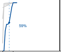
Below is one panel that is problematic using the default settings (note the collision with the line):
Here is the same panel after specifying DATALABELPOSITION=BOTTOMRIGHT, thinking the label would simply move down slightly:
No matter what I try for DATALABELPOSITION, anything other than AUTO scrunches up the graph. Am I missing something that's making it put the label outside the graph/plot region? Pared down code is below.
proc template;
    define statgraph NAME;
      dynamic VAR;
        begingraph / designWidth=2700px designHeight=675px;
            layout dataLattice columnVar=COLVAR /
                headerLabelDisplay=value
                rowAxisOpts=(offsetmin=0 linearopts=(tickvalueformat=percent11.0 viewmin=0) display=(tickvalues ticks label))
                columnAxisOpts=(display=(tickvalues ticks label));
                layout prototype;
                    referenceline x=XREF / lineattrs=(pattern=2 thickness=1);
< More seriesplot statements >
                    seriesplot x=XVAR y=YVAR / yaxis=y lineattrs=(color=&PLOTCOLOR thickness=2);
                    seriesplot x=XVAR y=YVAR / yaxis=y display=(markers) markerattrs=(color=&PLOTCOLOR symbol=circleFilled)
                        datalabel=YVAR2 datalabelattrs=(color=&PLOTCOLOR) datalabelposition=bottomright;
                endlayout;
            endlayout;
        endgraph;
    end;
run;
- Mark as New
- Bookmark
- Subscribe
- Mute
- RSS Feed
- Permalink
- Report Inappropriate Content
Can you include the removed SERIESPLOT statements from your template? Also, what is the format length of your YVAR2 variable?
- Mark as New
- Bookmark
- Subscribe
- Mute
- RSS Feed
- Permalink
- Report Inappropriate Content
seriesplot x=XVAR y=CATEGORY1 / yaxis=y lineattrs=(color=CXD0D0D0 thickness=2);
...
seriesplot x=XVAR y=CATEGORY5 / yaxis=y lineattrs=(color=CXD0D0D0 thickness=2);
YVAR2 is a percent11.0 format with length of 8 (same as YVAR and CATEGORY1 -- CATEGORY5).
XVAR is also a number (best12) with length of 8.
- Mark as New
- Bookmark
- Subscribe
- Mute
- RSS Feed
- Permalink
- Report Inappropriate Content
What do you get if you change the percentage format field width from 11 to 5?
- Mark as New
- Bookmark
- Subscribe
- Mute
- RSS Feed
- Permalink
- Report Inappropriate Content
Great, thanks for the suggestion, I appreciate the assistance. That definitely made a difference, but there is still white space for about a third of the plot. Would you have an idea what else I might be missing?
- Mark as New
- Bookmark
- Subscribe
- Mute
- RSS Feed
- Permalink
- Report Inappropriate Content
Also, set OFFSETMAX=0 (or 0.05) on your rowAxisOpts.
Learn how use the CAT functions in SAS to join values from multiple variables into a single value.
Find more tutorials on the SAS Users YouTube channel.
SAS Training: Just a Click Away
Ready to level-up your skills? Choose your own adventure.


