- Home
- /
- Programming
- /
- Graphics
- /
- PROC GCHART: formatting data labels inside stacked bar chart
- RSS Feed
- Mark Topic as New
- Mark Topic as Read
- Float this Topic for Current User
- Bookmark
- Subscribe
- Mute
- Printer Friendly Page
- Mark as New
- Bookmark
- Subscribe
- Mute
- RSS Feed
- Permalink
- Report Inappropriate Content
I'm trying to get percentages inside a stacked bar chart, but they come out to two decimal places and I just need one. (Note: I had originally posted a version of this in this topic, but didn't get a response, so am posting it here):
https://communities.sas.com/t5/SAS-Procedures/proc-gchart-format-inside-subpct/td-p/25122
Here're my data and code:
And the code:
/*Figure 6:  Coalition Progress on Individual Activities (All Coalitions)*/
title1 "Progress on Individual Activities (All Coalitions)";
axis1 label=("Activity") value=(angle=45 rotate=0);
axis2 label=none value=none;
axis3 label=(angle=90 "Percent") value=("0%" "10%" "20%" "30%" "40%" "50%" "60%" "70%" "80%" "90%" "100%")
	minor=none;
PROC GCHART data=temp;
	format prog1 prog.;
	vbar count / type=percent subgroup=prog1 g100 group=Activity inside=pct
	gaxis=axis1 maxis=axis2 raxis=axis3 width=20;
RUN;
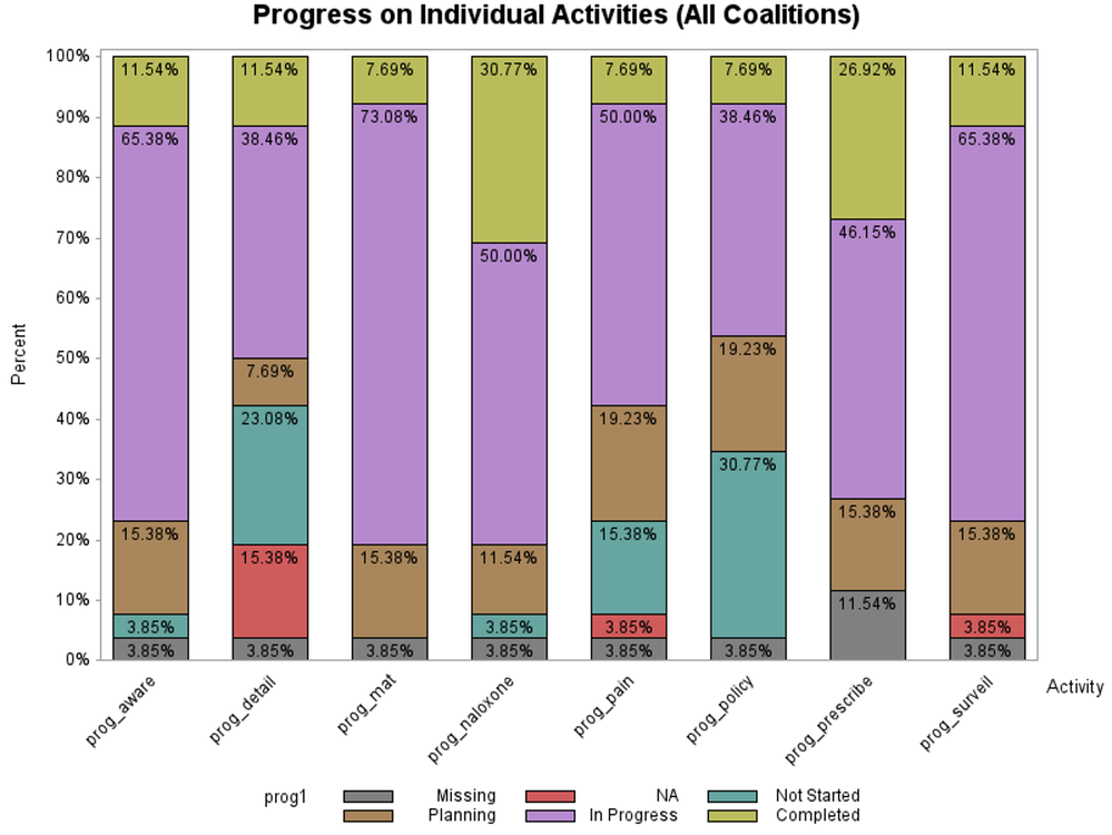
I get this graph, which is very nearly what I need, just that the two decimal points give an impression of a great precision that just isn't in the data!
How can I quickly and easily get the data labels to just one decimal point? Is there anything like the "maxdec" option? Can I apply a variable format? Do I have to do the complex "anno" procedure recommended recommended in this SAS User Community post?
Thanks,
David
Accepted Solutions
- Mark as New
- Bookmark
- Subscribe
- Mute
- RSS Feed
- Permalink
- Report Inappropriate Content
Pre-summarize the data until SAS add a similar G100
proc freq data=sashelp.class;
   tables sex*age / outpct out=work.classfreq;
run;

Proc sgplot data=work.classfreq;
   vbar sex / group=age response=pct_row
         seglabel seglabelformat=f2.;
run;
- Mark as New
- Bookmark
- Subscribe
- Mute
- RSS Feed
- Permalink
- Report Inappropriate Content
- Mark as New
- Bookmark
- Subscribe
- Mute
- RSS Feed
- Permalink
- Report Inappropriate Content
- Mark as New
- Bookmark
- Subscribe
- Mute
- RSS Feed
- Permalink
- Report Inappropriate Content
One of the reasons those sorts of Annotate macros exist is because the older device based graphics did not have options available to format values on bars (among other places in graphs).
Also there is not much updating going on for the older graphics procedures because they were based around devices and device files are not always a good way to go for modern document output.
So Proc SGplot as the options SEGLABEL to add a label to segments of a vertical or horizontal bar chart, which works with the SEGLABELFORMAT to set the display format for the values displayed on the segment. Other options involve SEGLABELFITPOLICY to help fit values into segments (or not) and SEGLABELATTRS to set the text options like font family, color and size of segment text.
- Mark as New
- Bookmark
- Subscribe
- Mute
- RSS Feed
- Permalink
- Report Inappropriate Content
Thanks for this detailed advice! 🙂 I'll apply it and update you with the results. As I mention below to Reeza, I'm still getting up to speed in SAS, so am not familiar with the program's history, commands (oops, procedures!), &c., so I appreciate the explanation on annotate, and on the newer graphics procedures.
- Mark as New
- Bookmark
- Subscribe
- Mute
- RSS Feed
- Permalink
- Report Inappropriate Content
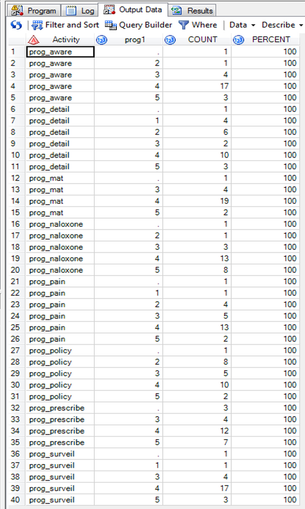
I now remember the reason I used PROC GCHART: the handy "g100" option to ensure that the percentages sum to 100% within each column. My data are frequency counts ("count") of a category ("prog1") within another category ("Activity"). Here's a screenshot of the data.
This code:
/*Figure 6:  Coalition Progress on Individual Activities (All Coalitions)*/
ods listing gpath="H:\Coalitions\";
ods graphics on / imagename="figure6" reset=index;
title1 "Figure 6. Progress by Individual Activities (All Coalitions)";
PROC SGPLOT data=temp2;
	format prog1 prog.;
	vbar Activity / response=count group=prog1 groupdisplay=stack seglabel;
	xaxis label="Activity";
	yaxis label="Percentage of Total for Each Activity";
RUN;
Produces this graphic:
which is farther from what I want than the graphic I produced with PROC GCHART.
It looks like the options I have are:
(1) doing more (or different) data pre-processing to get percentages in the "count" variables in the above data (e.g., the first cell in the count column would be 1/23 = 4.3), then getting the seglabel and segformat options to put in data labels with percent signs, or
(2) using the "annotate" statement with the "g100" option of PROC GCHART.
The first option is probably easier, but isn't their something yet easier--the equivalent of "g100" for PROC SGPLOT?
Thanks for your patience,
David
- Mark as New
- Bookmark
- Subscribe
- Mute
- RSS Feed
- Permalink
- Report Inappropriate Content
- Mark as New
- Bookmark
- Subscribe
- Mute
- RSS Feed
- Permalink
- Report Inappropriate Content
Pre-summarize the data until SAS add a similar G100
proc freq data=sashelp.class;
   tables sex*age / outpct out=work.classfreq;
run;

Proc sgplot data=work.classfreq;
   vbar sex / group=age response=pct_row
         seglabel seglabelformat=f2.;
run;
- Mark as New
- Bookmark
- Subscribe
- Mute
- RSS Feed
- Permalink
- Report Inappropriate Content
- Mark as New
- Bookmark
- Subscribe
- Mute
- RSS Feed
- Permalink
- Report Inappropriate Content
Catch up on SAS Innovate 2026
Nearly 200 sessions are now available on demand with the SAS Innovate Digital Pass.
Explore Now →Learn how use the CAT functions in SAS to join values from multiple variables into a single value.
Find more tutorials on the SAS Users YouTube channel.
SAS Training: Just a Click Away
Ready to level-up your skills? Choose your own adventure.


