- Home
- /
- Programming
- /
- Graphics
- /
- Re: Overlay histogram to compare two variables with 6 different group ...
- RSS Feed
- Mark Topic as New
- Mark Topic as Read
- Float this Topic for Current User
- Bookmark
- Subscribe
- Mute
- Printer Friendly Page
- Mark as New
- Bookmark
- Subscribe
- Mute
- RSS Feed
- Permalink
- Report Inappropriate Content
Hello Everyone,
I have two variables. Female effect and Male effect with levels of effect from 1-6 as values. I want to show a graph where it compare these two variable by overlaying along with displaying the 1-6 groups. I was trying it with histogram but was not getting a proper output.
| Female Effect | Male Effect |
| 6 | 4 |
| 4 | 3 |
| 3 | 5 |
| 5 | 2 |
| 1 | 1 |
| 4 | |
| 5 | 5 |
| 6 | 6 |
| 3 | 3 |
| 4 | 2 |
| 2 | 1 |
| 3 | 4 |
| 4 | 5 |
| 5 | 6 |
| 6 | 3 |
| 1 | 5 |
| 6 | 2 |
| 5 | 6 |
| 4 | 1 |
| 3 | 4 |
| 4 | 3 |
| 5 | 2 |
| 6 | 6 |
| 3 | |
| 4 | 2 |
title "Overlay Histograms with PROC SGPLOT";
proc sgplot data=PD;
  histogram femaleeffect / transparency=0.3
               name="Female" legendlabel="Female" fillattrs=graphdata1;
  histogram maleeffect / transparency=0.3
               name="Male" legendlabel="Male" fillattrs=graphdata2;
  xaxis label="Impact";
  keylegend "Female" "Male" / across=1 position=TopRight location=Inside;
run;
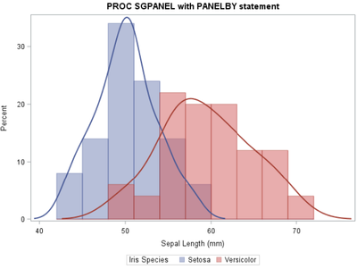
I wanted a overlay histogram as sample bellow without density lines:
Thanks!
Accepted Solutions
- Mark as New
- Bookmark
- Subscribe
- Mute
- RSS Feed
- Permalink
- Report Inappropriate Content
When I use this code I do not get any density lines using SAS 9.4.4
proc sgplot data=PD;
  histogram femaleeffect / transparency=0.3 nbins=6
               name="Female" legendlabel="Female" fillattrs=(color=pink);
  histogram maleeffect / transparency=0.3 nbins=6
               name="Male" legendlabel="Male" fillattrs=(color=lightblue);
  xaxis label="Impact" values=(1 to 6 by 1);
  keylegend "Female" "Male" / across=1 position=TopRight location=Inside;
run;
NBINS is the option to control how many columns are displayed. May want to play with Xaxis options to get offsets as desired.
- Mark as New
- Bookmark
- Subscribe
- Mute
- RSS Feed
- Permalink
- Report Inappropriate Content
The output shown doesn't match the code+data shown. Verify that you're looking at the correct output for your code, which appears correct.
Note for example the title in the code doesn't match the title in the graphic attached or the legend (iris?)
@RAVI2000 wrote:
Hello Everyone,
I have two variables. Female effect and Male effect with levels of effect from 1-6 as values. I want to show a graph where it compare these two variable by overlaying along with displaying the 1-6 groups. I was trying it with histogram but was not getting a proper output.
Female Effect Male Effect 6 4 4 3 3 5 5 2 1 1 4 5 5 6 6 3 3 4 2 2 1 3 4 4 5 5 6 6 3 1 5 6 2 5 6 4 1 3 4 4 3 5 2 6 6 3 4 2 title "Overlay Histograms with PROC SGPLOT"; proc sgplot data=PD; histogram femaleeffect / transparency=0.3 name="Female" legendlabel="Female" fillattrs=graphdata1; histogram maleeffect / transparency=0.3 name="Male" legendlabel="Male" fillattrs=graphdata2; xaxis label="Impact"; keylegend "Female" "Male" / across=1 position=TopRight location=Inside; run;I wanted a overlay histogram as sample bellow without density lines:
Thanks!
- Mark as New
- Bookmark
- Subscribe
- Mute
- RSS Feed
- Permalink
- Report Inappropriate Content
- Mark as New
- Bookmark
- Subscribe
- Mute
- RSS Feed
- Permalink
- Report Inappropriate Content
When I use this code I do not get any density lines using SAS 9.4.4
proc sgplot data=PD;
  histogram femaleeffect / transparency=0.3 nbins=6
               name="Female" legendlabel="Female" fillattrs=(color=pink);
  histogram maleeffect / transparency=0.3 nbins=6
               name="Male" legendlabel="Male" fillattrs=(color=lightblue);
  xaxis label="Impact" values=(1 to 6 by 1);
  keylegend "Female" "Male" / across=1 position=TopRight location=Inside;
run;
NBINS is the option to control how many columns are displayed. May want to play with Xaxis options to get offsets as desired.
- Mark as New
- Bookmark
- Subscribe
- Mute
- RSS Feed
- Permalink
- Report Inappropriate Content
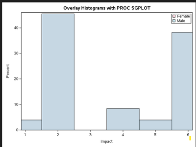
Thank you @Ballarddw. I have tried the above code. By I am not able to get the desired outcome.
Looks like only one color is being represented.
I do have both female and male effect data in the variable.
- Mark as New
- Bookmark
- Subscribe
- Mute
- RSS Feed
- Permalink
- Report Inappropriate Content
Check your input data then and post your code and log. I tested your code with the data you posted and it worked perfectly fine.
data PD;
infile cards dlm='09'x truncover;
input femaleeffect maleeffect;
cards;
6	4
4	3
3	5
5	2

1	1
 	4
5	5
6	6
3	3
4	2

2	1
3	4
4	5
5	6
6	3
1	5
6	2
5	6
4	1
3	4
4	3
5	2
6	6
3
4	2
;;;;
run;

title "Overlay Histograms with PROC SGPLOT";
proc sgplot data=PD;
  histogram femaleeffect / transparency=0.3
               name="Female" legendlabel="Female" fillattrs=graphdata1 nbins=6;
  histogram maleeffect / transparency=0.3
               name="Male" legendlabel="Male" fillattrs=graphdata2 nbins=6;
  xaxis label="Impact";
  keylegend "Female" "Male" / across=1 position=TopRight location=Inside;
run;- Mark as New
- Bookmark
- Subscribe
- Mute
- RSS Feed
- Permalink
- Report Inappropriate Content
- Mark as New
- Bookmark
- Subscribe
- Mute
- RSS Feed
- Permalink
- Report Inappropriate Content
April 27 – 30 | Gaylord Texan | Grapevine, Texas
Registration is open
Walk in ready to learn. Walk out ready to deliver. This is the data and AI conference you can't afford to miss.
Register now and save with the early bird rate—just $795!
Learn how use the CAT functions in SAS to join values from multiple variables into a single value.
Find more tutorials on the SAS Users YouTube channel.
SAS Training: Just a Click Away
Ready to level-up your skills? Choose your own adventure.


