- Home
- /
- Programming
- /
- Graphics
- /
- PROC SGPLOT with two x axis
- RSS Feed
- Mark Topic as New
- Mark Topic as Read
- Float this Topic for Current User
- Bookmark
- Subscribe
- Mute
- Printer Friendly Page
- Mark as New
- Bookmark
- Subscribe
- Mute
- RSS Feed
- Permalink
- Report Inappropriate Content
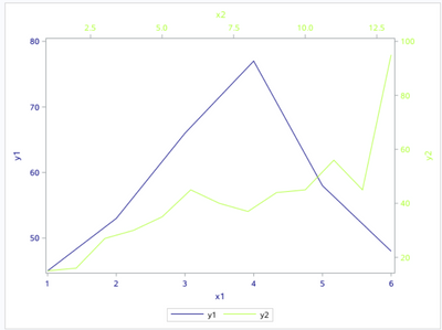
I have two different datasets and want to create a plot with two line graph. The X and Y axis in these two datasets are different. Is it possible to add two X and two Y axis simultaneously in one graph. I found its possible to add two Y axis in PROC SGPLOT. Is there any way to do the same for two X axis using SGPLOT or other SAS procedures?
data have;
input
x1 y1;
datalines;
1 45
2 53
3 66
4 77
5 58
6 48
;
data have2;
input
x2 y2;
datalines;
1 15
2 16
3 27
4 30
5 35
6 45
7 40
8 37
9 44
10 45
11 56
12 45
13 95
;
proc sgplot data=have;
series x=x1 y=y1;
run;
proc sgplot data=have2;
series x=x2 y=y2;
run;
Accepted Solutions
- Mark as New
- Bookmark
- Subscribe
- Mute
- RSS Feed
- Permalink
- Report Inappropriate Content
data have1;
input
x1 y1;
datalines;
1 45
2 53
3 66
4 77
5 58
6 48
;
data have2;
input x2 y2;
datalines;
1 15
2 16
3 27
4 30
5 35
6 45
7 40
8 37
9 44
10 45
11 56
12 45
13 95
;

data want;
 merge have1 have2;
run;

proc sgplot data=want;
series x=x1 y=y1/lineattrs=(color=navy);
series x=x2 y=y2/x2axis y2axis lineattrs=(color=greenyellow);
xaxis valueattrs=(color=navy) labelattrs=(color=navy);
yaxis valueattrs=(color=navy) labelattrs=(color=navy);
x2axis valueattrs=(color=greenyellow) labelattrs=(color=greenyellow);
y2axis valueattrs=(color=greenyellow) labelattrs=(color=greenyellow);
run;
- Mark as New
- Bookmark
- Subscribe
- Mute
- RSS Feed
- Permalink
- Report Inappropriate Content
First would be to combine the data sets.
Depending upon the final desired appearance there a MANY options but this is a basic graph with both lines:
data toplot;
   set have  (in=in1)
       have2 (in=in2)
   ;
run;

proc sgplot data=toplot;
   series x=x1 y=y1;
   series x=x2 y=y2;
run;
Labels, axis controls, style settings for lines/markers might help make the result more usable.
- Mark as New
- Bookmark
- Subscribe
- Mute
- RSS Feed
- Permalink
- Report Inappropriate Content
Thank you!
- Mark as New
- Bookmark
- Subscribe
- Mute
- RSS Feed
- Permalink
- Report Inappropriate Content
data have1;
input
x1 y1;
datalines;
1 45
2 53
3 66
4 77
5 58
6 48
;
data have2;
input x2 y2;
datalines;
1 15
2 16
3 27
4 30
5 35
6 45
7 40
8 37
9 44
10 45
11 56
12 45
13 95
;

data want;
 merge have1 have2;
run;

proc sgplot data=want;
series x=x1 y=y1/lineattrs=(color=navy);
series x=x2 y=y2/x2axis y2axis lineattrs=(color=greenyellow);
xaxis valueattrs=(color=navy) labelattrs=(color=navy);
yaxis valueattrs=(color=navy) labelattrs=(color=navy);
x2axis valueattrs=(color=greenyellow) labelattrs=(color=greenyellow);
y2axis valueattrs=(color=greenyellow) labelattrs=(color=greenyellow);
run;
- Mark as New
- Bookmark
- Subscribe
- Mute
- RSS Feed
- Permalink
- Report Inappropriate Content
Catch up on SAS Innovate 2026
Nearly 200 sessions are now available on demand with the SAS Innovate Digital Pass.
Explore Now →Learn how use the CAT functions in SAS to join values from multiple variables into a single value.
Find more tutorials on the SAS Users YouTube channel.
SAS Training: Just a Click Away
Ready to level-up your skills? Choose your own adventure.


