- Home
- /
- Programming
- /
- Graphics
- /
- Multiple plots with different vertical bars
- RSS Feed
- Mark Topic as New
- Mark Topic as Read
- Float this Topic for Current User
- Bookmark
- Subscribe
- Mute
- Printer Friendly Page

- Mark as New
- Bookmark
- Subscribe
- Mute
- RSS Feed
- Permalink
- Report Inappropriate Content
Hello,
proc sgplot data=_5A;
pbspline x=Date y=max / nomarkers lineattrs=(color=cxB30000) legendlabel="Maximum";
pbspline x=Date y=q3 / nomarkers lineattrs=(color=cxE34A33) legendlabel="3rd quantile";
pbspline x=Date y=median / nomarkers lineattrs=(color=cxFC8D59) legendlabel="Median";
pbspline x=Date y=q1 / nomarkers lineattrs=(color=cxFDCC8A) legendlabel="1st quantile";
pbspline x=Date y=min / nomarkers lineattrs=(color=cxFEF0D9) legendlabel="Minimum";
keylegend / noborder position=top location=inside across=1;
;run;quit;
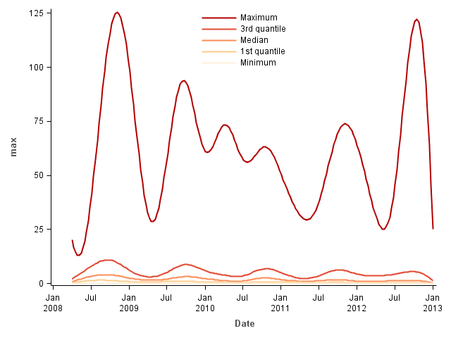
This is a time series plot of different values at 20 different dates.
I would like to create 20 different versions of this same plot, each time with one vertical line at the 20 different dates.

- Mark as New
- Bookmark
- Subscribe
- Mute
- RSS Feed
- Permalink
- Report Inappropriate Content
First, depending on what you are trying to model, you might want to consider quantile regression. See Quantile regression: Better than connecting the sample quantiles of binned data - The DO Loop
To answer your question, you could use the SGPANEL procedure with DATE as the PANELBY variable and the orginal (unsummarized) data as the Y variable.
However, you should also consider whether a single plot might suffice. A scatter plot of DATE vs "original Y variable" might give you what you want. An example is in the article that I linked to earlier. Alternatively, to get an easy summarization, you might want to create a VBOX of the original Y variable with CATEGORY=DATE.
- Mark as New
- Bookmark
- Subscribe
- Mute
- RSS Feed
- Permalink
- Report Inappropriate Content
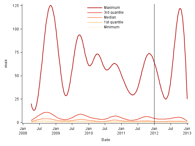
Like this for '01jan2012'd

- Mark as New
- Bookmark
- Subscribe
- Mute
- RSS Feed
- Permalink
- Report Inappropriate Content
You can use SGPLOT with a BY-group to generate the 20 plots; but, instead of using a literal value for the REFLINE, use a variable that contains the reference line values. That way, the reference line position will vary per BY-group.
Hope this helps!
Dan
- Mark as New
- Bookmark
- Subscribe
- Mute
- RSS Feed
- Permalink
- Report Inappropriate Content
Hi,
Thanks for the replies.
- Quantile regression: I don't think this is appropriate for what I intend to do.
- SGplot with by-group does not work. I think it's becasue there is only one date to plot, and then "pbspline x=Date y=max" will not produce any graph.
This produces the intended result, do you think it's efficient ?
%macro krigetimeplot(date);
proc sgplot data=_5A;
pbspline x=Date y=max / nomarkers lineattrs=(color=cxB30000) legendlabel="Maximum";
pbspline x=Date y=q3 / nomarkers lineattrs=(color=cxE34A33) legendlabel="3rd quantile";
pbspline x=Date y=median / nomarkers lineattrs=(color=cxFC8D59) legendlabel="Median";
pbspline x=Date y=q1 / nomarkers lineattrs=(color=cxFDCC8A) legendlabel="1st quantile";
pbspline x=Date y=min / nomarkers lineattrs=(color=cxFEF0D9) legendlabel="Minimum";
keylegend / noborder position=top location=inside across=1;
refline &date / axis=x;
;run;quit;
%mend krigetimeplot;
data _null_; set _5A;
call execute('%krigetimeplot('||Date||')');
run;
.jpg")
Catch up on SAS Innovate 2026
Nearly 200 sessions are now available on demand in the Innovate Hub.
Watch Now →Learn how use the CAT functions in SAS to join values from multiple variables into a single value.

Find more tutorials on the SAS Users YouTube channel.
SAS Training: Just a Click Away
Ready to level-up your skills? Choose your own adventure.
-
4 replies
-
04-25-2013 09:24 AM
-
2667 views
-
0 likes
-
3 in conversation
-
