- Home
- /
- Programming
- /
- Graphics
- /
- Re: Multiple categories in a bar chart with GTL
- RSS Feed
- Mark Topic as New
- Mark Topic as Read
- Float this Topic for Current User
- Bookmark
- Subscribe
- Mute
- Printer Friendly Page
- Mark as New
- Bookmark
- Subscribe
- Mute
- RSS Feed
- Permalink
- Report Inappropriate Content
Is there a way to specify two x variables in a bar chart using GTL? One way I have found is to create a dummy variable that is a string concatenation of the individual variables and use that as the x in sgplot. It works but it means I have to do a lot of hand chart work in the graphics editor; I'm looking to avoid that by coding it instead.
I have attached some sample data to play with and a PDF of a mock up of what I'm looking to do.
Thanks,
Adrian.
- Mark as New
- Bookmark
- Subscribe
- Mute
- RSS Feed
- Permalink
- Report Inappropriate Content
I don't recall the settings off and not sure what I'm suggesting is possible but you may want to plot 2 series.
One will the data you see on the chart with the var 1 in Axis 1
two will be the data that is set to transparent but is on the chart as Axis 2 and moved down (this is the part I'm not sure about).
The other option is doing what you've done, but have the labels automatically split into rows based on a split character. I remember seeing this come up a while back and it was possible under certain circumstances, but the solution may have been annotation.
Or add a second chart that plots nothing but the axis with the labels. If you have sgdesigner I'd play with that to get what I'd want and how the code should look.
- Mark as New
- Bookmark
- Subscribe
- Mute
- RSS Feed
- Permalink
- Report Inappropriate Content
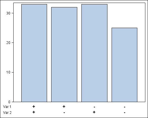
Yes, you can do this with SAS 9.2 GTL with a bit of creative coding. Here is the result:

I have used a lattice of two rows. The upper cell contains the bar chart using a new variable that has the 4 combinations of the var_1 and var_2. Then, I added 4 observations with the values of '+' and '-', and used a scatterplot with markercharacter in the lower cell. Column axes are set to union, and display of the axes is disabled. I did a Bar Chart of frequency, but you can add a response variable if you need.
SAS 9.2 GTL Program follows:
proc import datafile='C:\Work\Blogs\Communities\pgm\Two_Var_Data.xls' dbms=XLS out=Two_Var;
run;
data two_var2;
set two_var end=last;
var=cats(var_1, var_2);
if last then do;
var='++'; var1='+'; var2='+'; label1='Var 1'; label2='Var 2'; output;
var='+-'; var1='+'; var2='-'; label1='Var 1'; label2='Var 2'; output;
var='-+'; var1='-'; var2='+'; label1='Var 1'; label2='Var 2'; output;
var='--'; var1='-'; var2='-'; label1='Var 1'; label2='Var 2'; output;
end;
else output;
run;
proc sort data=two_var2 out=two_var3;
by var;
run;
proc template;
define statgraph two_var;
begingraph;
layout lattice / columndatarange=union rows=2 rowweights=(0.9 0.1);
layout overlay / xaxisopts=(display=none)
yaxisopts=(display=(ticks tickvalues));
barchart x=var;
endlayout;
layout overlay / walldisplay=none xaxisopts=(display=none)
yaxisopts=(display=(tickvalues));
scatterplot x=var y=label2 / markercharacter=var2 markercharacterattrs=(size=11 weight=bold);
scatterplot x=var y=label1 / markercharacter=var1 markercharacterattrs=(size=11 weight=bold);
endlayout;
endlayout;
endgraph;
end;
run;
ods listing;
ods graphics / reset width=5in height=4in imagename='two_var';
proc sgrender data=two_var3 template=two_var;
run;
- Mark as New
- Bookmark
- Subscribe
- Mute
- RSS Feed
- Permalink
- Report Inappropriate Content
That is three kinds of clever Sanjay and I'll confess that I'm jealous. ![]()
I'll mark your answer as correct when the "Correct Answer" button finally shows back up.
- Mark as New
- Bookmark
- Subscribe
- Mute
- RSS Feed
- Permalink
- Report Inappropriate Content
I wrote up a blog article on this case. Hope you don't mind me using your data. ![]()
- Mark as New
- Bookmark
- Subscribe
- Mute
- RSS Feed
- Permalink
- Report Inappropriate Content
Don't mind at all.
Thanks again.
-------
Edit: 5/25/2012 1:48 PM
Just read the blog post! So when does SAS 9.4 come out?!? :smileygrin:
- Mark as New
- Bookmark
- Subscribe
- Mute
- RSS Feed
- Permalink
- Report Inappropriate Content
If you can do without requiring a two line axis display and you do not need sorting of the bars by response, you could also get by with this solution. No changes to the data are needed since you are letting GTL expressions do the work for you:
--
proc template;
define statgraph two_var;
begingraph;
layout overlay / yaxisopts=(display=(ticks tickvalues)) xaxisopts=(label="var_1 , var_2");
barchart x=eval(var_1 || " , " || var_2) y=count / stat=mean;
endlayout;
endgraph;
end;
run;
--
- Mark as New
- Bookmark
- Subscribe
- Mute
- RSS Feed
- Permalink
- Report Inappropriate Content
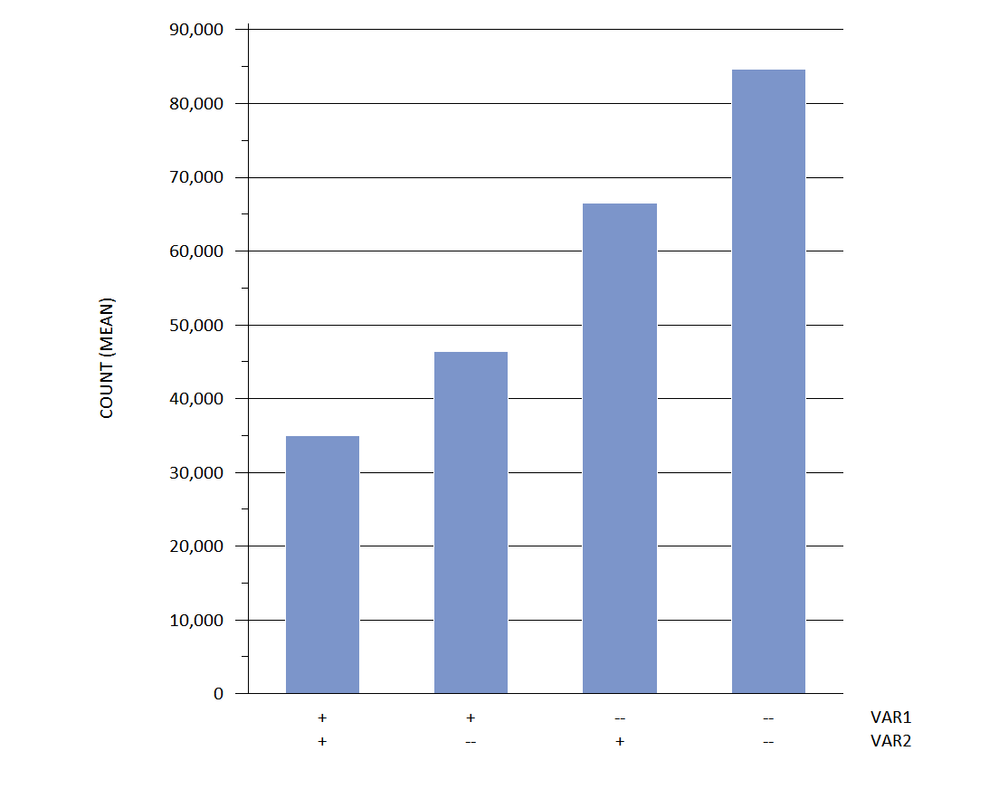
hi ... I know that you asked about GTL, but it's also possible in "vintage" SAS/Graph
since '+' has a value less than '-' in the sorting order, the bars will be in ++, +-, -+, -- order using the new VAR3
using a GROUP variable pushes the MIDPOINT axis label off to the side and an axis statement eliminates the appearance of any GROUP axis features
* your data;
data x;
infile 'z:\testdata.csv' dsd firstobs=2;
input (var1 var2) (:$1.) count;
run;
* your data 'tweaked';
data x;
retain group 1;
set x;
var3 = catt(var1,var2);
run;
goptions reset=all gunit=pct ftext='calibri' htext=2.5 hpos=40;
axis1 label=(j=c 'VAR1' j=c 'VAR2')
value=(
tick=1 j=c '+' j=c '+'
tick=2 j=c '+' j=c '--'
tick=3 j=c '--' j=c '+'
tick=4 j=c '--' j=c '--'
);
axis2 value=none label=none;
axis3 minor=(n=1) label=(a=90 'COUNT (MEAN)');
proc gchart data=x;
vbar var3 / sumvar=count type=mean discrete width=3 space=3 coutline=white
maxis=axis1 gaxis=axis2 raxis=axis3 autoref clipref cref=black group=group noframe;
format count comma10.;
run;
quit;

April 27 – 30 | Gaylord Texan | Grapevine, Texas
Registration is open
Walk in ready to learn. Walk out ready to deliver. This is the data and AI conference you can't afford to miss.
Register now and save with the early bird rate—just $795!
Learn how use the CAT functions in SAS to join values from multiple variables into a single value.
Find more tutorials on the SAS Users YouTube channel.
SAS Training: Just a Click Away
Ready to level-up your skills? Choose your own adventure.


