- Home
- /
- Programming
- /
- Graphics
- /
- Multiple X axis
- RSS Feed
- Mark Topic as New
- Mark Topic as Read
- Float this Topic for Current User
- Bookmark
- Subscribe
- Mute
- Printer Friendly Page
- Mark as New
- Bookmark
- Subscribe
- Mute
- RSS Feed
- Permalink
- Report Inappropriate Content
Hi all!
I want to make a graph: in the x axis i want to put month and lower year, and in Y axis rate.
How can I do it?
Thanks!
- Mark as New
- Bookmark
- Subscribe
- Mute
- RSS Feed
- Permalink
- Report Inappropriate Content
Do you mean multiple X axis or multiple labels on the X axis?
It helps if you show a picture and sample data that mimics your data.
- Mark as New
- Bookmark
- Subscribe
- Mute
- RSS Feed
- Permalink
- Report Inappropriate Content
- Mark as New
- Bookmark
- Subscribe
- Mute
- RSS Feed
- Permalink
- Report Inappropriate Content
I think the easiest way to handle this case is to combine the two variables into a SAS date variable and use that variable in SGPLOT. Here is a simple example:
data datedata;
format newdate monyy.;
do year=2000 to 2002;
do month=1 to 12;
newdate = mdy(month,01,year);
y=ranuni(123);
output;
end;
end;
run;
proc sgplot data=datedata;
scatter x=newdate y=y;
run;
- Mark as New
- Bookmark
- Subscribe
- Mute
- RSS Feed
- Permalink
- Report Inappropriate Content
- Mark as New
- Bookmark
- Subscribe
- Mute
- RSS Feed
- Permalink
- Report Inappropriate Content
Your data must contain at least several years worth the information. The system determined that the best format for your time axis was years. You can force it to months by adding this statement to your SGPLOT code;
xaxis interval=month;
Hope this helps!
Dan
- Mark as New
- Bookmark
- Subscribe
- Mute
- RSS Feed
- Permalink
- Report Inappropriate Content
2008 below JAN, 2009 below JAN, 2010 below JAN
- Mark as New
- Bookmark
- Subscribe
- Mute
- RSS Feed
- Permalink
- Report Inappropriate Content
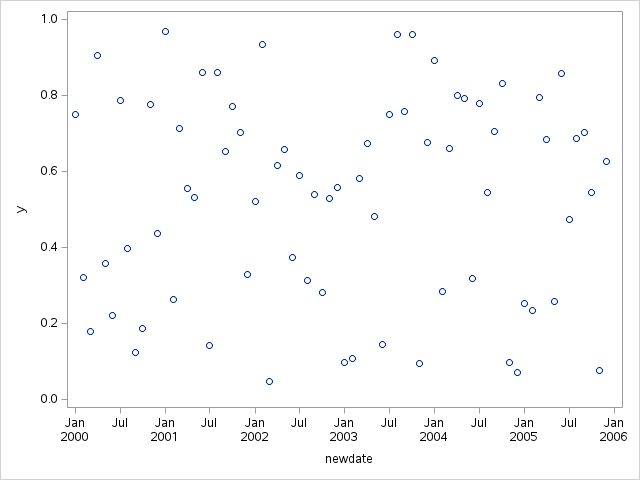
Hmmm.. I'm not sure how you would get behavior. When I run the code I gave you from 2000 to 2005, I get the attached picture. Can you show us your SGPLOT code (without the data)?
Thanks!
Dan

- Mark as New
- Bookmark
- Subscribe
- Mute
- RSS Feed
- Permalink
- Report Inappropriate Content
Try this and see if this is what you want:
proc sgplot data=sashelp.air;
where date between '01jan1955'd and '01jan1957'd;
series x=date y=air;
run;
Catch up on SAS Innovate 2026
Dive into keynotes, announcements and breakthroughs on demand.
Explore Now →Learn how use the CAT functions in SAS to join values from multiple variables into a single value.
Find more tutorials on the SAS Users YouTube channel.
SAS Training: Just a Click Away
Ready to level-up your skills? Choose your own adventure.


