- Home
- /
- Programming
- /
- Graphics
- /
- Re: Multiple Histograms/Densities on same graph?
- RSS Feed
- Mark Topic as New
- Mark Topic as Read
- Float this Topic for Current User
- Bookmark
- Subscribe
- Mute
- Printer Friendly Page

- Mark as New
- Bookmark
- Subscribe
- Mute
- RSS Feed
- Permalink
- Report Inappropriate Content
My pleasure, attached 4 samples from R, 3 versions that could work, I also added a faceted one which was not what I asked for and that I CAN do in sgpanel
the code I used is below, I also had to read the data and create a factor, which is not dissimilar to having a sas format - all in one line with minimal options, will get a bit more complicated if I wanted to format axes or add axis labels (in either platform)
#chart1
ggplot(small, aes(x=sheetz_num,fill=atm_group)) + geom_histogram(alpha=.2, position="identity",binwidth=1)+labs(title="Chart1")
#chart2
ggplot(small, aes(x=sheetz_num,fill=atm_group)) + geom_histogram(alpha=1, position="dodge",binwidth=1)+labs(title="Chart2")
#chart3
ggplot(small, aes(x=sheetz_num,color=atm_group)) + geom_density()+labs(title="Chart3")
#chart4
ggplot(small, aes(x=sheetz_num)) + geom_histogram(alpha=.2, position="identity",binwidth=1)+labs(title="Chart4")+facet_grid(atm_group~.)
I do not believe this is possible with gplot as suggested, unless I transform the data first with Proc freq (basically creating the bins) so I can have 3 variables as in the stock example, but why should I do that, for that matter I can maybe have 2 powerpoint charts on top of each other somehow, it would be cumbersome and time consuming.
I appreciate the help, and I do it because I like SAS and would like to be able to do it in SAS,

- Mark as New
- Bookmark
- Subscribe
- Mute
- RSS Feed
- Permalink
- Report Inappropriate Content
Thanks for the examples!
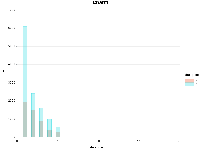
Here's some code showing how you could create something like Chart1 using gplot.
Yes, you'll have to pre-summarize your data.
One suggestion - once you get a plot you like, you might want to write a macro so that you can generate the plot by passing parameters to the macro (similar to what you're doing in R) rather than repeating the code each time.
data foo;
input atm_group sheetz_num count;
datalines;
1 1 1950
1 2 1500
1 3 900
1 4 400
1 5 300
2 1 6100
2 2 2400
2 3 1600
2 4 1000
2 5 550
;
run;
axis1 label=(angle=90 'count') minor=none offset=(0,0);
axis2 order=(0 to 20 by 5) minor=none offset=(0,0);
symbol1 value=none interpol=needle width=15 color=Af0582f55;
symbol2 value=none interpol=needle width=15 color=A39dee455;
legend1 position=(right middle) across=1 label=(position=top);
title "Chart1";
proc gplot data=foo;
plot count*sheetz_num=atm_group /
vzero vaxis=axis1 haxis=axis2 legend=legend1
autohref autovref chref=grayee cvref=grayee;
run;

- Mark as New
- Bookmark
- Subscribe
- Mute
- RSS Feed
- Permalink
- Report Inappropriate Content
I had the same problem as your Chart 3 last year. One solution (to chart 3) is to create your own template file. It's kind of like a layout() in R. This one will create 3 densities overlaid on one plot. I can give you a full example if you want.
proc template;
define statgraph d;
begingraph;
layout overlay / xaxisopts=(label='Volume');
densityplot eval((log(src = 'bc') + 1) * vol) /
kernel() lineattrs=(color=purple);
densityplot eval((log(src = 'bp') + 1) * vol) /
kernel() lineattrs=(color=red);
densityplot eval((log(src = 'fp') + 1) * vol) /
kernel() lineattrs=(color=gray);
endlayout;
endgraph;
end;
run;
proc sgrender data=abcd template=d;
run;
- Mark as New
- Bookmark
- Subscribe
- Mute
- RSS Feed
- Permalink
- Report Inappropriate Content
Thank you all - it is clear exactly how to do it in SAS now
What I want to emphasize is that in R I am not doing any pre-processing, nor am I required to create a template or a macro, I am just using ggplot2 - the equivalent in SAS would be to do it in sgplot/sgpanel/gplot without pre-processing. The simple calls I showed do all the work
If I worked at SAS, implementing the grammar of graphics and allowing this sort of things would be on my priority list
I really like SAS, I believe it can do most of what people need, and every day I discover new things (The ability to call support for help is a super valid feature, the R forums are not quite the same). And it deals with large datasets easily while in R we are constrained to in memory or have to use special techniques - but graphics is one area where it lags a bit - as shown here - it is hard to always have labels on top of bars as well, if they do not fit perfectly they just are not printed.
- Mark as New
- Bookmark
- Subscribe
- Mute
- RSS Feed
- Permalink
- Report Inappropriate Content
If you feel that R graphics are better for your needs, you can actually call R from SAS using IML studio. Here's some information about calling R from SAS:
- Mark as New
- Bookmark
- Subscribe
- Mute
- RSS Feed
- Permalink
- Report Inappropriate Content
I did not know that, very interesting.
I am not familiar with IML - is that part of Base SAS?
- Mark as New
- Bookmark
- Subscribe
- Mute
- RSS Feed
- Permalink
- Report Inappropriate Content

- Mark as New
- Bookmark
- Subscribe
- Mute
- RSS Feed
- Permalink
- Report Inappropriate Content
You can call R from PROC IML and from SAS/IML Studio.
For a video that shows the basics, see Video: Calling R from the SAS/IML Language - The DO Loop
For an example and discussion, see Calling R from SAS/IML software - The DO Loop
- « Previous
-
- 1
- 2
- Next »
.jpg")
Catch up on SAS Innovate 2026
Nearly 200 sessions are now available on demand in the Innovate Hub.
Watch Now →Learn how use the CAT functions in SAS to join values from multiple variables into a single value.

Find more tutorials on the SAS Users YouTube channel.
SAS Training: Just a Click Away
Ready to level-up your skills? Choose your own adventure.
-
22 replies
-
04-29-2010 10:05 AM
-
23668 views
-
0 likes
-
8 in conversation
-
