- Home
- /
- Programming
- /
- Graphics
- /
- Missing Line on the Dots for few cases - SAS GPLOT
- RSS Feed
- Mark Topic as New
- Mark Topic as Read
- Float this Topic for Current User
- Bookmark
- Subscribe
- Mute
- Printer Friendly Page

- Mark as New
- Bookmark
- Subscribe
- Mute
- RSS Feed
- Permalink
- Report Inappropriate Content
Hi,
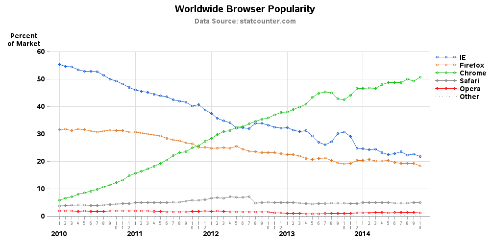
I'm plotting a gplot in SAS 9.3, I'm not sure what mistake am I doing that it is not plotting lines on all the cases of my graph. the line is plotting for only one case.
Please refer to the attached graph.
Please help me to resolve this.
Naresh

Accepted Solutions

- Mark as New
- Bookmark
- Subscribe
- Mute
- RSS Feed
- Permalink
- Report Inappropriate Content
In that case, the easiest way is to leave the color= off the symbol statement, and let it take colors from the ods style that is in use. Something like this:
goptions reset=symbol;
symbol1 value=dot interpol=join repeat=3;
proc gplot data=sashelp.stocks;
plot close*date=stock;
run;
If you want to control the color of each line, you'll need a symbol statement for each line, such as ...
goptions reset=symbol;
symbol1 value=dot interpol=join color=red repeat=1;
symbol2 value=dot interpol=join color=pink repeat=1;
symbol3 value=dot interpol=join color=purple repeat=1;
proc gplot data=sashelp.stocks;
plot close*date=stock;
run;

- Mark as New
- Bookmark
- Subscribe
- Mute
- RSS Feed
- Permalink
- Report Inappropriate Content
Looks like you need additional SYMBOL statements with the I=Join option. This will also let you define more interesting markers.
You need one symbol statement for each response category to customize appearance.
- Mark as New
- Bookmark
- Subscribe
- Mute
- RSS Feed
- Permalink
- Report Inappropriate Content
Hi,
What do you mean by additional symbol options. Could you please provide me some details.
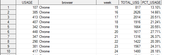
here is my code.
I've already used symbol option with join.
*PLOTTING*/
symbol1 interpol=join value=dot;
AXIS1 LABEL = NONE ORDER = &cutoffweek. TO &lastfullweek.;
PROC GPLOT DATA = PCT_OSBYTIME&clientname.;
TITLE "OS Usage Overtime - &clientname.";
PLOT PCT_USAGE * WEEK = OS / haxis= AXIS1 ;
/* PLOT PCT_USAGE * WEEK = OS;*/
RUN;
PROC GPLOT DATA = PCT_BROWSERBYTIME&clientname.;
TITLE "Browser Usage Overtime - &clientname.";
PLOT PCT_USAGE * WEEK = BROWSER / haxis= AXIS1;
/* PLOT PCT_USAGE * WEEK = BROWSER;*/
RUN;
/* Define symbol characteristics */
symbol1 color=vibg interpol=join value=dot;
PROC GPLOT DATA = PCT_RESLNBYTIME&clientname.;
TITLE "Screen size usage Overtime - &clientname.";
PLOT PCT_USAGE * WEEK = WIDTHBIN / haxis= AXIS1;
/* PLOT PCT_USAGE * WEEK = WIDTHBIN ;*/
RUN;
- Mark as New
- Bookmark
- Subscribe
- Mute
- RSS Feed
- Permalink
- Report Inappropriate Content
It could depend on how your data is structured - are you using "plot y*x=browser" or do you have a separate y-variable for each browser (which you 'overlay')? And it might also depend on whether you're using a traditional device such as png, or activex (or java).
Anyway, here's an example that shows one way to create a plot like what it appears you're wanting:
http://www.robslink.com/SAS/democd59/browser_wars.htm
http://www.robslink.com/SAS/democd59/browser_wars_info.htm
- Mark as New
- Bookmark
- Subscribe
- Mute
- RSS Feed
- Permalink
- Report Inappropriate Content
Hi,
I don't have separate y variable for each category. I've single PCT variable for all the categories.
Please refer to the attached image.
- Mark as New
- Bookmark
- Subscribe
- Mute
- RSS Feed
- Permalink
- Report Inappropriate Content
In that case, the easiest way is to leave the color= off the symbol statement, and let it take colors from the ods style that is in use. Something like this:
goptions reset=symbol;
symbol1 value=dot interpol=join repeat=3;
proc gplot data=sashelp.stocks;
plot close*date=stock;
run;
If you want to control the color of each line, you'll need a symbol statement for each line, such as ...
goptions reset=symbol;
symbol1 value=dot interpol=join color=red repeat=1;
symbol2 value=dot interpol=join color=pink repeat=1;
symbol3 value=dot interpol=join color=purple repeat=1;
proc gplot data=sashelp.stocks;
plot close*date=stock;
run;
.jpg")
Catch up on SAS Innovate 2026
Nearly 200 sessions are now available on demand with the SAS Innovate Digital Pass.
Explore Now →Learn how use the CAT functions in SAS to join values from multiple variables into a single value.

Find more tutorials on the SAS Users YouTube channel.
SAS Training: Just a Click Away
Ready to level-up your skills? Choose your own adventure.
-
5 replies
-
10-27-2014 01:13 PM
-
3885 views
-
0 likes
-
3 in conversation
-
