- Home
- /
- Programming
- /
- Graphics
- /
- Re: Manipulate axis title in graph
- RSS Feed
- Mark Topic as New
- Mark Topic as Read
- Float this Topic for Current User
- Bookmark
- Subscribe
- Mute
- Printer Friendly Page
- Mark as New
- Bookmark
- Subscribe
- Mute
- RSS Feed
- Permalink
- Report Inappropriate Content
Hi all,
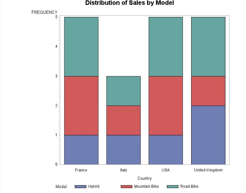
I have this graph created by this code:
PROC SGPLOT DATA = new;
VBAR country / GROUP = model;
RUN;
How can I change the direction of the Y-axis title from vertical to horizontal?
- Mark as New
- Bookmark
- Subscribe
- Mute
- RSS Feed
- Permalink
- Report Inappropriate Content
PROC SGPLOT DATA = new;
VBAR country / GROUP = model;
yaxis LABELPOS=CENTER ;
RUN;
Jag
- Mark as New
- Bookmark
- Subscribe
- Mute
- RSS Feed
- Permalink
- Report Inappropriate Content
- Mark as New
- Bookmark
- Subscribe
- Mute
- RSS Feed
- Permalink
- Report Inappropriate Content
I think JAG meant to say
yaxis LABELPOS=TOP;
- Mark as New
- Bookmark
- Subscribe
- Mute
- RSS Feed
- Permalink
- Report Inappropriate Content
yaxis LABELPOS=TOP ;
I used the above statement, it worked but still I need to make a space between the word "frequency" and the axis, not to be exactly above the axis. Need to make space betwee the two.
- Mark as New
- Bookmark
- Subscribe
- Mute
- RSS Feed
- Permalink
- Report Inappropriate Content
This is the graph I am looking for with a space betwee the word "frequency" and the Y-axis.
- Mark as New
- Bookmark
- Subscribe
- Mute
- RSS Feed
- Permalink
- Report Inappropriate Content
Catch up on SAS Innovate 2026
Nearly 200 sessions are now available on demand with the SAS Innovate Digital Pass.
Explore Now →Learn how use the CAT functions in SAS to join values from multiple variables into a single value.
Find more tutorials on the SAS Users YouTube channel.
SAS Training: Just a Click Away
Ready to level-up your skills? Choose your own adventure.


