- Home
- /
- Programming
- /
- Graphics
- /
- Issue with secondary vertical axis
- RSS Feed
- Mark Topic as New
- Mark Topic as Read
- Float this Topic for Current User
- Bookmark
- Subscribe
- Mute
- Printer Friendly Page

- Mark as New
- Bookmark
- Subscribe
- Mute
- RSS Feed
- Permalink
- Report Inappropriate Content
Hello,
I want a secondary vertical axis to be displayed as shown in the attached file.
Can we achieve this using proc gplot, if not suggest me alternative methods.

- Mark as New
- Bookmark
- Subscribe
- Mute
- RSS Feed
- Permalink
- Report Inappropriate Content
With SGPLOT, you can get a graph that shows the data in the same way but maybe not the exact "look" you showed, like the x axis in the middle. Here is the graph and the code:
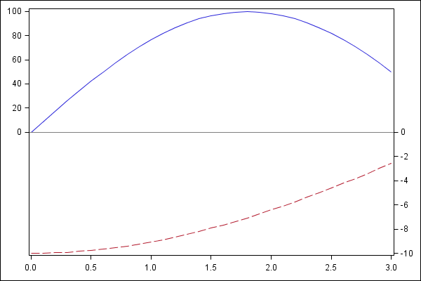
data curves;
pi=constant('PI');
do x=0 to 3 by 0.1;
y1=100*sin(50*x*pi/180);
y2=-10*(cos(25*x*pi/180));
output;
end;
run;
ods graphics / reset width=6in height=4in imagename='DualAxes';
proc sgplot data=curves noautolegend;
series x=x y=y1;
series x=x y=y2 / y2axis;
refline 0;
yaxis min=0 offsetmin=0.5 display=(nolabel);
y2axis max=0 offsetmax=0.5 display=(nolabel);
xaxis display=(nolabel);
run;
If it is important to get a "look" closer to your graph, you can do it using GTL. Both these need SAS 9.2 or later. If you are interested, I can work up that code.
- Mark as New
- Bookmark
- Subscribe
- Mute
- RSS Feed
- Permalink
- Report Inappropriate Content
Hi Sanjay,
Thanks for your answer. Eventhough it helps , I am still struggling to get the final one. In my case refline is not zero as the range of left hand y-axis is something like 50 t0 60 and right hand y axis is something like -3 to 5.
Thank You,
Ravi.
- Mark as New
- Bookmark
- Subscribe
- Mute
- RSS Feed
- Permalink
- Report Inappropriate Content
That is not a problem. Your Y axis can be 50 - 60 and Y2 from -3 to 5. You can set a reference line at Y=50 or Y2=-3. I actually set Y axis min=0 and Y2axis max=0. If you want, you can set these to whatever values you want. It is very flexible.

- Mark as New
- Bookmark
- Subscribe
- Mute
- RSS Feed
- Permalink
- Report Inappropriate Content
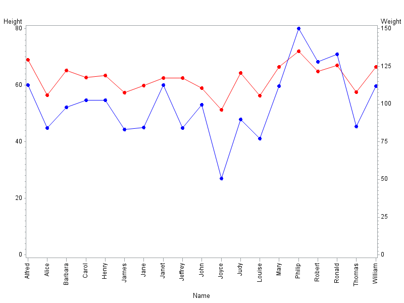
I'm not able to view your attached file correctly, but here is a simple example showing how to add a second vertical axis (on the right-hand-side) in gplot ...
axis1 order=(0 to 80 by 20);
axis2 order=(0 to 150 by 25);
axis3 value=(angle=90);
symbol1 value=dot interpol=join color=red;
symbol2 value=dot interpol=join color=blue;
proc sort data=sashelp.class out=class; by name; run;
proc gplot data=class;
plot height*name=1 / vaxis=axis1 haxis=axis3;
plot2 weight*name=2 / vaxis=axis2;
run;
.jpg")
Catch up on SAS Innovate 2026
Nearly 200 sessions are now available on demand in the Innovate Hub.
Watch Now →Learn how use the CAT functions in SAS to join values from multiple variables into a single value.

Find more tutorials on the SAS Users YouTube channel.
SAS Training: Just a Click Away
Ready to level-up your skills? Choose your own adventure.
-
4 replies
-
01-08-2013 12:37 PM
-
3021 views
-
0 likes
-
3 in conversation
-
