- Home
- /
- Programming
- /
- Graphics
- /
- Re: Is it possible to have different WALLCOLORs for each panel in a DA...
- RSS Feed
- Mark Topic as New
- Mark Topic as Read
- Float this Topic for Current User
- Bookmark
- Subscribe
- Mute
- Printer Friendly Page

- Mark as New
- Bookmark
- Subscribe
- Mute
- RSS Feed
- Permalink
- Report Inappropriate Content
Hi all-
I have a custom panel graph that I'm running in SAS 9.3 (code below)
proc template;
define statgraph AnnotatedPanel ;
dynamic __BYLINE__
_IndVar
_DepVar
_GroupVar
_TitleText
_RowVar
_ColVar
_RowLabel
_ColLabel
_cellN
_cellGPct
_cellLPct ;
begingraph ;
EntryTitle _TitleText ;
EntryTitle __BYLINE__ / textattrs = (size = GraphLabelText:fontsize) ;
layout datalattice rowvar = _RowVar
columnvar = _ColVar /
Rows = 6
Columns = 5
HeaderLabelDisplay = namevalue
Inset = (_cellN _cellGPct _cellLPct)
InsetOpts = ( autoalign = (TopLeft BottomRight)
border = false
opaque = false
textattrs = (size = 8pt))
ColumnAxisOpts = ( label = _ColLabel
linearopts = ( viewmin = 0))
RowAxisOpts = ( label = _RowLabel
griddisplay = on
display = (label ticks tickvalues)) ;
layout prototype / wallcolor = lightgrey ;
SeriesPlot X = _IndVar
Y = _DepVar / group = _GroupVar lineattrs = (color = red) datatransparency = 0.6 ;
endLayout ;
endlayout ;
endgraph ;
end ;
run ;
The INSET allows me to include the N represented in each panel, as well as the percent that that represents of the overall total sample.
One thing I'd like to be able to do is specify the WALLCOLOR of each panel to correspond to the relative sample volume. For example, maybe panels will less than 1% are white, and between 1 and 5% they're light gray, and 5-10% are medium gray, and over 10% are dark gray. Basically, I want the panels to represent a macro heat map under the series plots.
Is this even possible?
Accepted Solutions

- Mark as New
- Bookmark
- Subscribe
- Mute
- RSS Feed
- Permalink
- Report Inappropriate Content
New article on this topic in Graphically Speaking.
- Mark as New
- Bookmark
- Subscribe
- Mute
- RSS Feed
- Permalink
- Report Inappropriate Content
While this is not supported directly, the layering architecture allows you some creative work arounds. The simple way is to just color the scatter markers themselves by a gradient using obs count with Markercolorgradient.
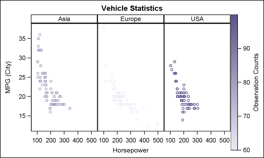
To get a ramp color background, you can add a bubble plot behind the scatters.
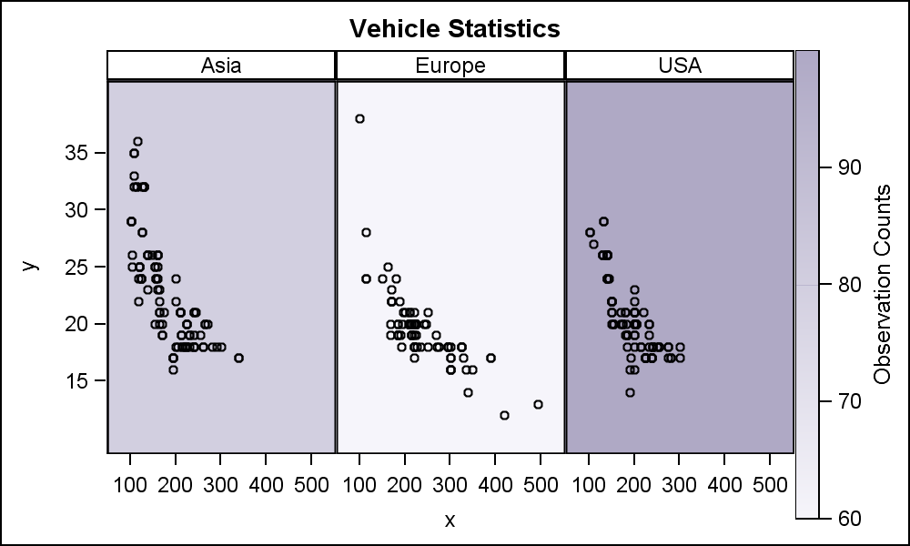
You can also use the RangeAttrMap to control the ramp color.
In bubbleplot case, the data has only one (x,y) point per cell, so only one bubble is plotted. Since bubble is very large ( to cover the region), you have to set the axis offsets back to a smaller value.
In both cases, the height of ramp legend is not ideal. I'll see what we can do about that.
Sample code with made up values for obs count is attached.
- Mark as New
- Bookmark
- Subscribe
- Mute
- RSS Feed
- Permalink
- Report Inappropriate Content
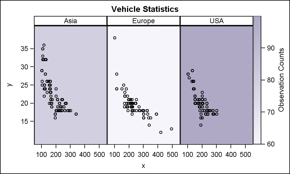
Found a way. Add padding to bottom of the legend. PAD=(Bottom=58px) does the trick.
- Mark as New
- Bookmark
- Subscribe
- Mute
- RSS Feed
- Permalink
- Report Inappropriate Content
New article on this topic in Graphically Speaking.
- Mark as New
- Bookmark
- Subscribe
- Mute
- RSS Feed
- Permalink
- Report Inappropriate Content
Thanks Sanjay! This worked great. It took some doing for sure, but I finally got it.
I would add, you really can't stress the importance of the offset specifications enough. Without that, the graph didn't work at all!
.jpg")
Catch up on SAS Innovate 2026
Nearly 200 sessions are now available on demand with the SAS Innovate Digital Pass.
Explore Now →Learn how use the CAT functions in SAS to join values from multiple variables into a single value.

Find more tutorials on the SAS Users YouTube channel.
SAS Training: Just a Click Away
Ready to level-up your skills? Choose your own adventure.
-
4 replies
-
02-21-2014 10:16 AM
-
2868 views
-
6 likes
-
2 in conversation
-
