- Home
- /
- Programming
- /
- Graphics
- /
- Re: How to reorder stacked bar subgroups
- RSS Feed
- Mark Topic as New
- Mark Topic as Read
- Float this Topic for Current User
- Bookmark
- Subscribe
- Mute
- Printer Friendly Page
- Mark as New
- Bookmark
- Subscribe
- Mute
- RSS Feed
- Permalink
- Report Inappropriate Content
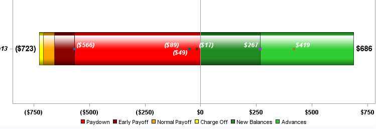
My version is SAS 9.3. I am trying to figure out how to reorder the subgroups of this barchart. I am using legend overlaying a scatterplot with markers. The red segment needs to be moved to the furthest left with dark red, orange and yellow (up against the zero axis). My code is below the image.
ods graphics / reset width=8in height=3in imagename='Wfall_GTL';
proc template;

define statgraph StackedClusterBarStat;
 begingraph /
 designheight = 750 designwidth = 1000 border = false
	backgroundcolor=white drawspace=datavalue
	pad=0%;
      entrytitle textattrs=(color=black style=italic size=16pt) "Example";
          discreteattrmap name='fillcolors'/ ignorecase=true trimleading=true;
		        value "Paydown" / fillattrs=(color=red);
				value "EPayoff" / fillattrs=(color=darkred);
				value "NPayoff" / fillattrs=(color=orange);
				value "COff" / fillattrs=(color=yellow);
                value "New" / fillattrs=(color=forestgreen);
				value "Advance" / fillattrs=(color=limegreen);

		   enddiscreteattrmap;
			    discreteattrvar attrvar=categoryfill var=type attrmap='fillcolors';
           discreteattrvar attrvar=categoryfill var=type attrmap='fillcolors';
                    legendItem type=fill name="A" /
        			fillattrs=(color=red) outlineattrs=(color=red)
        			label="A" ;
                    legendItem type=fill name="B" /
                    fillattrs=(color=darkred) outlineattrs=(color=darkred)
        			label="B" ;
      				legendItem type=fill name="C" /
                    fillattrs=(color=orange) outlineattrs=(color=orange)
        			label="C" ;

					legendItem type=fill name="D" /
        			fillattrs=(color=yellow) outlineattrs=(color=yellow)
        			label="D" ;
				    legendItem type=fill name="E" /
        			fillattrs=(color=forestgreen) outlineattrs=(color=forestgreen)
        			label="E" ;
      				legendItem type=fill name="F" /
        			fillattrs=(color=limegreen) outlineattrs=(color=limegreen)
        			label="F" ;


        layout overlay / xaxisopts=(display=(ticks tickvalues) tickvalueattrs=(size=12 color=black weight=bold))
                     yaxisopts=(griddisplay=on /*offsetmin=0 offsetmax=.1*/ display=(ticks tickvalues)
                     tickvalueattrs=(Color=black Size=12 Style=Italic Weight=Bold)
                     linearopts= (viewmax=900 viewmin=-900
                     tickvaluesequence=(start=-900 end=900 increment=200)));

            barchart x=month y=balance2 / orient=horizontal group=categoryfill groupdisplay=stack
                     barwidth=.4 barlabel=true /*primary=true*/ yaxis=y
                     barlabelattrs=(size=14 weight=bold color=black) barlabelformat=dollarc.
                     stat=sum dataskin=gloss name='fillcolors' ;
            scatterplot x=balance2 y=month / /*markercharacter=balance2
						markercharacterattrs=(size=12 color=white weight=bold)*/
				        group=categoryfill yaxis=y groupdisplay=overlay grouporder=ascending
						markerattrs=(symbol=squarefilled)
                        datalabel=balance2 datalabelposition=auto
						DATALABELATTRS=(Color=white Size=12 Style=Italic Weight=Bold);
		    discretelegend "A" "B" "C" "D" "E" "F" / valueattrs=(size=12 color=black)
                               autoitemsize=true location=outside halign=center valign=bottom border=false;

   endlayout;
endgraph;
end;
run;
/*--Render the graph--*/
proc sgrender data=temp_merge template=StackedClusterBarStat;
format balance2 dollarc.; run;
Accepted Solutions
- Mark as New
- Bookmark
- Subscribe
- Mute
- RSS Feed
- Permalink
- Report Inappropriate Content
Usually I sort the data in the order that I want the categories to appear, and then use GROUPORDER=DATA on the BARCHART statement (or any other statement that supports it).
- Mark as New
- Bookmark
- Subscribe
- Mute
- RSS Feed
- Permalink
- Report Inappropriate Content
Usually I sort the data in the order that I want the categories to appear, and then use GROUPORDER=DATA on the BARCHART statement (or any other statement that supports it).
- Mark as New
- Bookmark
- Subscribe
- Mute
- RSS Feed
- Permalink
- Report Inappropriate Content
Thank you. I sorted the data the way I want to see it in the code. I took your suggestion and added grouporder=data in the barchart. Grouporder=data is already in the scatterplot code. The markers (from scatterplot) did not shift. They remain the same as illustrated below. Essentially, I would like the markers to sync up with the segments of the bar as midpoints in the barchart subgroups.
- Mark as New
- Bookmark
- Subscribe
- Mute
- RSS Feed
- Permalink
- Report Inappropriate Content
I made some adjustments and it works for the most part. Thank you
Catch up on SAS Innovate 2026
Nearly 200 sessions are now available on demand with the SAS Innovate Digital Pass.
Explore Now →Learn how use the CAT functions in SAS to join values from multiple variables into a single value.
Find more tutorials on the SAS Users YouTube channel.
SAS Training: Just a Click Away
Ready to level-up your skills? Choose your own adventure.


