- Home
- /
- Programming
- /
- Graphics
- /
- layout overlay group order not consistent between barchart and scatter...
- RSS Feed
- Mark Topic as New
- Mark Topic as Read
- Float this Topic for Current User
- Bookmark
- Subscribe
- Mute
- Printer Friendly Page
- Mark as New
- Bookmark
- Subscribe
- Mute
- RSS Feed
- Permalink
- Report Inappropriate Content
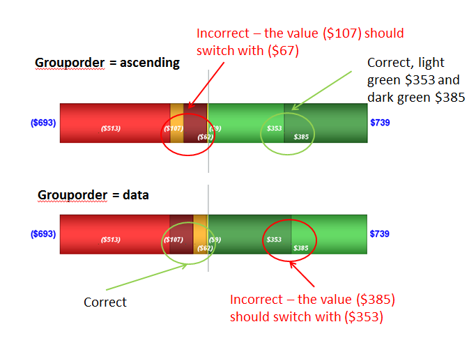
Hi my version of SAS is 9.3. I asked a similar question a few days back regarding the position of segments of a barchart and scatterplot overlay. The issue I have is the scatterplot overlay is not in sync with the barchart y axis for a horizontal chart. I am sorting both the barchart and scatterploy y values - I tried both grouporder = data and grouporder=ascending - the results below indicate the issue. How can I make this work so that the right values get the right barcolors. er the last suggestion I went back to the data and sorted it. My issue is between the barchart ordering and the ordering of the markers using a scatterplot.
Accepted Solutions
- Mark as New
- Bookmark
- Subscribe
- Mute
- RSS Feed
- Permalink
- Report Inappropriate Content
What this means is - to align the labels displayed by scatter plot (using your data) with stacked segments of a HBAR (which internally stacks the elements) you will have to preprocess the data to get the segments you want, and position them yourself. Then you can draw them using a HIGHLOW plot.
See example here: http://blogs.sas.com/content/graphicallyspeaking/2013/09/20/stacked-bar-chart-with-segment-labels/
If you have SAS 9.40M2, segment labels can be displayed by the HBAR itself, making this easier.
- Mark as New
- Bookmark
- Subscribe
- Mute
- RSS Feed
- Permalink
- Report Inappropriate Content
I would say that with Grouporder= DATA that you did not get the values into the order you that you wanted be graphing. If the the values you are showing come from part of a graphy with other bars I would expect the order to be the same as for the "first" bar. So if the range of groups changes you may not get what you're looking for.
Are you summarizing the data prior to graphing or letting the chart procedure to the summarization? And some code and data example may help.
- Mark as New
- Bookmark
- Subscribe
- Mute
- RSS Feed
- Permalink
- Report Inappropriate Content
The data on both the barchart and the scatterplot are coming from the same dataset. The group=type (which is a character value) and grouporder=data. This orders the barchart segments in the order of the type column.
On the other hand when I set the scatterplot the same way (group= type and grouporder=data) using the same x,y values the order appears to be based on the X value balance, not type. I believe this is causing the barchart and the scatterplot to be out of sync.
I can send dataset code directly if needed.
here is the segment of chart code that shows the grouporders:
barchart x=month y=balance2 / orient=horizontal group=type groupdisplay=stack grouporder=data
barwidth=.4 barlabel=true yaxis=y
barlabelattrs=(size=14 weight=bold color=blue) barlabelformat=dollarc.
stat=sum dataskin=pressed name='a' ;
scatterplot x=balance2 y=month /
group=type datatransparency=0 yaxis=y groupdisplay=overlay grouporder=data
markerattrs=(symbol=squarefilled size=.01 weight=bold) discreteoffset=-.1 DISCRETEMARKERSIZE=1
datalabel=balance2 datalabelposition=auto
DATALABELATTRS=(Color=white Size=10 Style=Italic Weight=Bold);
- Mark as New
- Bookmark
- Subscribe
- Mute
- RSS Feed
- Permalink
- Report Inappropriate Content
A full working program would help. In the meantime, the (stacked) group bar chart stacks the values provided for the same category (negative and positive on each side of the zero axis). While a value may be y, its position will be at (x+y) where x is the previous stack segment. Group order will change how the values are stacked.
Scatter does not stack data in this manner. So, an observation with value "y" will be placed at "y" from the axis. Not knowing what your data set looks like it is hard to say if this is the issue. You can try the same with a cluster bar chart (just a test). Do you get the consistency you expect?
- Mark as New
- Bookmark
- Subscribe
- Mute
- RSS Feed
- Permalink
- Report Inappropriate Content
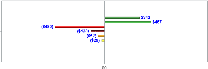
Hi Sanjay - when I change to cluster it works! Code is coming
Code is coming
- Mark as New
- Bookmark
- Subscribe
- Mute
- RSS Feed
- Permalink
- Report Inappropriate Content
What this means is - to align the labels displayed by scatter plot (using your data) with stacked segments of a HBAR (which internally stacks the elements) you will have to preprocess the data to get the segments you want, and position them yourself. Then you can draw them using a HIGHLOW plot.
See example here: http://blogs.sas.com/content/graphicallyspeaking/2013/09/20/stacked-bar-chart-with-segment-labels/
If you have SAS 9.40M2, segment labels can be displayed by the HBAR itself, making this easier.
Learn how use the CAT functions in SAS to join values from multiple variables into a single value.
Find more tutorials on the SAS Users YouTube channel.
SAS Training: Just a Click Away
Ready to level-up your skills? Choose your own adventure.


